The Psychology of Pricing: How to Present Price So Buyers Feel Good About It
Last updated:
Two stores. Same product. Same price. One converts at 3.2%. The other is at 1.4%.
Most founders would start looking at the product, the ads, and the landing page copy. Almost nobody looks at how the price itself is presented. In our experience at Precision, that is almost always the answer.
Price is not just a number on a page. It is a psychological event, and the psychology of pricing is more controllable than most stores realise. The brain does not evaluate prices in a vacuum. It evaluates them against reference points, against other numbers on the page, against what it expected to pay, and against the story the price is sitting inside. Change any of those things, and you change how the price feels, even if the actual number never moves.
Dan Ariely's research in Predictably Irrational is probably the clearest evidence of this. His experiments repeatedly showed that completely irrelevant numbers, context, and framing choices shaped what people were willing to pay. Not by a small margin. By a lot. Here is what that means practically for your store.
How Does Price Anchoring Shape What Your Customers Will Pay?
Price anchoring is the cognitive bias where the first number a customer sees becomes the reference point for every price they evaluate after. The most powerful thing about a price is not its absolute value. It is what came before it. Whatever number a customer sees first becomes the anchor, and every price they evaluate afterward is measured against it.
Ariely tested this with a simple experiment. He asked participants to write down the last two digits of their social security number, then bid on a bottle of wine. People with higher two-digit numbers bid significantly more than those with lower ones. A completely arbitrary number, one that had nothing to do with wine, had anchored their willingness to pay. In e-commerce, you get to choose that anchor deliberately. Most stores do not.
Anchoring Bias: The first number a customer sees becomes the reference point for everything that follows. Show a higher number before your real price, and the real price feels like a deal. Show nothing, and the brain invents its own anchor, which is usually worse for you.
For discounted products, always show the original price crossed out above or beside the sale price, then explicitly call out the savings. "Save £20" works harder than just showing the new number on its own.
For bundles: show the sum of individual item prices next to the bundle total. For subscriptions: show the per-unit or per-month cost next to the annual total. Give the brain a number to anchor against before it sees the number you want it to evaluate.
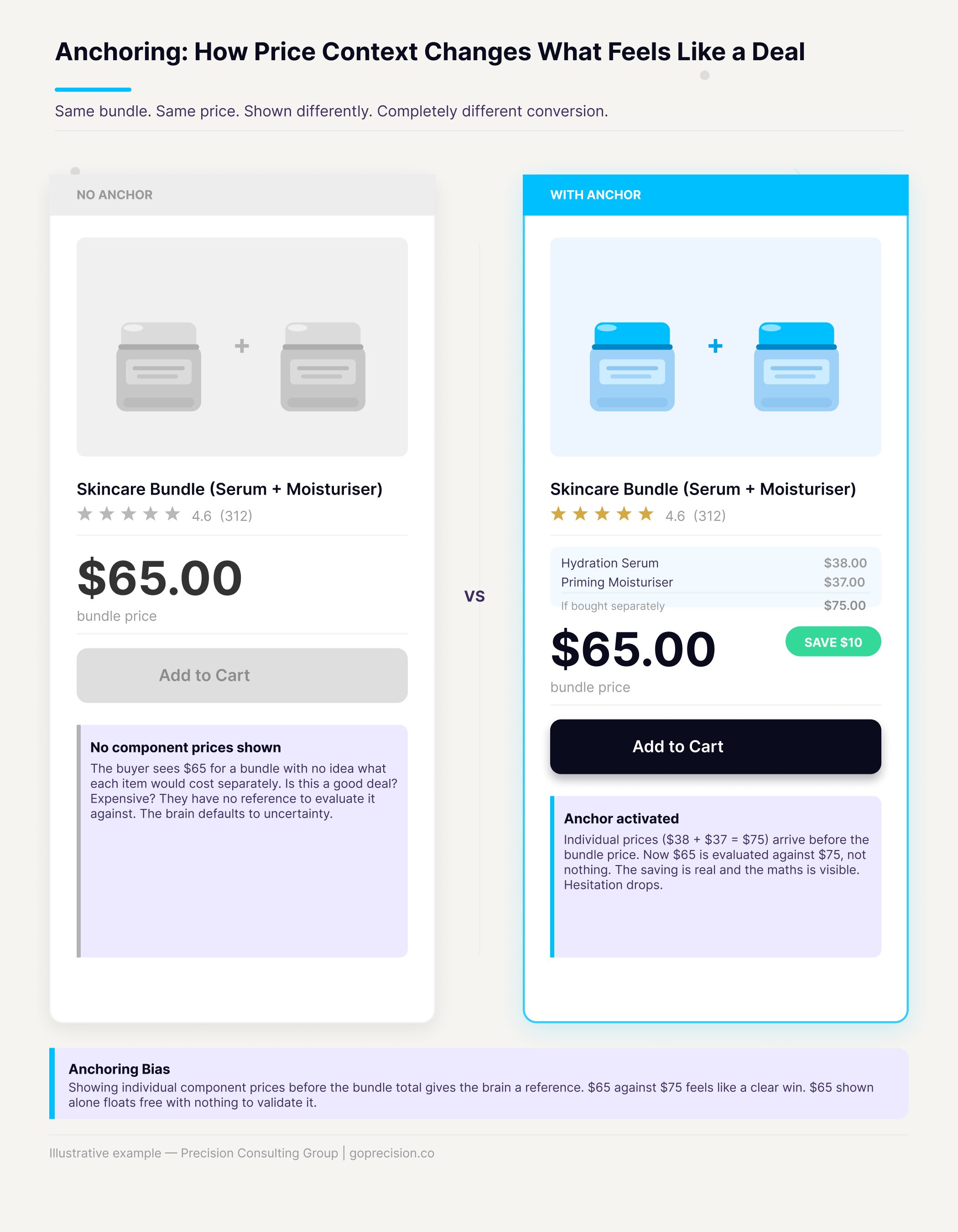
Side-by-side: price with no anchor versus price with crossed-out original and savings callout.
What Is the Decoy Effect and How Can It Work for Your Store?
The decoy effect is when adding a third option, deliberately less attractive than the one you want to sell, makes the target option look like the obvious choice. Ariely ran an experiment with The Economist's subscription page that illustrates this clearly. Three options were on offer: digital only at $59, print only at $125, and print plus digital at $125. The print-only option looked like a mistake. Who would pay the same price for less?
It was not a mistake. It was a decoy. When the print-only option was present, 84% of people chose the combined subscription. When it was removed, leaving just the two original options, only 32% chose it. The print-only option never needed to sell. Its entire job was to make the combined option look like an obvious deal by sitting next to it at the same price.
The Decoy Effect: Introducing an option that is clearly inferior to one of the others but similar in price shifts demand toward the superior option. The decoy does not need to convert. It exists to reframe the value of the option you actually want people to choose.
Applied to your store: if you want customers to buy the 500g pack at £18, a 350g pack at £16 makes the 500g look like the rational choice. The 350g is the decoy. It does not need to be popular. It needs to make the 500g feel like a no-brainer. This works across product variants, subscription tiers, and bundle options.
Look at your product variants and pricing tiers. If you only have two options, consider whether a third would shift demand toward the higher-value option. Position the decoy close in price to your preferred option, but with noticeably less value. It is the value gap, not the price gap, that makes the mechanism work.
Why Does Charm Pricing Work and When Should You Use It?
Charm pricing is ending prices in 9 (£99 instead of £100, $4.99 instead of $5) because the brain processes the leftmost digit first and treats the price as belonging to the lower category. £99 feels meaningfully cheaper than £100. You already know this works. What is less obvious is why it works even when the rational part of your brain knows the difference is one pound.
The brain reads prices from left to right and heavily anchors on the first digit. £99 gets encoded as "ninety-something" before the full number registers. The moment the leading digit drops, it feels like an entirely different price category, even though the actual difference is negligible.
Left-Digit Effect: The brain encodes prices starting from the leftmost digit and weights it disproportionately. A price drop from £100 to £99 feels larger than a drop from £101 to £100, because the leading digit changes. The cognitive shortcut fires before the full number is processed.
For value-positioned products, .99 or .95 endings are the right call. But this flips for premium products. Round numbers (£100, £200, £500) feel more premium and are easier to process cognitively. Ease of processing is associated with quality and trust. A £97 price signals a deal. A £100 price signals confidence. Do not use .99 endings on premium lines. It undercuts your positioning before the customer has read a single word about the product.
Value or mid-range products: use .99 or .95 endings. Premium products: use clean round numbers. The test is simple: does your pricing signal the brand you are trying to build? If you are positioning for quality, a .99 ending is working against you.
When Should You Show a Percentage Discount Versus a Cash Amount?
Show a percentage discount when the cash amount looks small, and show a cash amount when the percentage looks small. The simple version is the rule of 100: above £100, show the cash amount; below £100, show the percentage. A £20 product with a £4 discount. You can show this as "20% off" or "£4 off". Same discount. Completely different feel.
For prices under £100, percentage discounts tend to look better because 20% sounds bigger than £4. For prices over £100, absolute amounts tend to land better because "£50 off" sounds more substantial than "10% off" on a £500 item. The brain is not comparing the actual value of the discount. It is comparing the size of the numbers in front of it.
Numerical Magnitude Perception: The brain struggles to compare percentages against absolute amounts. It compares the numbers as written. 20 (percent) beats 4 (pounds) in perceived impact, even when they represent identical value. The format you choose determines which number the brain uses to judge the deal.
A £50 jacket with a £10 discount: say "20% off". A £500 laptop with a £50 discount: say "£50 off". For annual versus monthly subscription plans, the annual savings almost always look better as a flat amount. "Save £120 a year" hits harder than "save 17%".
Go through your discount copy and apply the rule: under £100, use percentages. For amounts over £100, use absolute amounts. For annual subscriptions, always show the annual saving as a pound or euro figure. If you are unsure which works better for your specific price point, run it as an A/B test.
How Does Price Framing Change the Way Customers Feel About What They Pay?
The same price can feel cheap or expensive depending entirely on how you frame it. This is the mental accounting principle: people do not evaluate spending from a single unified budget. They categorise it.
A £5 coffee does not feel expensive. The same £5 added to a £40 restaurant bill does. Same amount, different mental account, completely different emotional response.
Mental Accounting: People maintain separate mental budgets for different categories of spending and apply different standards to each. Framing a price within a familiar, lower-stakes spending category changes how reasonable it feels, even when the actual cost is identical.
In e-commerce, the frame around a price does as much work as the number itself. "£1 a day" puts a £365 annual subscription into the category of a small daily habit. "£365 a year" puts it into the category of a large annual commitment. The brain evaluates these very differently, even though they are describing the same thing.
Some frames that work well: "less than your morning coffee" for low-cost subscriptions, per-unit price shown alongside the multi-pack total, and cost-per-wear or cost-per-use for higher-ticket items. The goal is always to move the price into a mental account where the number feels proportionate.
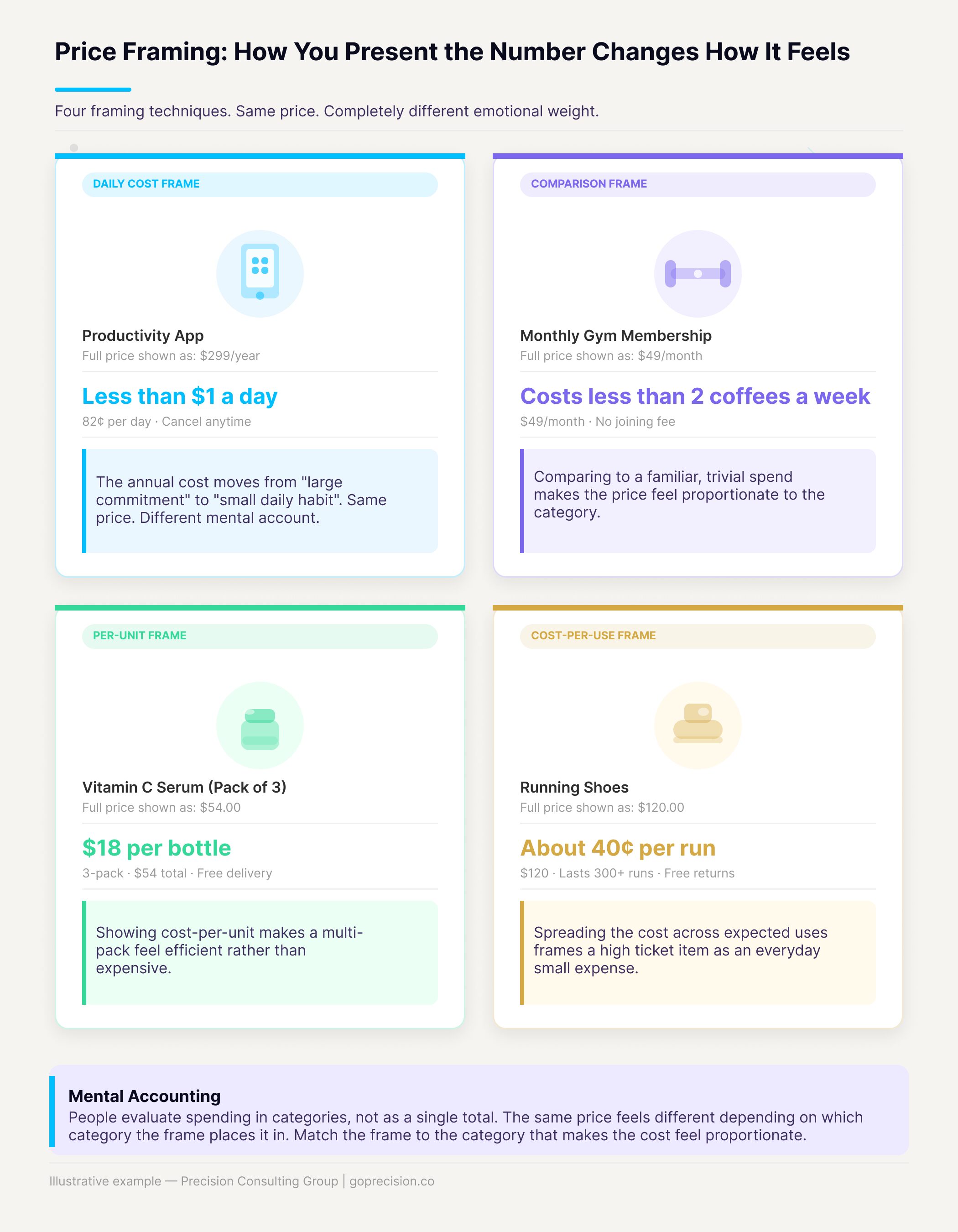
Four examples of the same price presented in different frames: daily cost, comparison frame, per-unit breakdown, and cost per use.
Identify which of your products might have a mental accounting problem. For high-ticket items where the total price feels large, show cost per use or cost per day. Subscriptions: lead with the weekly or daily cost. Multi-packs: always show per-unit cost alongside the total. The frame should make the price feel smaller, not bigger.
Why Does Free Shipping Have Such a Disproportionate Effect on Conversion?
Free is not just a low price. It is a completely different psychological category. Ariely documented this precisely in Predictably Irrational with the Amazon shipping experiment. When Amazon introduced free shipping above a threshold, sales increased across every market except France. The French division had priced shipping at one franc instead of zero. Essentially nothing. But not free.
The difference in customer behaviour between one franc and zero was enormous. The moment it changed to genuinely free, France matched every other market. One franc. That was the gap.
Zero-Price Effect: Free eliminates the mental calculation entirely. At any non-zero price, however small, the brain runs a cost-benefit check: is this worth it? At zero, that check does not happen. Free creates disproportionate demand because it removes the question, not just the cost.
A correctly set free shipping threshold is one of the most reliable conversion and AOV levers available to any e-commerce store. It works best when set 15 to 25% above your current average order value. Close enough that most customers can reach it by adding one item, far enough that they actually need to add something. Show the gap on the cart page as a progress bar with the exact amount remaining. The cart page optimisation article covers the shipping threshold mechanic and the endowed progress effect in detail.
If you charge for shipping below a threshold, make sure that threshold is visible at the product page level and shown as a progress indicator on the cart page. Frame it as "You are £X away from free shipping", not "Standard shipping: £Y". The first tells the customer what they stand to gain. The second just reminds them of a cost.
Why Does Loss Framing Outperform Gain Framing in Promotional Copy?
Kahneman and Tversky's research established that the pain of losing something feels roughly twice as intense as the pleasure of gaining the equivalent thing. Losing £50 hurts about as much as gaining £100 feels good.
Most promotional copy is written as a gain. "Save £20." "Get 20% off." These are fine, but they leave motivation on the table. Reframe the same promotion as something the customer is about to lose, and the response rate changes.
Loss Aversion: The pain of a loss is roughly twice as powerful as the pleasure of an equivalent gain. Framing a promotion in terms of what the customer stands to lose activates this asymmetry. The customer is not thinking "I want to save £20." They are thinking "I do not want to lose the chance to save £20." That is a different emotional driver, and it is stronger.
The word genuine matters here. Countdown timers that reset on refresh, perpetual sales that never actually end, fake low-stock warnings. These do not just fail to work. They actively damage trust. Customers who feel manipulated remember it. Real scarcity and real deadlines work precisely because they are true.
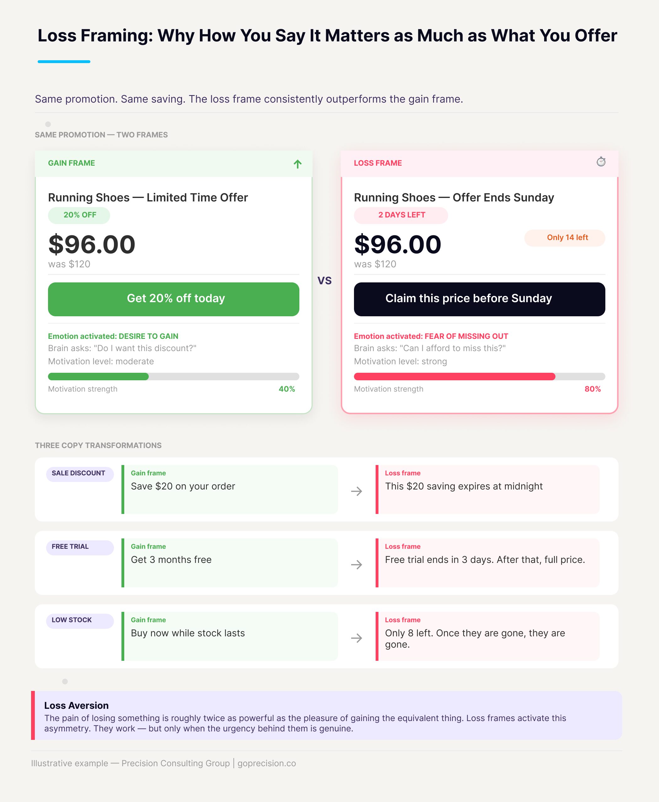
Same promotion written two ways: gain frame versus loss frame. Copy and design differences are shown.
Review your promotional copy with this question: is this framed as a gain or a loss? "Save £20" becomes "This price disappears on Sunday." "Get 20% off" becomes "This offer closes in 3 days." For genuinely limited stock, show the real number. Loss frames consistently outperform gain frames, but only when the urgency behind them is real.
This is the kind of analysis we run in a Precision Deep Dive Audit. If you want to see exactly where your store is leaking revenue, request your free audit and we will walk through it together.
How Do You Audit Your Pricing Presentation Using the Psychology of Pricing?
Open your best-selling product page and work through these six questions.
- If the product is discounted or part of a bundle, is the reference price shown before the actual price?
- Is your discount shown as a percentage or an absolute amount? Is that the right format for your price point?
- Is there a frame around the price that puts it into a familiar, lower-stakes spending category?
- If you charge for shipping, is the free threshold visible before checkout and framed as a gain rather than a cost?
- Do your promotions carry genuine urgency? Is the framing about what the customer stands to lose rather than what they stand to gain?
- If you have product variants or tiers, is the pricing structure designed so that one option naturally looks like the rational choice?
Three or more questions with a no, and your pricing presentation is working against your conversion rate. The product page design article covers how pricing fits within the full set of elements that drive buying decisions. For mobile-specific considerations, where cognitive load is higher and price framing displays differently on smaller screens, the mobile CRO guide covers what to audit and fix.
Key Takeaways
- Price is a frame, not just a number. The context around it determines whether it feels high, low, or like a deal.
- Anchoring: the first number sets the value of every number that follows. For discounted products and bundles, always show a reference price before the actual price.
- The Decoy Effect: a third option positioned near your preferred choice in price but below it in value shifts demand toward the option you want people to pick.
- Charm pricing works for value products. Round numbers work for premium products. Using .99 endings on premium lines undercuts your positioning.
- Rule of 100: under £100, use percentage discounts. For amounts over £100, use absolute amounts.
- Free shipping is not just a perk. The jump from any non-zero cost to zero disproportionately changes customer behaviour.
- Loss frames outperform gain frames for promotions. Only works when the urgency is genuine. Manufactured scarcity breaks trust.
Frequently Asked Questions
Does psychological pricing work for premium products?
Yes, but the mechanics shift. For premium products, the goal is not to make the price feel low. It is to make the value feel justified. Anchoring still works (show the cost of comparable products). Loss aversion still works (genuine limited availability or time-bound offers). What does not work is charm pricing. A .99 ending signals a value positioning that conflicts with a premium brand. Use round numbers and invest in the story around the price.
Is psychological pricing the same as manipulation?
Not when used honestly. Showing a reference price is not manipulation if the reference is real. Using a loss frame for a promotion that genuinely ends is not manipulation. The line gets crossed when reference prices are fabricated, urgency is manufactured, or framing misrepresents what the customer is actually getting. The techniques here work because they align with how people naturally process information. The application is ethical when the underlying offer is genuine.
How important is price presentation versus actual price?
More than most founders assume. Two stores with the same price can convert very differently based solely on how that price is framed and what sits around it. That said, price presentation does not replace product quality or genuine value. It ensures that a good product is not undercut by poor framing. Start with something worth the price, then make sure the price feels that way.
Should I test these changes or just implement them?
It depends on the change. Adding a reference price to a discounted product that currently shows none: implement directly. The evidence is strong, and the downside risk is minimal. Choosing between charm pricing and round numbers for a specific product line: test it, because the right answer depends on your positioning and your customer base. Run the test for at least two full weeks per variant and watch median order value, not just average, so a few outlier purchases do not skew the result.
Predictably Irrational by Dan Ariely is the primary source for anchoring, the Decoy Effect, the Zero-Price Effect, and mental accounting as applied to pricing. Influence by Robert Cialdini covers scarcity and loss aversion in the context of persuasion and buying behaviour.
Want to put these principles to work across your store? See how Precision works with e-commerce brands, or book a strategy session for a personalised review of your pricing presentation and checkout experience.