Last updated:
If you sell products online, do not be mistaken: your product page design is the most important thing on your site.
Not the homepage. Not the category page. Not the brand story. The product page. It is where the buying decision actually happens. Everything before it (your ads, your SEO, your social content, your email sequences) exists to get someone there. Everything after it depends on what happens in that moment.
And yet most e-commerce stores treat the product page like a form to fill in. Product image, title, price, specs, and Add to Cart. Done. Next product. Same template.
Buying decisions are not made by reading spec sheets. They are made by a brain that is running constant background checks: Can I trust this? Is it worth it? What happens if I get it wrong? Every element on your product page either answers those questions or leaves them hanging.
When we at Precision audit e-commerce stores, product pages consistently account for the largest share of fixable lost revenue. At a multinational food delivery platform, when we redesigned the product discovery experience, we delivered +40% conversion from the homepage to the product page. The principles that drove that result apply to any store selling online. Here is the science behind them.
The anatomy of a high-converting product page: 8 elements, each with the psychology principle behind it.
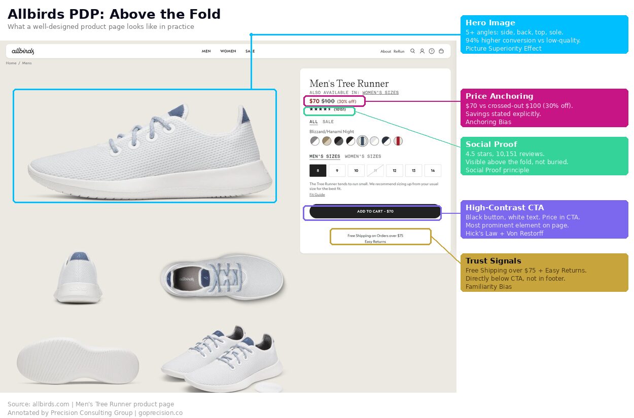
Why does your hero image determine whether customers buy or keep scrolling?
Your hero image determines whether customers buy because it gets processed before a single word does. Visual information moves through the brain far faster than language. Images are encoded more deeply and recalled more reliably than text, because they engage multiple areas of the brain at once.
Mental Simulation: Research compiled in Made to Stick shows that when people can vividly imagine using something, they engage the same parts of the brain as if they were actually doing it. A lifestyle image does not just look better. It triggers the mental experience of ownership.
Most product pages lead with a clean shot on a white background. Professional? Sure. But also emotionally dead. A white-background image answers one question: what does the product look like? It does not answer the question that actually drives purchase: what would owning this feel like?
Lead with a lifestyle image that shows the product in use. Keep the clean product shots as secondary images for customers who want to examine details. A coffee mug on white says "mug." A coffee mug on a desk next to an open laptop says "your productive morning." Minimum five images per product. Multiple angles, a close-up on texture or detail, and ideally a scale reference. High-quality product images increase conversions by up to 94% compared to low-quality images, according to MDG Advertising's research on visual commerce.
Why should your product headline lead with a benefit, not a feature?
The first words a customer reads set the frame for everything that follows. Lead with a benefit, and their brain processes the page through the lens of what the product does for them. Lead with a model number or spec, and they start evaluating the product. Those are two very different mental frames, and the first one converts better.
Progressive Disclosure: Surface the most relevant information first, then layer in detail for the customers who want it. Benefit headline up top. Short explanation of how the product delivers that benefit below it. Full specifications in a collapsible section further down.
Rewrite your top product headlines to lead with the primary benefit. "Track your sleep, wake up refreshed" does more work than "Advanced Sleep Monitoring Device." Save technical specs for a collapsed section below the fold. The customers who need that information will find it. The ones who do not will be distracted by it.
How does price framing change what customers are willing to pay?
A price on its own is just a number. $79.99 means nothing without something to compare it against. The first number a customer sees becomes the reference point against which everything else is judged. Show the original price crossed out before the sale price, and make the sale price look like a gain. Remove that anchor, and the same number just feels like money leaving a wallet.
Anchoring Bias: Dan Ariely demonstrated in Predictably Irrational that participants who wrote down a random two-digit number before bidding on products consistently let that completely irrelevant number influence what they were willing to pay. Initial numbers anchor our perception of value, even when they have nothing to do with what we are buying.
And this is not about fake, inflated prices. Fabricated "was" prices destroy trust the moment a customer looks it up. This is about giving a genuine reference. What the product normally costs, what comparable products cost, or what individual items in a bundle would cost separately.
Always display a reference price. If there is a sale, show the original crossed out and state the savings explicitly ("Save $20"). For bundles, show individual item values alongside the bundle total. For subscriptions, show the per-unit cost against a one-off purchase. Give the customer's brain something to anchor against.
Why is social proof the most influential element on a product page?
Star ratings. Review counts. Customer photos. Bestseller badges. These are not nice-to-haves. For most e-commerce products, they are the single biggest driver of whether a visitor buys or leaves.
Social Proof: When people are not sure, they look at what other people like them have done. Products with 11-30 reviews convert roughly 68% higher than those with zero, according to PowerReviews research.
But the type of review matters just as much as the quantity. Products with customer photo reviews convert at roughly double the rate of text-only reviews, according to Yotpo's e-commerce benchmarks. A typed sentence saying "great quality" is easy to ignore. A photo of the product on someone's kitchen counter, in their living room, on their wrist, is proof you cannot fake.
And placement matters as much as existence. Reviews buried three scrolls down are functionally invisible at the moment of decision. The customer forms their first impression in the opening seconds. If your reviews are not in that window, they are not doing anything.
Place star ratings and the review count directly below the product title, so they are visible without scrolling. If you have customer photo reviews, surface them above the fold, not hidden in a reviews tab. And if a product has fewer than 10 reviews, prioritise getting more reviews before driving more traffic to it. Social proof compounds. Each review makes the next sale easier.
Above-the-fold anatomy: the 6 elements that must be visible without scrolling and the psychology behind each one.
Why does your Add to Cart button need one colour across every product page?
Your Add to Cart button needs one colour across every product page because consistency teaches the customer where the action lives. After three or four pages, the brain stops looking for it and starts reaching for it. Inconsistent colours reset that learning every time.
Hick's Law and the Von Restorff Effect: Every secondary CTA on your product page (Wishlist, Compare, Share, Subscribe) reduces the probability of the one action you actually want. And what stands out is what gets acted on. Your "Add to Cart" button should be the only element on the page in its colour.
When we audited the Rocketbook e-commerce site, a specific problem jumped out: the "Add to Cart" button changed colour depending on which product variant the user selected. Blue product, blue button. Orange product, orange button. The CTA was camouflaging itself on every page. The customer's brain could not build the pattern recognition needed to click without hesitating.
One primary CTA, one high-contrast colour, consistent across every product page sitewide. Reduce secondary actions to subtle icons or plain text links. The button should be the most visually prominent interactive element above the fold, and it should look identical every single time.
Where should you place trust signals on a product page?
Trust signals belong directly next to the Add to Cart button, where the buying decision actually happens. A security badge in the footer or a returns policy on a separate page does nothing for a buyer who is weighing risk in the moment. Buying from a website requires a small act of trust, and the customer's brain handles it by scanning for recognisable patterns at the exact moment of decision.
Most stores have these trust signals somewhere. Footer. FAQ page. Buried in the navigation. That is the wrong place. They need to be next to the CTA, visible at the exact moment the customer is deciding whether to click it.
Place your return policy, security badge, and payment logos in a tight row directly below "Add to Cart." "Free returns within 30 days" should be visible without scrolling on every product page. Trust signals belong at the point of friction, not in the footer.
How does honest urgency increase conversions without damaging trust?
Honest urgency increases conversions because it gives a hesitant buyer a reason to decide now instead of later, and it does not damage trust because it is true. Real low-stock counts, real shipping cut-offs, real time-bound offers. Fake countdown timers and inflated scarcity messages do the opposite of both.
Loss Aversion: People feel the pain of missing out roughly twice as strongly as the pleasure of getting something. When a product is genuinely limited or a sale genuinely time-bound, that constraint makes it feel more valuable.
The keyword is genuinely. Countdown timers that reset on refresh, "Only 2 left!" notices on products with 5,000 units in the warehouse, and manufactured deadlines that extend indefinitely. These are dark patterns. They might produce a short-term spike. They also generate returns, negative reviews, and customers who never come back. Customers who feel manipulated do not become repeat buyers.
Show real inventory levels when stock is actually low. Use genuine sale end dates and communicate them clearly. If there is no real urgency, do not manufacture it. The scarcity principle works because it communicates a fact. The moment that fact is fabricated, it stops working and starts eroding trust.
What should go below the fold on a high-converting product page?
Everything above the fold drives the buying decision. Everything below it serves a different purpose: reducing lingering doubt among customers who are not ready to commit yet.
Do not front-load every specification into the main view. Customers who need that depth will scroll for it. Customers who do not will be overwhelmed by it. Collapsible sections for specs, sizing guides, comparison charts, and FAQ keep the page clean at the top while making the information available to the people who want it.
The Zeigarnik Effect: People remember incomplete tasks better than completed ones. A collapsed "Size Guide" signals that there is useful information waiting. That mild sense of incompleteness often draws the click.
Organise below-the-fold content into collapsible sections: Specifications, Sizing Guide, Shipping and Returns, FAQ. Keep the product page visually clean above the fold and richly detailed below it. Every type of customer gets what they need without the page feeling cluttered.
This is the kind of analysis we run in a Precision Deep Dive Audit. If you want to see exactly where your store is leaking revenue, request your free audit and we will walk through it together.
How do you audit your product page design for conversion issues?
Open your top-selling product page on your phone right now. Eight questions (for a deeper site-wide review, see our CRO audit checklist):
- Does the hero image show the product in use, not just on a white background?
- Does the headline lead with a benefit rather than a model name or spec?
- Is the price anchored against a reference (original, competitor, or bundle)?
- Are star ratings and review count visible without scrolling?
- Is the CTA the most visually prominent element, in a consistent colour?
- Are trust signals (returns, security, payment) next to the CTA?
- Is urgency based on real data (actual stock levels, genuine sale dates)?
- Are specs and details in collapsible sections below the fold?
If you answered no to more than 3 of these, your product page is losing sales that your ads already paid for.
Want a personalised audit of your product pages? See how Precision works with e-commerce brands, or book a free strategy call and we will walk through your top pages together.
Robert Cialdini's Influence covers social proof and scarcity in depth, both of which are directly applicable to product page design. Predictably Irrational by Dan Ariely explains anchoring and arbitrary coherence, essential for anyone pricing products online. Made to Stick by Chip and Dan Heath covers mental simulation and concreteness, which is why lifestyle imagery works the way it does.
Key Takeaways
- The product page is where buying decisions happen. Everything else on your site is traffic acquisition.
- 8 elements, each grounded in behavioural science: hero image, benefit headline, anchored price, social proof, single CTA, trust signals, honest urgency, progressive disclosure.
- Placement matters as much as existence. Social proof and trust signals do nothing if they are not visible at the moment of decision.
- Consistency builds recognition. Same CTA colour, same button text, every page, every time.
- +40% conversion from redesigned product discovery at a leading food delivery platform. The principles apply across any e-commerce store.
Frequently Asked Questions
Which element has the biggest impact?
Social proof placement. Moving star ratings and review counts from below the fold to directly beneath the product title is consistently one of the highest-impact changes we see. It reduces perceived risk at the exact moment the customer is forming their impression, because the brain processes the social-proof signal before it has finished evaluating the product itself.
How many product images should I have?
Minimum 5. Lead with a lifestyle image, then provide clean product shots from multiple angles, a close-up on details or texture, and ideally a scale reference. Customer photos in reviews add further confidence.
Should I use video on product pages?
If you can produce it well, yes. Short video (under 30 seconds, auto-play on mute) showing the product in use outperforms longer demo content. Video increases time on page and answers questions static images cannot, particularly how something moves, sounds, or functions in real life. On mobile, where the majority of e-commerce traffic now comes from, keep videos vertical and ensure they auto-play silently without forcing a tap to start.
How do I get more reviews?
Post-purchase email sequences, timed right. Send a review request 7-10 days after delivery (enough time to use the product, not so long they have forgotten). Offering a small incentive specifically for photo reviews (a discount on the next purchase or loyalty points) increases both submission rate and review quality.
