Last updated:
Your homepage has one job. Not to feature your bestsellers, tell your brand story, run your seasonal sale, and collect email addresses at the same time. One job: convince the visitor they are in the right place and give them a clear path to what they came for. Everything else is a distraction.
When I audit underperforming homepages, the problem is almost never the design. It is the intent. The page is trying to do too many things at once. The visitor arrives, cannot quickly find what they are looking for, and leaves. That bounce is not happening because the page is ugly. It is happening because the page is confused about its own purpose. CXL's benchmarks put the average e-commerce homepage bounce rate at around 45%. Nearly half of all visitors make a decision about your store and leave.
Homepage CRO, in the work we do at Precision, is the discipline of stripping a homepage back to that one job. What follows is what your homepage is actually supposed to do, what it should not, and how to diagnose where yours is going wrong.
Your homepage has one job: convince the visitor they are in the right place and give them a clear path forward. Every element that does not serve that job is working against it.
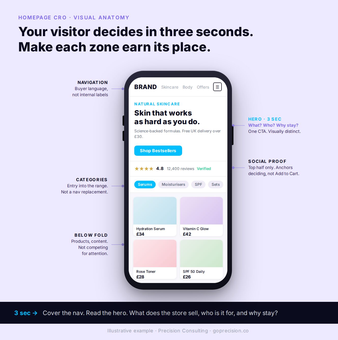
The core elements of a high-converting homepage. One primary message, one primary action, social proof above the fold, navigation in the buyer's language.
What your homepage visitor is actually asking
In 2009, Twitter's homepage was cluttered with dozens of links, text blocks, and competing explanations. New users arrived and left. Three redesigns later, the team landed on the insight Nir Eyal documents in Hooked: they had the motivation sequence wrong. Visitors were being asked to understand the product before they could act on it. They were being asked to think when they wanted to act.
Most e-commerce homepages make the same mistake. They present complexity before clarity. The visitor arrives and is faced with a hero image that communicates aesthetic, a navigation full of internal category names, and three or four competing calls to action. None of it answers the one question the visitor is actually asking: am I in the right place?
You have about three seconds
Steve Krug's foundational argument in Don't Make Me Think is simple: users do not read websites, they scan them. They are looking for signals that confirm or deny whether this page has what they need. If those signals are not immediately visible, they leave. They do not scroll in hope of finding clarity.
Think about how you navigate a supermarket you have never been in before. You look for aisle signs. If the signs are confusing or missing, you either ask someone or you leave. You do not wander every aisle hoping the thing you came for will reveal itself. Your homepage visitor is doing exactly the same thing in the first three seconds.
Open your homepage on your phone right now. Cover the navigation with your thumb. Read only what is visible above the fold. Can you identify what this store sells, who it sells to, and one reason to stay? If that test fails, your homepage is failing before the visitor has done anything at all.
Your headline is describing your brand instead of your offer
The most common homepage headline mistake is stating a brand position rather than an offer. "Redefining wellness for the modern age." "Crafted for those who demand more." These communicate aesthetics. They do not answer the visitor's question.
The format that works consistently is offer plus audience plus one differentiator. "Natural skincare for sensitive skin. Free shipping on orders over $30." Three pieces of information in one sentence: what it is, who it is for, and why it is worth considering. A visitor who can read that and immediately recognise themselves in it will scroll. A visitor who reads a brand position statement first has to do extra work to find out whether this store is relevant to them. Many of them will not bother.
Krug's principle applies here directly: clarity trumps consistency. If a more specific, slightly less polished headline communicates your offer more immediately, use it. The aesthetics can be refined later. Lost visitors cannot be recovered.
The Fogg Behaviour Model says that motivation, ability, and a trigger have to fire together for action to happen. Reducing the effort required to understand your offer is the fastest way to lift conversion, because it directly increases the ability axis. Less thinking, more acting.
Rewrite your hero headline using the format: offer plus audience plus differentiator. Read it aloud. If a friend who has never visited your store cannot tell you what you sell after one read, it is not specific enough. Move every brand position statement below the fold or onto the About page. The hero is for clarity, not for poetry.
What a high-converting homepage actually contains
I have run homepage redesigns across markets in MENA and Southeast Asia. The pattern that comes out of every audit is the same. High-converting homepages have fewer elements, not more. Each element has a clear function. Nothing is on the page without a reason.
Navigation that uses your buyers' language, not yours
Navigation is the first structured signal visitors get about what your store contains. A visitor who looks at your navigation and immediately understands your range knows within seconds whether they are in the right place. A visitor who sees category names that mean something to your team but nothing to them has to translate before they can browse.
The most common navigation failure I see is using internal category names. "Collections," "Solutions," "Range." These are organisational labels, not buying labels. Every label that requires interpretation before action consumes cognitive capacity that the visitor needs for deciding whether to stay. Name categories the way your customers search for them.
Social proof that reaches the visitors who are still deciding
Homepage social proof has a different job from product page social proof. On a product page, a buyer needs detailed reviews about a specific item. On the homepage, they need to know whether people like them have bought from this store and had a good experience.
A review count and average rating, a specific customer quote that reflects the target buyer's situation, and press mentions from recognisable publications. All of these address the same question: can I trust this store enough to keep exploring?
The placement rule is strict: social proof needs to be in the top half of the page. Homepage social proof below the fold is seen only by visitors who are already engaged enough to scroll, which means it is reaching the visitors who least need the reassurance. The visitors who need it most are the ones who have not yet decided to invest any attention.
One primary CTA, not a competition
Count the distinct calls to action visible above the fold on your homepage on a mobile screen. If there are more than two, you have too many. Shop now. Learn more. Explore the range. Sign up for offers. View new arrivals. When everything is asking for a click equally, nothing is clearly the right next step. The visitor is not being directed. They are being presented with a decision.
In one homepage redesign I ran for a major food delivery platform, we moved the category module to the top of the page, reordered categories by basket size and user penetration, and removed competing elements from the hero section. The homepage to product page rate increased by 40%, and the homepage Add to Cart rate increased by 25%. The page did not become more impressive. It became more directed.
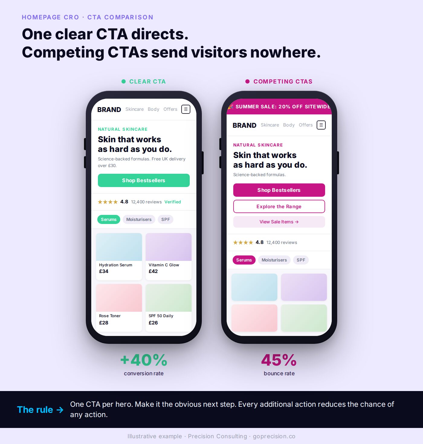
Competing CTAs versus one primary CTA. The version on the right is not more impressive. It is more directed, which is why it converts.
Pick one primary action you want homepage visitors to take. For most e-commerce stores, it is entering the product catalogue. Make that action visually distinct. Place it clearly in the hero section. Move every other action to a secondary position further down the page.
Hick's Law states that decision time grows with the number of options presented. A hero section with five competing CTAs forces a slow comparison the visitor has not signed up for. A hero section with one primary CTA and a clearly subordinate secondary CTA produces faster, more confident clicks because the choice is already made.
Audit your hero section. Count CTAs above the fold on a mobile viewport. Keep one primary action visually distinct. Demote everything else: change colour, reduce weight, move further down the page. Then run the same exercise on each scroll segment. One primary message per segment. No competing buttons.
What your homepage is not supposed to do
The list of what belongs on a homepage is short. So is the list of what does not. Both matter equally.
It should not try to sell specific products
Featured product cards on a homepage almost never convert directly. Not because the products are wrong, but because the visitor's decision-making sequence is not ready for them. They have just arrived. They have not yet established orientation, trust, or intent. Presenting a specific product to someone who has not yet decided whether they want the category is like a shop assistant trying to close a sale before the customer has had a chance to look around.
If you feature products, frame them as category entry points. "Our bestselling moisturiser" linking to the skincare range is a useful navigation. A product card with a price and an Add to Cart button on the homepage is premature. The visitor has not yet had the opportunity to establish that they want this category, let alone this specific product.
It should not pop up before the visitor has seen anything
An email capture pop-up that fires within five seconds of arrival interrupts the exact moment the visitor is deciding whether to stay. It is the equivalent of a shop assistant asking for your email address before you have even walked through the door. You are asking for a commitment before you have given them anything.
The conversion on early-firing pop-ups reflects only visitors who were going to sign up regardless of timing. Exit intent pop-ups and pop-ups triggered after 60 seconds of active engagement convert better because they reach visitors who have already established some interest in what you offer. The landing page optimisation guide covers when and how email capture works across the funnel.
It should not make speed an afterthought
Google's research found that moving from a one-second to a three-second load time increases the probability of a bounce by 32%. At ten seconds, that probability increases by 123%. Your homepage can be perfectly structured and still lose nearly half its visitors before they see a single word if it loads slowly.
Most homepage speed problems on e-commerce sites come from the same sources: large uncompressed images in the hero section, third-party scripts loaded synchronously, and too many apps adding JavaScript to every page. The why your store gets traffic but no sales guide covers the technical friction points that kill conversion before a visitor has a chance to engage.
Reactance theory predicts that interruptions which feel premature trigger a defensive response. The visitor who is asked for an email address before they have evaluated the store does not just dismiss the modal. They form a mild negative impression of the store itself. Timing of the ask is a brand decision, not just a conversion mechanic.
Move every pop-up to either exit intent or a 60-second engagement trigger. Replace product cards with Add to Cart buttons on the homepage with category-entry links. Run a Lighthouse mobile audit on your homepage and fix anything pulling Largest Contentful Paint past three seconds. Speed and timing are not separate from CRO. They are CRO.
How to diagnose what your homepage is getting wrong
Before changing anything, read what the data is already showing you.
Your bounce rate and session duration are telling you different things
High bounce rate combined with short average session duration is a clarity problem above the fold. Visitors are arriving and deciding within seconds that this is not what they were looking for, or that the page is too confusing to navigate. The fix is the headline, the hero, or the navigation.
High bounce rate combined with long average session duration is a different problem. Visitors are engaging but not converting. They are reading, exploring, and then leaving without taking action. That is usually a CTA structure problem or a path to purchase that is unclear.
Same symptom, different cause. Read both numbers together before changing anything, or you risk fixing the wrong thing.
Watch ten homepage recordings before you touch anything
Install Microsoft Clarity if it is not already running. Watch ten recordings of sessions that bounced from the homepage. Two patterns come up in nearly every audit I run. First, visitors scroll to a point and then scroll back up to check the navigation before leaving. They were looking for something specific, could not find it, and went back to the starting point to re-evaluate. Second, visitors click a CTA and immediately hit the back button. The CTA led somewhere that did not match their expectation.
Both are fixable without a redesign. Both are identifiable from recordings in under an hour. The CRO audit checklist includes a structured homepage diagnostic if you want a step-by-step framework for this review.
Recordings reveal intent that analytics dashboards cannot. A visitor scrolling back to the navigation before leaving is not a bounce statistic. They are a customer telling you, silently, that the structure of your page failed them. Watching that pattern ten times in a row is the fastest cure for guessing-based homepage redesigns.
This week: pull bounce rate and average session duration for your homepage from the last 30 days, segmented mobile versus desktop. Open ten Clarity recordings of mobile bouncers. Note the two most common drop-off patterns. Map each pattern to one of: headline clarity, navigation language, social proof placement, CTA hierarchy, or page speed. Fix the most common pattern first.
If you want an outside read on which of these your homepage is getting wrong and which fix would move conversion fastest, the work we do at Precision starts with that diagnosis before any redesign or experiment.
Don't Make Me Think by Steve Krug covers visual hierarchy, scanning behaviour, and why clarity in page structure is the single most important factor in whether visitors engage or leave. The chapters on the three-second rule and the supermarket aisle metaphor are directly applicable to homepage hero sections.
Hooked by Nir Eyal covers the Fogg Behaviour Model and why reducing the effort required to act is more effective than increasing motivation. The Twitter homepage evolution in the book is the clearest real-world illustration of what happens when a homepage tries to explain before it directs.
Influence by Robert Cialdini covers social proof and the other five principles of persuasion that govern why people comply, commit, and convert. The placement-on-the-page argument for social proof comes directly from the recognition-then-trust mechanic Cialdini documents.
- Your homepage has one job: convince the visitor they are in the right place and give them a clear path forward. Every element that does not serve that job is working against it.
- Steve Krug's principle applies directly: clarity trumps consistency. A specific, slightly less polished headline that answers the visitor's question converts better than a brand position statement that looks good.
- Navigation should use the words your buyers type into Google when they search for your products. Internal category names make visitors translate before they can browse.
- Social proof belongs in the top half of the homepage. Below the fold, it is seen only by the visitors who least need the reassurance.
- One primary CTA in the hero section, visually distinct. In a homepage redesign at a major food delivery platform, removing competing elements and restructuring the hero lifted homepage to product page rate by 40%.
- Email pop-ups in the first five seconds interrupt the moment the visitor is deciding whether to stay. Exit intent and time-delayed pop-ups convert better because they reach visitors who have already established some interest.
- According to Google's research, moving from a one-second to a three-second load time increases bounce probability by 32%. Page speed is a conversion variable, not a technical afterthought.
Frequently asked questions
What is homepage CRO?
Homepage CRO is the process of optimising your homepage to convert more visitors into buyers. It focuses on above-the-fold clarity, navigation language, social proof placement, and primary call-to-action hierarchy. The goal is to ensure visitors can quickly establish they are in the right place and find a clear path forward.
What should a high-converting e-commerce homepage include?
A clear headline that states what you sell, who it is for, and one reason to stay. Navigation using the exact language buyers search with. Social proof in the top half of the page. One visually distinct primary call to action. Everything else is secondary and should not compete for attention in the hero section.
What is a good bounce rate for an e-commerce homepage?
CXL's benchmarks put the average e-commerce bounce rate at around 45%. Below 40% is strong. Above 60% almost always indicates a clarity or speed problem with the above-the-fold content. The most useful comparison is your own bounce rate over time paired with average session duration, which together tell you whether visitors are leaving immediately or engaging but not converting.
Why is my e-commerce homepage not converting?
The most common causes are a headline that does not quickly communicate what the store sells, navigation using internal category names rather than buyer language, social proof below the fold, competing calls to action in the hero section, and page speed issues. Start by watching ten session recordings of visitors who bounced to identify where the earliest exit is happening.
How important is page speed for homepage conversion?
Highly important. Google's research found that moving from a one-second to a three-second load time increases the probability of a bounce by 32%. At ten seconds, that probability increases by 123%. Most homepage speed problems on e-commerce sites come from large uncompressed hero images, unused third-party scripts, and too many apps adding JavaScript to every page load.
Should I feature products on my homepage?
Featured products on a homepage rarely convert directly because first-time visitors have not yet established enough context or trust to add a specific product to the cart. Use product features as entry points to categories rather than direct purchase opportunities. A visitor who clicks through to a category is significantly more likely to convert than one presented with a specific product before they have had a chance to orient themselves.