Last updated:
Trust signals in e-commerce are everything on your store that quietly tells a first-time buyer "this business is real and your money is safe here". Reviews, security badges, returns policies, payment logos, guarantees. Their effectiveness does not come from having them. It comes from putting them where the doubt is, at the moment it shows up.
Every first-time visitor to your store is running a silent background check. Can I trust this store? Is this business real? What happens if something goes wrong? Those questions do not disappear when someone lands on your product page. They get louder at the payment screen. Having the right trust signals on the site is not enough. Where and when they appear is the entire problem.
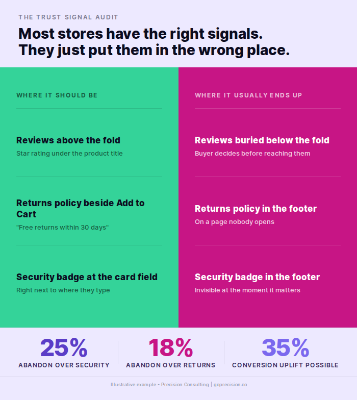
What I see most often, in the work we do at Precision, is stores that have trust signals, just not in the right place. The security badge is in the footer. The returns policy is on a separate page nobody opens. The reviews are below the fold. By the time any of those things would become visible, the buyer has already decided to leave.
Trust signals do not add a positive to a neutral situation. They remove a negative from a sceptical one. Where they appear is the entire problem.
| What the data shows | Stat | Source |
|---|---|---|
| Shoppers who abandon checkout because they do not trust the site with their financial information | 25% | Baymard Institute |
| Shoppers who say authentic customer reviews are the most important factor in their purchase decision | 98% | Spiegel Research Center |
| Conversion lift on products with at least one negative review compared with a perfect 5.0 rating | +67% | Spiegel Research Center |
| Sweet-spot star rating range that converts higher than a perfect score | 4.2 to 4.7 | Spiegel Research Center |
| Checkout abandonments caused by an unsatisfactory returns policy | 18% | Baymard Institute |
| Checkout abandonments caused by insufficient payment options | 13% | Baymard Institute |
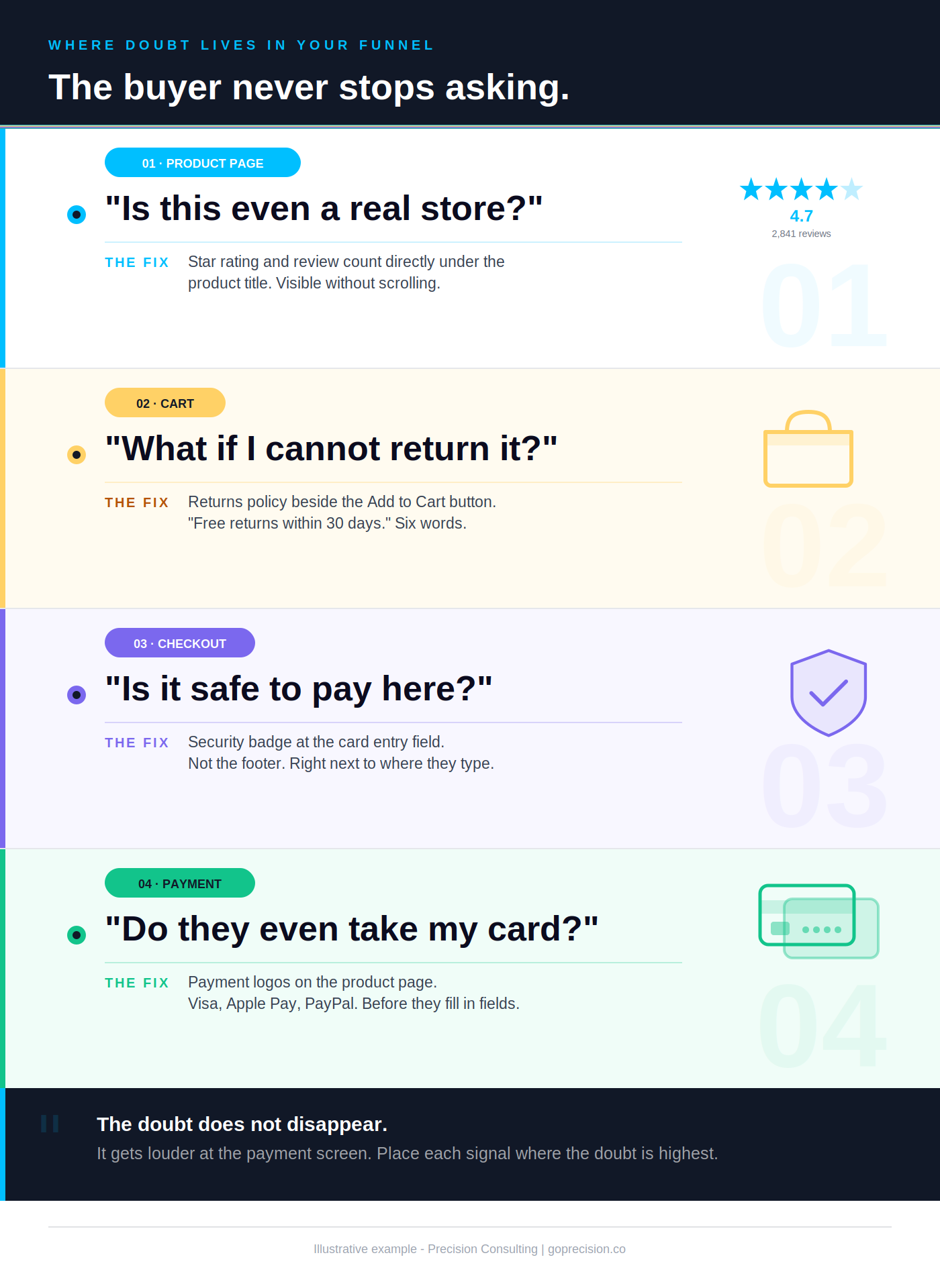
How trust signals work at each stage of the buyer's journey. The doubt changes at each step, so the signal has to change with it.
Why your buyer does not trust you yet
Your buyer does not trust you yet because they have never heard of you. Trust is built through familiarity and signals, not through how good your store looks. A first-time visitor arrives sceptical by default, and nothing about a clean design or competitive price changes that on its own. Here is a pattern that comes up in almost every store audit I run. The founder is surprised by their abandonment rate. The store looks good. The product is solid. The pricing is competitive. What they have not accounted for is that their visitor has never heard of them.
Dan Ariely ran an experiment in Predictably Irrational in which students offered passers-by free money ranging from $1 to $50. Even at fifty dollars, only 19 percent stopped to take it. The majority walked past free cash because they did not trust that it was real. If people distrust a free offer from a stranger on the street, imagine what they do with a request to type their card number into an unfamiliar website.
Your buyer's default position is suspicion, not trust
A first-time visitor has no prior relationship with your store. They cannot examine the product physically. They cannot see your warehouse or verify that you are a real business. All they have is what the page shows them. And the brain, when faced with an unfamiliar commercial transaction, defaults to risk assessment. Not desire. Not excitement. Risk assessment.
Your trust signals do not add a positive to a neutral situation. They remove a negative from a sceptical one. That distinction changes how you think about where they need to go.
The buying decision resets at every stage
Someone adds an item to their cart, having already decided they want it. Then the checkout page asks for card details, and the decision resets. They are no longer evaluating desire. They are evaluating risk. Every piece of information on that page is now being processed against one question: is this safe enough to hand over my card?
This is why trust signals cannot sit in the footer or on a separate page. According to Baymard Institute research, 25% of shoppers abandon checkout specifically because they do not trust the site with their financial information. That is one in four buyers, lost not because of the product or the price, but because a security signal was not visible at the exact moment it was needed.
The brain runs a separate risk-assessment loop the moment a transaction becomes real. That loop fires at checkout, not at landing. A signal placed before the loop activates is invisible. A signal placed inside the loop is the one that converts.
Map every step of your buying journey. At each step, ask: what doubt is highest here? Then make sure the trust signal that addresses that specific doubt is visible without scrolling. Reviews matter on the product page. Security matters at the card field. Returns matter at the Add to Cart decision.
Which trust signals actually move conversion
Not every trust element has the same impact. Some move conversion numbers you can measure. Others are present but functionally invisible. The difference is almost always placement and specificity, not the signal itself.
Your reviews are not working because they are in the wrong place
Reviews are the most powerful trust signal available to most stores. The reason is simple: they come from people who are not you. According to Cialdini's research in Influence, citing survey data from the Spiegel Research Center, 98% of online shoppers say authentic customer reviews are the most important factor in their purchase decision. Not price. Not product imagery. Reviews.
But here is the counterintuitive finding from the same research: a perfect 5.0 rating actually reduces conversion. The Spiegel Research Center found that products rated between 4.2 and 4.7 stars convert better than those with a perfect score, because buyers have learned to distrust perfection. It reads as fabricated. The presence of even one or two negative reviews increases conversion by 67%, because critical feedback signals authenticity.
The placement rule is non-negotiable: star rating and review count must be visible directly under the product title, above the fold on mobile. Reviews buried below the fold have near-zero conversion impact for the majority of buyers who make their decision in the first half of the page. If your reviews are not visible without scrolling, they are not doing the job you installed them to do.
Your returns policy is the most underused conversion tool on your store
Baymard Institute research shows that 18% of checkout abandonments are caused by an unsatisfactory returns policy. That is not a small number. That is nearly one in five buyers walking away, not because they changed their mind about the product, but because they were not confident about what happens if it is wrong.
A visible returns policy reduces the perceived cost of being wrong. When a buyer knows they can return without friction, the stakes of the decision go down. A lower-stakes decision is easier to make. That shift in stakes is what converts hesitant first-time buyers who would otherwise leave.
Most stores have a returns policy. Almost none have it in the right place. It is in the footer, on a dedicated page, or somewhere in the FAQ. None of those positions is where the buyer is when they are deciding whether to click Buy.
In one audit I ran for a fashion e-commerce brand, moving the returns policy from the footer to a single line directly below the Add to Cart button improved product page conversion by over 12%. Nothing else changed. The policy did not change. The product did not change. The placement changed.
Security badges belong in the card field, full stop
Security badges are useful at exactly one moment: when the buyer is about to type their card number into a site they have never used before. That is when "is this safe?" is loudest. A padlock indicator adjacent to the card field, a 256-bit encryption notice, or a recognisable payment security mark reduces the friction of that specific action.
Baymard's research is worth noting here. Their consumer survey found that shoppers trust large consumer-facing brands like Norton and PayPal significantly more than less well-known security providers. The badge only works if the buyer already has a relationship with the brand on it. A custom-designed "Secure Checkout" seal with no external authority behind it raises more doubt than it resolves.
In the footer, that same badge appears after the decision to proceed or leave has already been made. It is too late. The checkout optimisation guide covers where each trust element belongs across the full checkout flow.
Payment logos do two things, most stores only know about one
Displaying Visa, Mastercard, PayPal, Apple Pay, and Google Pay logos on your product and checkout pages signals that others have transacted here safely. That is the trust function. But there is a second function most stores miss: it tells the buyer their preferred payment method is accepted before they start filling in fields.
Baymard's research found that 13% of checkouts are abandoned due to insufficient payment options. Many of those abandonments happen not because the store does not accept the method, but because the buyer assumed it did not and left without checking. Show payment logos on the product page. Not just at checkout. By the time a buyer reaches checkout, having not seen them, the doubt is already there.
Borrowed credibility transfers when the source is recognised. PayPal, Norton, and Trustpilot work because the buyer already trusts them. A custom seal with no external authority has no source to borrow from. The trust value of any badge is exactly equal to the trust the buyer already has in the entity behind it.
Run a placement audit on your top product page. Star rating directly under the title. Returns policy line adjacent to Add to Cart. Payment logos visible above the fold. Then check your checkout: a security indicator in the card-entry field, not in the footer. If any of these are missing or below the fold, you have found a fixable conversion problem.
Which trust signals are making things worse
Some trust elements are so overused that buyers have learned to ignore them. Others actively trigger suspicion. Both are worth identifying and removing, because a trust signal that does not work is not neutral. It adds visual noise and page weight with zero return.
Nobody recognises the badge you just added
Certification badges from services the buyer has never encountered do not build confidence. They create a question the buyer was not asking: what is this, and why does this store need to tell me it is secure? An unrecognised badge signals manufactured credibility. It is the visual equivalent of a stranger telling you to trust them.
Use badges with genuine brand recognition: SSL padlock indicators, PayPal Buyer Protection, Trustpilot, and Google Customer Reviews. These carry weight because the buyer already has a relationship with those brands. The trust is borrowed from an entity the buyer already trusts. A custom seal from an unknown certifier borrows trust from nobody.
Fake urgency is destroying the trust you spent months building
Countdown timers that reset when you reload the page. Stock counts that never change. "Only 2 left" appearing on every single product. Buyers notice these more than most stores assume. And when someone catches one, the credibility cascade is severe. The security badge becomes less convincing. The reviews look more suspicious. The returns policy feels like it probably has a catch. One fake signal contaminates everything else on the page.
Cialdini documents this exact dynamic in Influence. When people detect that someone is trying to manufacture pressure, they withdraw trust not just from that tactic but from the broader interaction. The scarcity principle works powerfully when it is real. When it is fabricated, it works once on buyers who do not notice, and never on buyers who do.
Use urgency only when it is true. "Back in stock after selling out last month" is both credible and motivating because it is verifiable. "Ordered 47 times this week" costs nothing to implement and is actually persuasive if accurate.
Detected deception generalises. The buyer does not stop at "this timer is fake". They extend the inference to the rest of the page: if this signal is fabricated, the others probably are too. One contaminated element discredits the entire trust stack on the page.
Walk your site as a sceptical buyer. Reload product pages and watch what changes. If a stock counter or timer behaves the same on every visit, remove it. If you cannot prove a scarcity claim with order data, do not display it. Replace fabricated urgency with verifiable urgency: real recent sales counts, real restocks, real time-limited launches.
This is the kind of analysis we run in a Precision Deep Dive Audit. If you want to see exactly where your store is leaking revenue, request your free audit and we will walk through it together.
How to audit your trust signals right now
Audit your trust signals by walking through your store as a first-time visitor and asking three questions at each stage of the journey: what doubt does a first-time buyer have here, is anything on this page addressing it, and is that thing visible without scrolling. Open your store as if you have never seen it before.
Where each trust signal belongs across the product page and checkout. Placement is the difference between a signal that converts and a signal that takes up space.
Start with your best-selling product on an actual phone
Not a desktop preview. Your phone. Check whether a star rating and review count are visible above the fold without touching the screen. Check whether a returns policy line is adjacent to the Add to Cart button. Check whether payment logos are visible without scrolling.
If any of these fail, you have found a conversion problem. Fix them before looking at anything else. These are not nice-to-haves. According to Baymard, a checkout optimisation focused purely on removing trust friction can deliver a 35% uplift in conversion rate. The low-effort, high-impact fixes are almost always placement, not creation. The product page design guide walks through trust signal placement on the PDP in more detail.
Then open ten Microsoft Clarity recordings of sessions that viewed this product page but did not add to cart. Watch how far down the page users actually scrolled before leaving. In most cases, they will not have reached your reviews section. The data makes the placement problem visible in a way no analytics dashboard can.
Then check your checkout
Check whether a security indicator is adjacent to the card entry field. Check whether your returns policy is visible before the Pay button. Check whether payment method logos appear before the buyer starts entering details.
The buyer abandoning checkout is almost never changing their mind about the product. Baymard's research shows the average large e-commerce site has 39 documented areas for checkout improvement, even among Fortune 500 companies that have already run optimisation projects. Most of those improvements are trust and friction-related.
The psychology of e-commerce conversions guide covers the broader behavioural science behind why each of these signals works at the mechanism level.
Loss aversion makes the cost of being wrong feel roughly twice as heavy as the gain of being right. Visible trust signals lower the perceived cost of being wrong. Lower perceived cost translates directly into higher conversion, even when nothing else about the offer has changed.
Run the audit this week. Phone first, checkout second. For every failed check, make the fix in the next sprint, not the next quarter. Trust signal placement fixes are typically half a day of theme work and produce a measurable conversion lift within two weeks. There is no faster CRO win available to most stores.
If you want an outside read on which trust signals your store is missing and where each one belongs, the work we do at Precision starts with that audit before any redesign or experiment.
Influence by Robert Cialdini covers social proof, authority, and the Spiegel Research Center findings on how review ratings and negative feedback affect buyer trust. The research on why perfect ratings underperform and why verified reviews outperform generic ones is directly applicable to product page optimisation.
Predictably Irrational by Dan Ariely covers the mechanics of distrust in commercial transactions and the pain of paying. That underpins why visible returns policies change the risk calculation at the moment of decision and why trust signals work as a negative-removal rather than a positive-addition mechanism.
- Your buyer's default starting position is suspicion, not trust. Trust signals remove a negative from a sceptical situation. They do not add a positive to a neutral one.
- According to Baymard Institute, 25% of checkout abandonments are caused by security concerns and 18% by an unsatisfactory returns policy. Both are fixable with placement, not product changes.
- Star rating and review count must be above the fold on mobile, under the product title. Below the fold, they are not seen by the majority of buyers who make their decision before scrolling.
- Reviews rated 4.2 to 4.7 outperform perfect 5-star ratings. A single negative review increases conversion by 67% because it signals authenticity.
- A one-line returns policy adjacent to the Add to Cart button outperforms a full returns page that nobody opens. Six words at the decision point do more than six paragraphs somewhere else.
- Security badges belong in the card entry field at checkout. In the footer, they appear after the decision to stay or leave has already been made.
- Fake urgency contaminates all other trust signals on the page when buyers catch it. Use urgency only when it is real, recent, and specific.
Frequently asked questions
What are trust signals in e-commerce?
Trust signals in e-commerce are elements that reduce perceived risk at the moment of purchase. They include customer reviews, security badges, returns policies, payment method logos, and social proof indicators. They reduce the specific doubt a buyer has at the specific moment they have it. Placement is as important as presence.
Where should trust signals be placed on a product page?
Star rating and review count should be directly under the product title, above the fold on mobile. A returns policy line should sit adjacent to the Add to Cart button. Payment method logos should be visible without scrolling. Security elements belong at checkout, adjacent to the card entry field. Each trust signal belongs at the moment where the doubt it addresses is highest.
Do trust badges actually increase conversions?
Badges with genuine brand recognition placed at the right moment increase conversion. According to Baymard Institute research, shoppers trust consumer-facing brands like PayPal and Norton significantly more than unrecognised providers, even when the unknown badge provides the same technical security. An unrecognised badge can raise doubt rather than resolve it.
What is the most effective trust signal for a new store with no reviews?
A clear, unconditional returns policy adjacent to the Add to Cart button is the highest-impact starting point for a new store. It requires no reviews or reputation. It directly reduces the cost of being wrong, which is the primary barrier for first-time buyers. A security indicator at the card field and payment logos on the product page complete the baseline trust infrastructure.
Why do perfect 5-star reviews sometimes hurt conversion?
Research by the Spiegel Research Center, cited in Cialdini's Influence, found that products rated between 4.2 and 4.7 stars convert better than those rated 5.0. Buyers have learned to associate perfect scores with fabricated reviews. The presence of at least one or two critical reviews actually increases conversion by 67% because it signals authenticity.
How do I get better reviews for my store?
Send a post-purchase email within 48 hours of confirmed delivery. Ask buyers specifically to describe what hesitation they had before purchasing and whether the product resolved it. Reviews that address specific concerns convert better than generic positive feedback. Most stores that ask directly generate their first detailed reviews within two to four weeks.