Last updated:
Checkout optimisation is fixing what makes ready buyers walk away at the payment screen. Not running better ads, not getting more traffic. Stopping the people who already decided to buy from abandoning right before they hand over their card. It is the last place most stores look and the first place they should. In the work we do at Precision, the checkout is consistently where the most recoverable revenue is sitting.
A checkout that converts at 65% instead of 55% on the same traffic is an 18% revenue increase from a single page. No new ads. No new products. Just a checkout that stops losing buyers who have already decided to spend.
The eight changes below are grounded in how people actually behave at the moment of payment. What makes them hesitate? What makes them trust? What makes them follow through? None requires a full rebuild. Most can be done in a week.
Your checkout is not plumbing. It is a conversion surface. Treat it like one.
How to reduce checkout abandonment: remove every distraction
Reduce checkout abandonment by removing every element that is not directly involved in completing the purchase. Navigation links, promotional banners, social icons, related-product carousels. They all create exit points that pull buyers away from the payment step. Open your checkout page right now. Count the things on it that have nothing to do with completing the order.
Each of those is an exit. Each one adds a decision point between where your buyer is and where you need them to go. The checkout page has one job. It should look like it.
Hick's Law: Decision time increases with the number of options available. A checkout cluttered with navigation and distractions is not just visually noisy. It is actively slowing down the decision to buy and increasing the chance the customer makes a different decision entirely: to leave.
Strip the header and footer navigation from your checkout if your platform allows it. Promotional banners and product carousels go too. Any element that offers an exit or a distraction belongs off the page. A stripped checkout with only the elements required to complete the transaction will outperform a full-site-layout checkout on the same traffic every time.
Why a progress indicator reduces checkout drop-off
A progress indicator reduces checkout drop-off because it tells the buyer the finish line exists. Without it, a checkout feels like an open-ended commitment. With it, each step shrinks the perceived effort to complete. Walk through your own checkout on your phone right now. At each step, do you know how many steps are left?
If you are on a multi-step checkout with no progress indicator, your buyers are making a calculation every time a new screen loads: is this worth continuing? Without knowing how close the end is, some of them decide it is not. A progress bar showing cart, delivery, payment, and confirmation costs almost nothing to add and eliminates that question before it becomes a reason for abandonment.
Goal Gradient Effect: Motivation to complete a task increases as the visible finish line gets closer. A progress indicator makes completion tangible. It also reinforces the buyer's commitment: they have started, they are close, and the drive to finish something already invested in is strong.
Add a progress indicator to every step of your checkout flow. Label the stages clearly: Cart, Delivery, Payment, Confirmation. Even on a one-page checkout, a visual completion indicator reduces anxiety. The goal is to make the buyer feel they are progressing, not waiting.
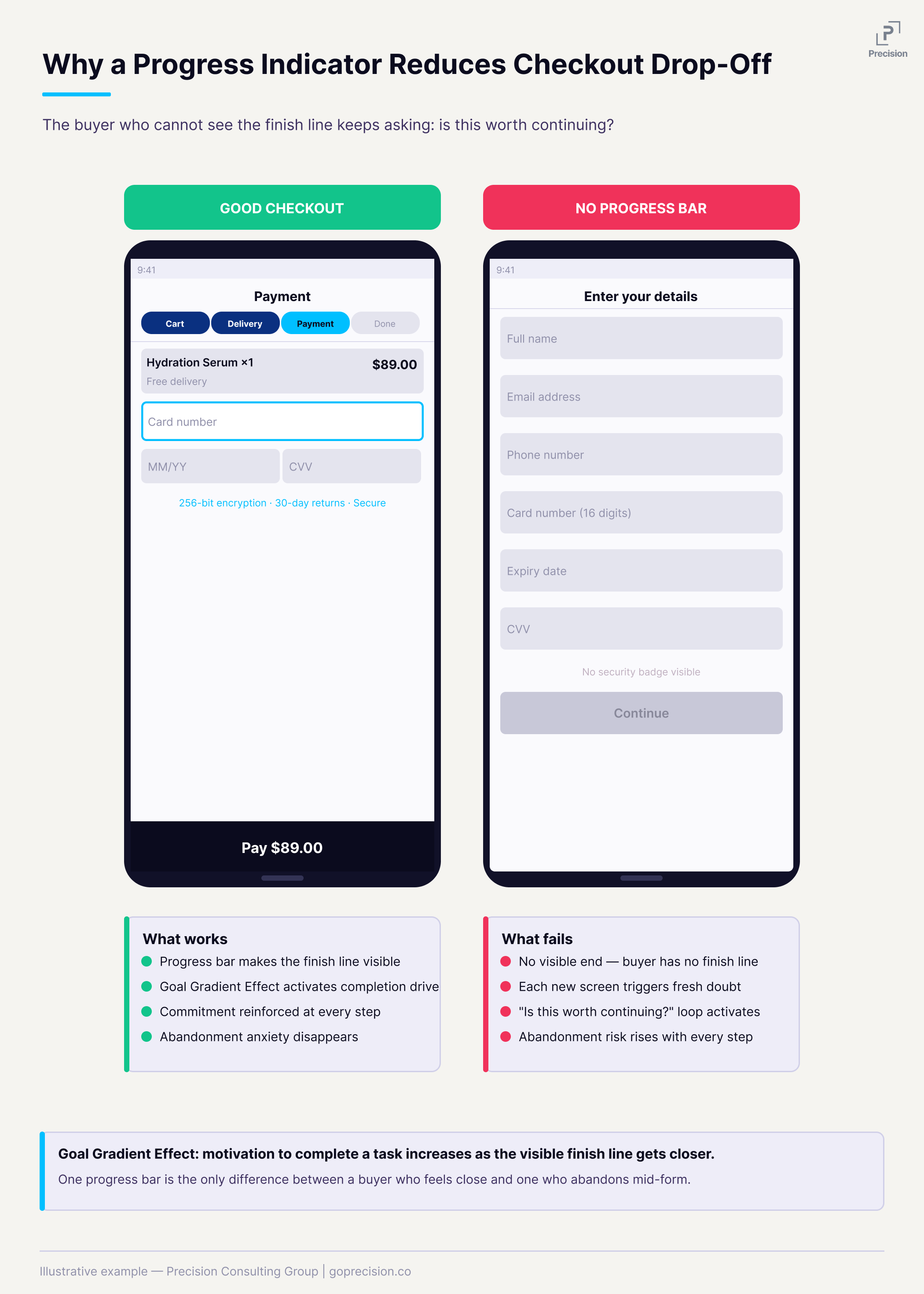
Checkout flow with and without a visible progress indicator, showing why the finish line matters at every step.
The biggest reason buyers leave at checkout: unexpected costs
Shipping fees and taxes that appear for the first time at the payment step are the single most common reason customers abandon at checkout, accounting for 48% of all abandonment according to the Baymard Institute. Not because the amounts are always unreasonable. Because the number changed.
The buyer built a mental expectation during browsing. They thought they were paying $39. The checkout says $54. That gap feels like a breach of trust, even when it is technically just standard shipping. The trust drops, and they leave.
Expectation Violation: The brain does not register an unexpected cost as a minor inconvenience. It registers it as a broken promise made earlier in the session. That response is closer to a threat than a rational re-evaluation, and the reaction is often far larger than the actual cost warrants.
Show shipping costs on the product page and cart page before checkout. If you cannot calculate the exact shipping without a delivery address, show a clear range or your most common rate. The goal is simple: nothing on the payment screen should be new information. Everything there should confirm what the buyer already expected.
Why forcing account creation kills first-time purchases
Requiring account creation before a first-time buyer can complete a purchase will lose you buyers. They came to buy a product. You are asking them to start a membership first. Many will not.
Guest checkout should be the default path, not a secondary option buried under the sign-in button. After the order is confirmed, invite them to save their details. At that point, it is a convenience, not a requirement. Their name, address, and email are already in the system from the purchase they just completed. It takes seconds and feels like a service, not a gate.
Psychological Reactance: When people feel their freedom is being restricted, they often respond by resisting entirely rather than complying. A mandatory account requirement does not just create friction. It can trigger active resistance, even when the effort required is low. You are introducing a requirement they did not agree to at the worst possible moment.
Make guest checkout the primary, most visible path. Move account creation to the post-purchase confirmation page as an optional invitation. Frame it around the benefit to them: "Save your details for faster checkout next time." The conversion from guest to account holder is far higher after a successful purchase than before one.
What trust signals to add to your checkout and where
Security badges, recognisable payment logos, and a clear returns policy. These belong at checkout, right next to the payment fields and CTA. Not in the footer. Not only on the product page.
For a first-time customer, the payment step is genuinely uncertain. They do not know you. Familiar signals reduce that uncertainty by association. A padlock icon, the Visa logo, and a "30-day returns" line. None of these needs to be large. They just need to be visible at the exact moment the risk question is being evaluated.
Risk Perception: Unfamiliar environments raise perceived risk. Recognised signals lower it. Familiar payment logos also carry an implicit social proof signal: they communicate that others have transacted here safely. That matters most when someone is deciding whether to hand over their card details for the first time.
Place trust signals directly adjacent to your payment fields and confirm button: a security padlock, recognisable card logos (Visa, Mastercard, PayPal), and a one-line returns assurance. For more on how trust signals work across the full page, the cart page optimisation guide covers trust placement earlier in the funnel.
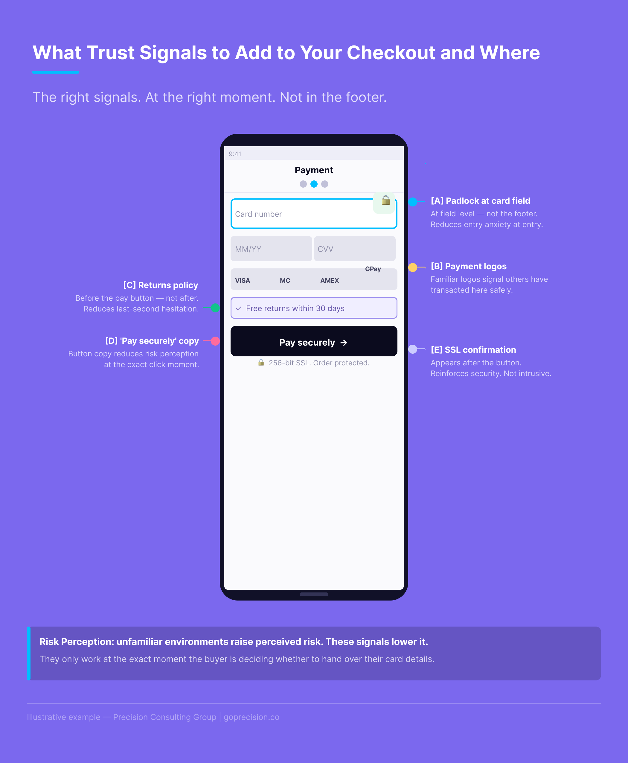
Trust signal placement at the payment step: where each element should sit relative to the fields and confirm button.
Mobile checkout optimisation: build the form around the device
Mobile checkout optimisation means building the form around how a phone actually gets used. Numeric keyboards for card numbers. Email keyboards for email fields. One-handed thumb reach for buttons. Autofill that works. Mid-range Android performance, not just iPhone flagship. Do this now: go through your own checkout on a real phone, not a browser preview. Time it from the product page to order confirmation.
What you find is almost always worse than expected. Wrong keyboard types. Address fields fighting autocorrect. A confirm button that requires scrolling to reach. Each of those loses buyers. For a broader look at where mobile loses revenue across the full funnel, the mobile CRO guide covers the patterns we see most often.
Fogg's Behavior Model: Behavior happens when motivation, ability, and a trigger align at the same moment. Checkout friction attacks the ability directly. Your buyer's motivation can be intact, but if the path to completing the purchase is too difficult, they will not follow through. Wanting to buy and being able to buy are not the same thing.
Set the correct input type for every form field: type="tel" for phone and card numbers, type="email" for email addresses. Use standard HTML autocomplete attribute names so browser autofill works. Enable Apple Pay and Google Pay. According to Shopify, Shop Pay achieves checkout completion rates up to 50% higher than regular checkouts. On mobile, every field you remove or auto-populate directly reduces abandonment.
The hidden cost of a prominent promo code field
A prominent promo code field does two things to customers who do not have a code. First, it makes them wonder whether they are paying too much. There is a code out there, they just do not have it. Second, it sends some of them off to find one. Most of those people do not come back.
The customers who leave to search for a discount and return are a fraction of those who leave and do not. A field meant to help conversions is actively driving abandonment among your non-coupon customers.
Loss Aversion: A visible promo code field implies there is a saving available that the customer is not getting. That perception of missing out on a discount is often enough to break the purchase decision. The customer does not leave because they are dissatisfied. They leave because they feel they might be overpaying.
Make the promo code field collapsible. Label it "Have a promo code?" so it only draws attention from people who actually have one. If most of your transactions do not involve a code, a prominent code field is one of the easiest checkout changes you can make. Hide it. Measure the difference.
How to use the order summary page to prevent last-moment abandonment
Use the order summary page to prevent last-moment abandonment by reaffirming the buyer's commitment, not just listing the items. Show what they bought and why it was the right choice. Repeat the trust signals that closed the decision. Make the CTA say "Place order", not "Confirm". The order summary screen, the final review before payment is confirmed, is the most underused page in most checkouts. The standard version shows a list, a total, and a confirm button. That is fine as information. But the buyer at this stage is at peak commitment anxiety. They have done everything. They just need to click.
This is not the moment for a cold transactional screen. It is the moment to remind them why this was a good decision. Show the product benefit alongside the name. Put the returns policy front and centre. Confirm the delivery date. Remind them that the order is secure. They have already committed. Make completing that commitment feel like the obvious next step.
Commitment and Consistency: By the order summary stage, the buyer has chosen a product, entered their details, and reviewed their cart. They have made multiple small commitments in sequence. The psychological drive to act consistently with those prior commitments is strong. The summary page should make finishing feel natural, not introduce new uncertainty.
Rewrite your order summary page to do three things: confirm the value of what they are buying (benefit, not just product name), reassure them on risk (returns policy, security), and make the CTA unmissable. The goal is to reduce the gap between "I have entered my details" and "I have placed my order" to as close to zero as possible.
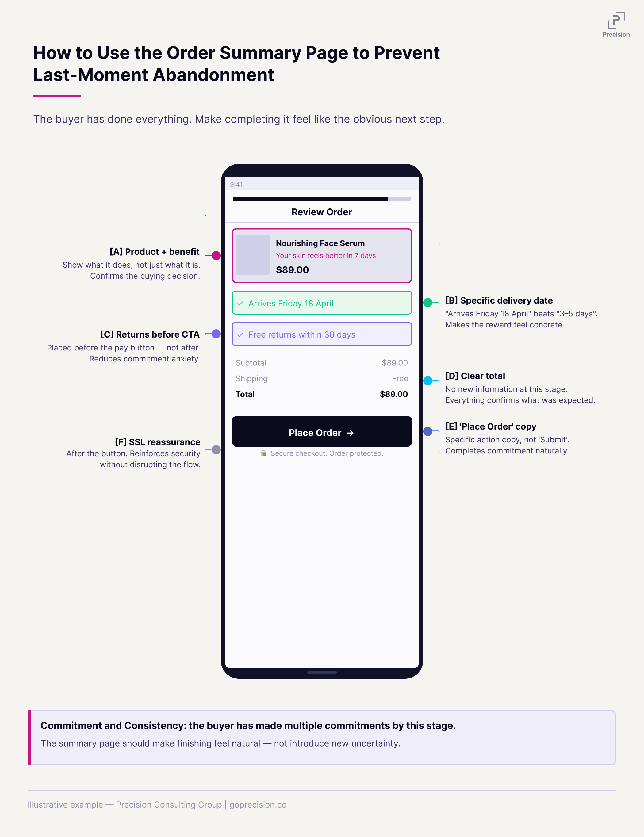
The order summary page reframed: what to include to reduce commitment anxiety and carry the buyer through the final click.
This is the kind of analysis we run in a Precision Deep Dive Audit. If you want to see exactly where your store is leaking revenue, request your free audit and we will walk through it together.
Where to start with checkout optimisation
Do not implement all eight changes at once. You will not know which one moved the needle. Start here:
Today: Remove the navigation from your checkout page, make the promo code field collapsible, and confirm that trust signals are visible at the payment step. These are often one-day changes that address three of the most common abandonment triggers.
This week: Add a progress indicator, ensure shipping costs are visible before the payment screen, set guest checkout as the default if it is not already, and rewrite your order summary page.
Then: Enable Apple Pay and Google Pay. It is the single highest-impact change for mobile checkout. Stripe, Shopify Payments, and Braintree all support it.
After each change, watch ten session recordings of people going through checkout. The data tells you where people are leaving. The recordings tell you why. That combination is more useful than any prioritisation framework.
A 10-percentage-point improvement in checkout conversion is a meaningful revenue increase from a single page, on traffic you are already paying for.
Want to know where your checkout is losing the most revenue right now? See how Precision works with e-commerce brands, or book a free strategy call and we will walk through your checkout funnel together.
Robert Cialdini's Influence covers commitment, consistency, social proof, and authority, all directly relevant to what makes a checkout feel safe and what makes buyers follow through. Hooked by Nir Eyal covers the Fogg Behaviour Model and how ability constraints determine whether motivated people complete an action. The Baymard Institute publishes the most comprehensive ongoing research on checkout abandonment and e-commerce UX patterns.
Key Takeaways
- Checkout is where most e-commerce revenue gets lost. A 10-percentage-point improvement in checkout conversion is a significant revenue increase from a single page on traffic you already have.
- Strip everything from the checkout that is not required to complete the transaction. Every extra element is a potential exit.
- A progress indicator reduces abandonment by making the finish line visible and activating the drive to complete what someone has already started.
- Unexpected costs at the payment step account for 48% of checkout abandonment. Show all costs before the payment screen. A cost that appears for the first time there does not feel like information; it feels like a broken promise.
- Guest checkout is the right default for first-time buyers. Account creation belongs after the purchase, as an invitation not a requirement.
- Trust signals belong at the payment step, not the footer. A padlock, recognisable payment logos, and a clear returns policy reduce commitment anxiety exactly where it peaks.
- A prominent promo code field sends customers without codes off to find discounts they will not find. Make it collapsible.
- The order summary page is where the buyer is most anxious. Use it to reinforce the decision, not just confirm the transaction.
Frequently Asked Questions
How many fields should a checkout form have?
As few as possible, while collecting only what you need to fulfil the order. For most stores that is name, email, delivery address, and payment. Phone number should be optional unless delivery genuinely requires it. The billing address should default to the delivery address, with an option to change it. Every required field that is not necessary for fulfilment is a point at which someone might decide not to continue.
One-page or multi-step checkout: which converts better?
Both work, and the research is genuinely mixed. A one-page checkout showing every field at once can feel overwhelming. A multi-step checkout with no visible progress can feel endless. The progress indicator matters more than the format. A well-executed multi-step checkout with a clear progress bar will outperform a poorly designed one-page checkout. Focus on the execution, not the format.
Does checkout design affect SEO?
Not directly. But checkout page speed affects Core Web Vitals and mobile usability scores, which feed into Google's mobile-first indexing. Slow mobile checkout increases bounce rates over time. And a checkout that converts well means more revenue from the organic traffic you already have. The SEO work gets people there. The checkout keeps them.
How do I know which checkout change to prioritise?
Run your checkout funnel in Google Analytics 4 and find the step with the biggest drop-off, which is the problem to solve first. Then watch ten to twenty session recordings of people who dropped off at that specific step. The funnel data shows where people leave. The recordings show what they were doing when they left. Together they will point you to the right fix faster than any generic prioritisation list, because the answer is specific to your funnel rather than a generalised best practice.
