Last updated:
Cart abandonment happens when a shopper adds products to an online cart but leaves without completing the purchase. Around 70% of shoppers do exactly that, according to the Baymard Institute's research on cart abandonment rates, a figure that has held steady for years across the major studies on the subject. It does not matter the category, the price point, or the audience.
When I show founders this number in my work at Precision, the instinct is almost always the same: set up an abandoned-cart email, add a discount pop-up, done. Those things help. But they are recovery tactics, not solutions. And recovery will only ever get you so far if you have not fixed the thing that caused the abandonment in the first place.
The more important question is: why did they leave? Because the answer changes everything about how you respond. Someone who left because your checkout surprised them with a $15 shipping fee needs a completely different intervention than someone who left because they were not yet ready to commit. Treating all abandonment the same way is like giving everyone the same prescription without running any diagnostics.
Here is what is actually happening, why it happens, and what to do about it.
Why people actually leave: the real reasons behind cart abandonment
People leave cart pages for predictable reasons: unexpected costs at checkout, forced account creation, slow loading, weak trust signals, and a clunky mobile flow. The same causes show up every time. Across stores, categories, and price points. Here are the ones responsible for the majority of it.
You surprised them with costs at checkout.
This is the biggest one. Shipping fees, taxes, and handling charges that first appear on the payment screen are the most frequently cited cause of cart abandonment in every study that has examined this. And the frustrating part is that it is entirely preventable.
The buyer made a mental commitment when they added the item. In their head, they were paying $39. Then the checkout tells them they are paying $39 plus $12 in shipping and tax. The number changed. That feels like being misled, even if it technically was not. The trust drops, and many of them leave.
Expectation Violation: The brain treats a violated expectation as a mild threat response. It is not just disappointment. It registers as a breach of the implicit agreement the buyer thought they had made. That emotional reaction is often enough to kill the session, even when the total is still objectively reasonable.
Show the full landed cost before checkout. If you have a free shipping threshold, display it on the product and cart pages with the exact gap amount visible. If you charge for shipping, show the rate before the payment screen. The goal is that nothing on the checkout page should be new information.
You made them create an account before buying.
If your checkout requires account creation before a purchase can be completed, you are losing a significant share of first-time buyers. They came to buy a product. You are asking them to start a relationship first. Many of them will not.
Guest checkout is not a nice-to-have. For first-time customers especially, it is the difference between buying and leaving. You can always invite them to save their details after the order is confirmed. At that point, the purchase is done, and the offer feels like a convenience, not a toll.
Make guest checkout the default path, not buried under the account option. After the order confirmation, invite them to create an account. At that point, the incentive is clear and tangible: they can track the order they just placed, get faster checkout next time, and access their order history. Their name, address, and email are already in the system from the purchase they just completed. Account creation at post-purchase takes seconds and feels like a convenience, not a requirement.
The checkout form is too much of a hassle.
On a desktop with autofill running, most checkout forms feel fine. Put that same form in front of someone on a mid-range Android phone with a slow connection, typing out a 16-digit card number by hand, and it becomes a different experience entirely. Every field is a small decision point: is this worth continuing? For enough people, the answer becomes no.
Mobile wallet options change this entirely. Apple Pay, Google Pay, and Shop Pay replace the entire card entry flow with a single biometric confirmation. Shopify's data shows that Shop Pay achieves checkout completion rates up to 50% higher than regular checkouts. One tap instead of fifteen fields. For stores that have not yet enabled wallet payments, it is the highest-ROI checkout change available. The mobile CRO guide covers the full picture of how form friction affects mobile conversion rates.
Friction and Motivation: The Fogg Behavior Model says behavior happens when motivation, ability, and a trigger align. Checkout friction attacks the ability directly. Your buyer's motivation might be perfectly intact. But if the path to completing the purchase is hard enough, they will not follow through. Wanting to buy and being able to buy are not the same thing.
Enable Apple Pay, Google Pay, and Shop Pay as the primary checkout path on mobile. Reduce form fields to the minimum required. On mobile specifically, test your checkout on a real mid-range Android device over a real mobile connection, not on office broadband in a browser. The experience you see in that test is the one your customers are actually having.
Your checkout does not feel safe.
For someone buying from you for the first time, handing over card details requires a real act of trust. If the checkout page looks dated, the URL is unfamiliar, there are no recognisable payment logos, and your returns policy is nowhere in sight, the risk alarm goes off. Even if your store is completely legitimate, a checkout that looks uncertain will lose sales to a store that feels safe.
Risk Perception: People are wired to weigh potential losses more heavily than equivalent gains. A checkout that activates any sense of risk, however minor, will lose customers that a trust-signaling checkout would have kept. The perception of risk matters more than the actual risk.
Put security badges, recognisable payment logos (Visa, Mastercard, PayPal, Apple Pay), and a clear returns or guarantee statement near your checkout CTA. These signals do not just answer objections. They shift the emotional tone of the page from uncertain to safe, which is what you need when someone is deciding whether to hand over their card details.
The discount code did not work the way they expected.
This one is underreported and causes a specific type of abandonment that stings more than others because the buyer was genuinely motivated. They saw a promo code in an email, an Instagram post, or a banner on your site. They added it to the cart. They got to checkout. They entered the code. And then they found a condition they were not told about: a minimum spend requirement, excluded categories, new customers only, first-app order only.
The gap between what the marketing communicated and what the checkout enforces breaks trust at exactly the wrong moment. The buyer does not just leave. They leave feeling misled, and that impression tends to stick. Dark-patterned discount conditions, where the fine print contradicts the headline offer, drive abandonment that is nearly impossible to recover with email sequences.
Trust Violation: The buyer formed a clear expectation when they saw the promotional message. When the checkout enforces different conditions, the brain treats it as a broken promise. At the moment of payment, that response does not feel like a minor inconvenience. It activates the same withdrawal response as any other form of being misled, and it is felt most acutely because the buyer was already committed.
Every discount communication needs to state exactly what the code applies to and what it excludes, before the customer ever reaches the cart. The fix is upstream: align the marketing message with the actual checkout conditions. Fine print that contradicts the headline offer does not just lose the sale. It leaves a negative impression that recovery emails cannot fix.
They were not ready to buy yet.
Some abandonment is not a problem you can fix. People use carts as wishlists. They are comparison shopping, waiting for payday, or want to talk it over with a partner. They left with real intent, and some of them will come back. The job here is not to prevent the abandonment but to make the return path as easy as possible. If a large share of your traffic is browsing without buying at all, the guide to traffic without sales covers the pre-cart conversion problem separately.
Something broke or loaded too slowly.
A checkout page that crawls, a discount code that errors, a payment that fails without explanation. Technical friction at the highest-intent moment of the session is particularly damaging because it casts doubt on whether the store is reliable at all. Test your checkout end-to-end on a real mobile device, over a real mobile connection, not on office broadband in a browser.
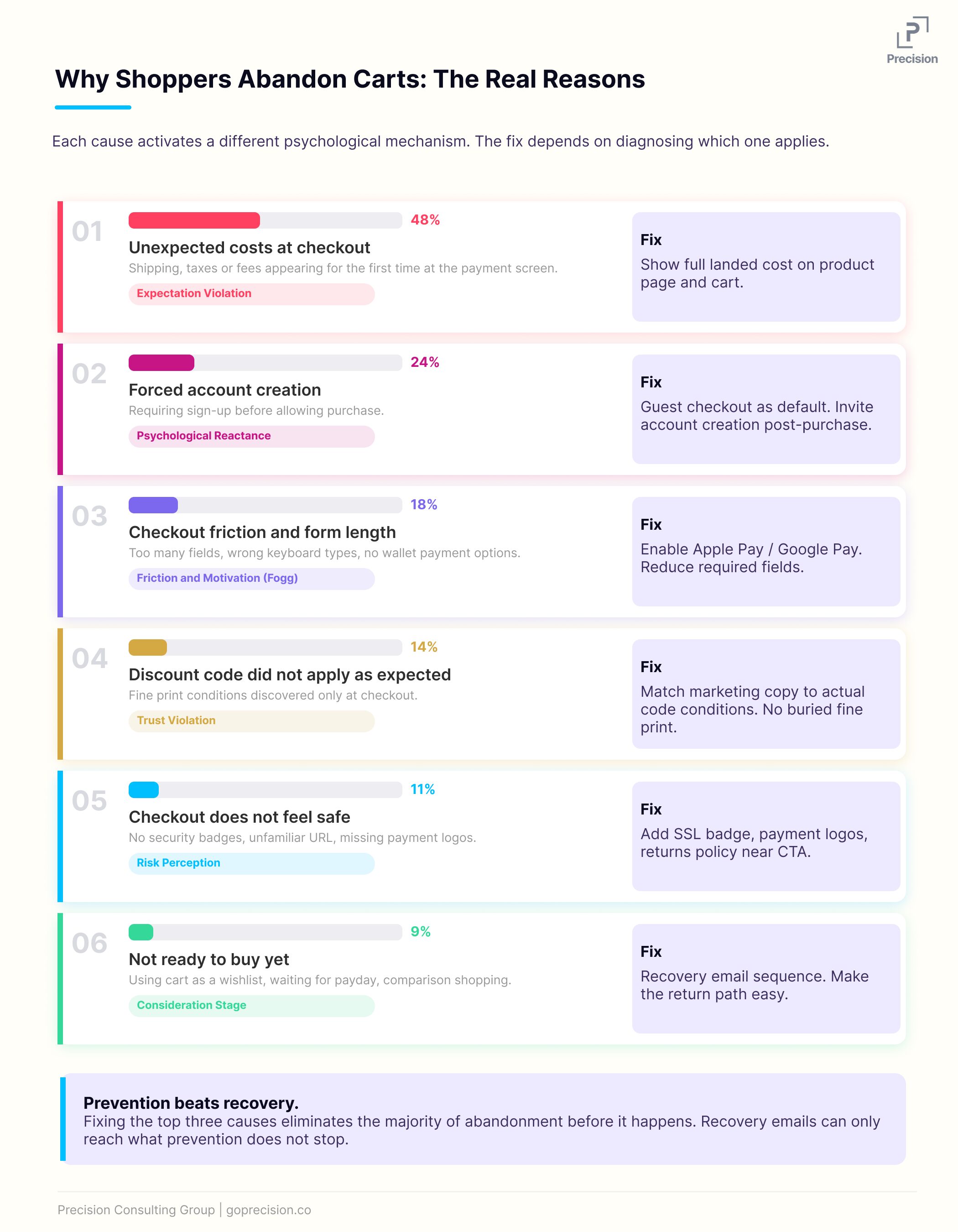
The most common cart abandonment reasons, ranked, with the psychological mechanism behind each.
What is actually happening in your buyer's brain at the cart stage
Before the cart, the buyer is asking: do I want this? Once they are in the cart, the question changes: do I actually want to do this right now? That shift is where most of the doubt surfaces. And doubt does not need much room to become abandonment.
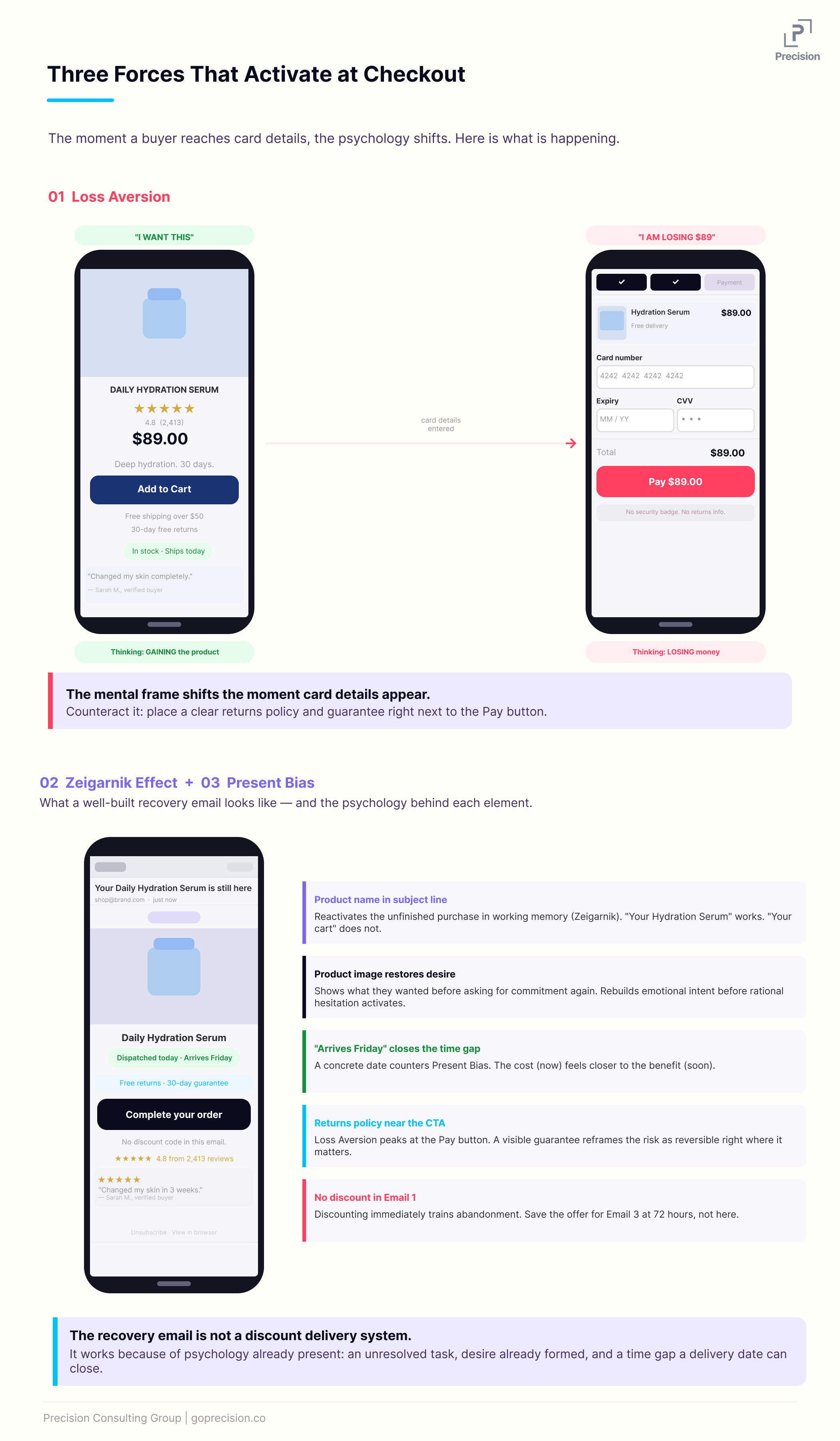
Loss aversion hits hardest at the payment step.
The moment someone starts entering card details, the purchase stops being imaginary and becomes real. The brain is no longer processing the idea of gaining a product. It is processing the certainty of losing money. Daniel Kahneman and Amos Tversky's research on loss aversion, foundational to Kahneman's work in Thinking, Fast and Slow, consistently shows that the pain of losing something is roughly twice as powerful as the pleasure of gaining an equivalent thing. That asymmetry is felt most acutely at checkout.
This is why putting a clear, no-friction returns policy near your CTA actually moves conversion. It does not just answer an objection. It counteracts the loss activation directly by reframing what the buyer stands to lose if the product is not right. For a full breakdown of what trust signals belong on the cart page and where to place them, the cart page optimisation guide covers the layout in detail.
Loss Aversion: At the cart stage, the buyer's brain has flipped its frame. The question is no longer "do I want this?" It is "what am I risking by paying for this?" Anything that increases the perceived certainty of the gain (a guarantee, an easy return window, a clear delivery date) works by reducing the felt risk of the money leaving.
Incomplete purchases stay in working memory.
When someone leaves a purchase unfinished, it does not just disappear. The brain holds onto incomplete tasks. It is why you remember the thing you forgot to do more easily than the ten things you did. That same mechanism is working for you in cart recovery. The buyer who left still has that unfinished purchase sitting somewhere in the back of their mind. The email does not create a new desire. It gives existing desire a place to go.
This is also why recovery emails that reference the specific product left in the cart outperform generic "you left something behind" messages by a significant margin. The specificity reactivates the incomplete task. The generic email does not.
The benefit feels too far away.
Here is a simple reason people leave carts that does not get enough attention: paying now for something that arrives in a few days feels worse than it should. The cost is immediate and certain. The benefit is in the future. For some buyers, that gap is enough to tip them toward closing the tab.
Closing that gap helps. Showing a concrete delivery date rather than "3-5 business days". Displaying a same-day dispatch badge if the order is placed before a certain time. Anything that makes the product feel closer, and the wait feel shorter, reduces the psychological friction of paying now for something that arrives later.
The three psychological mechanisms that activate at the cart stage: loss aversion, incomplete task tension, and present bias.
Cart recovery: what to do after they leave
Fix the checkout first. Then build recovery. If you do it the other way around, you are trying to win back people you should not have lost in the first place.
For people who left because of timing or indecision rather than friction, a well-timed recovery sequence can bring back a meaningful percentage of them. Here is how to structure it.
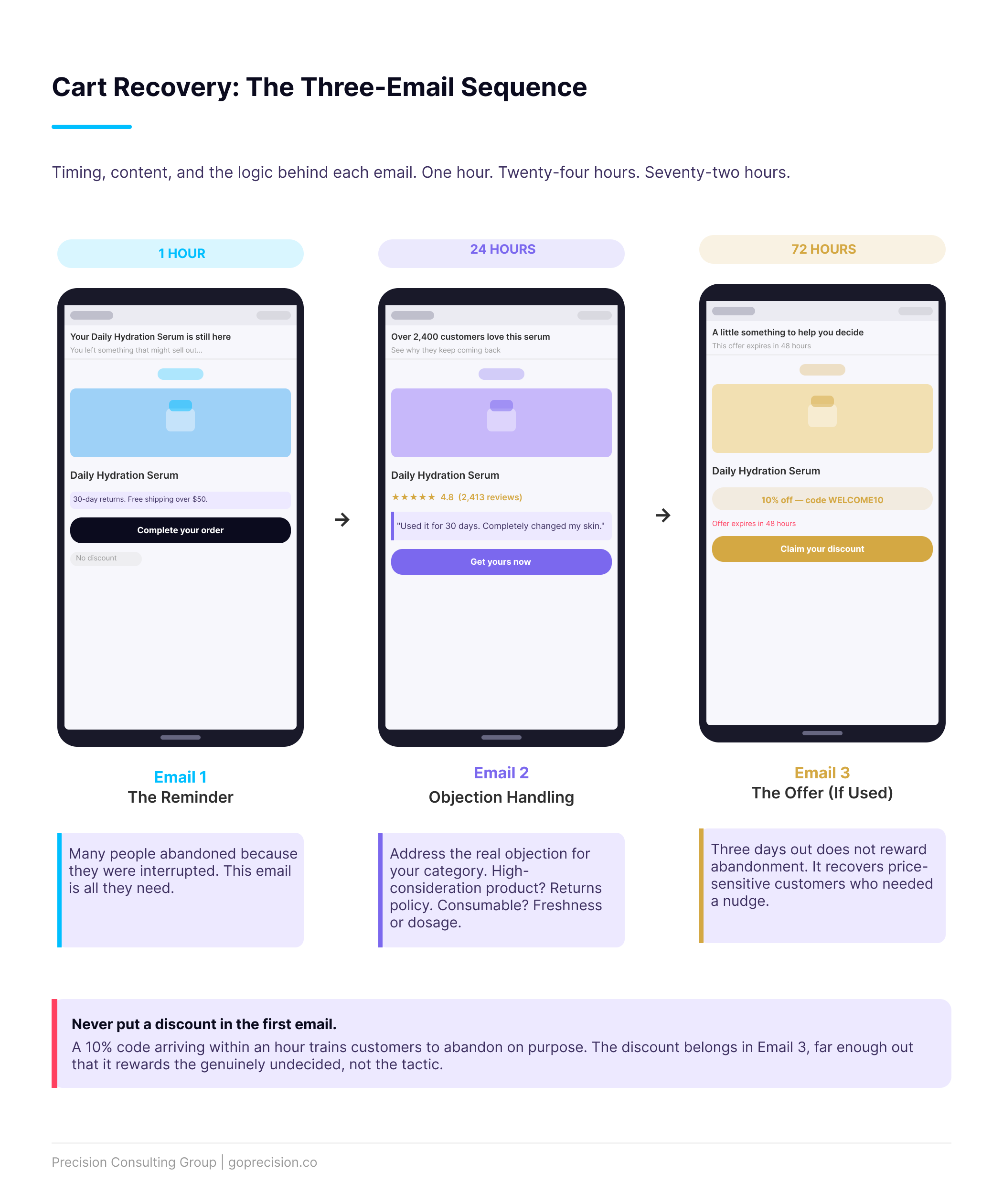
The three-email sequence.
Three emails outperform one. The timings that consistently work are one hour, twenty-four hours, and seventy-two hours after abandonment.
The first email at one hour is a straightforward reminder. No discount, no urgency language, no pressure. Just the product image, the product name, a clear CTA back to the cart, and a trust signal such as your return policy or delivery timeline. You would be surprised how many people abandon because they got interrupted or distracted. This email is the only nudge they need.
The second email within twenty-four hours can work harder. If you have genuine stock constraints, this is where urgency belongs. If you do not, lean on social proof instead. This is also the right place to address the most common objection for your category. High-consideration product? Lead with returns and guarantee. Consumable? Address freshness or shelf life concerns. Know your objections and meet them here.
The third email at seventy-two hours is where a discount offer makes sense if you are going to use one. Putting the discount in the first email trains customers to abandon on purpose. If someone knows a 10% code arrives within an hour of leaving the cart, they will leave the cart. The third email is far enough out that it rewards genuinely undecided customers without conditioning the behavior.
Use the product name and image in the subject line of every recovery email. Not "you left something behind". Not "your cart is waiting". Something like: "Your Daily Hydration Serum is still here." Specificity reactivates the incomplete task. Generic language does not.
Exit-intent on the cart page.
An exit-intent pop-up triggered when someone moves their cursor toward the close button gives you one last moment before they leave. The version that works is not a blanket 10% off. That is expensive and, again, it trains abandonment. The version that works asks a direct question: "Is there anything stopping you from completing this order?" with a live chat link or a visible returns statement. It addresses the hesitation rather than just throwing a discount at it.
Retargeting the people who left.
Paid retargeting to cart abandoners, showing them the specific product they left in the cart, is among the highest-ROI ad spend options available to most e-commerce businesses. The intent signal is already there. The creative writes itself. The targeting is tight. The only thing to watch is frequency. Seeing the same product ad every hour for three days is annoying, not persuasive. Two to three exposures over forty-eight hours is a reasonable starting point.
Cart recovery email sequence: three emails, what each one does, and when to introduce an offer.
This is the kind of analysis we run in a Precision Deep Dive Audit. If you want to see exactly where your store is leaking revenue, request your free audit and we will walk through it together.
Before you build a recovery sequence, do this first
Before you build a recovery sequence, spend thirty minutes diagnosing where in your funnel buyers are actually dropping. Open your checkout funnel in Google Analytics 4 and find the step with the biggest drop. That analysis tells you more about your abandonment problem than any generic checklist. If people are leaving when they first land on the checkout page, the problem is almost certainly friction, trust issues, or account requirements. If they are leaving at the payment step, it is usually the total changing or security concerns. If they are dropping at the order review screen, look at what the final number is showing them.
Then watch ten session recordings of abandoned checkout sessions. Actually watch them. You will see specific things: the hesitation when the shipping line updates, the rage tap on a button that is not large enough on mobile, the exit right after the promo code field appears. That promo code field is a silent killer in many stores. The moment someone without a code sees it, they leave to search for one and often do not return.
Fix what the recordings show you before you spend time on recovery emails. A checkout that does not drive people away will always beat one that does, regardless of how good your recovery sequence is. For a structured way to prioritise all the fixes you find across the full funnel, the CRO audit checklist gives you a step-by-step framework.
Want to understand what is actually driving abandonment in your store? See how Precision works with e-commerce brands, or book a free strategy call and we will walk through it together.
- Seven out of ten people who add to the cart do not buy. That is not a recovery problem. It is a diagnosis problem first.
- The top causes of cart abandonment: surprise costs at checkout, forced account creation, excessive form friction, and a checkout that does not feel trustworthy.
- At the cart stage, the buyer's brain switches from evaluating the product to evaluating the commitment. Loss aversion, incomplete task tension, and present bias all activate here.
- Fix the checkout before building recovery. Prevention stops more abandonment than any email sequence can recover.
- Use a three-email recovery sequence: one hour (reminder only), twenty-four hours (objection handling), seventy-two hours (discount offer if you use one).
- Use the specific product name in your recovery email subject lines. Generic messages do not re-activate the incomplete task. Specific ones do.
- Do not discount in the first email. You will train customers to abandon on purpose.
Frequently asked questions
What is a good cart abandonment rate?
The industry average is around 70%, according to the Baymard Institute. Below 60% is genuinely strong performance. Above 80% usually points to a specific, diagnosable problem in the checkout: surprise costs, a broken mobile experience, a trust deficit, or forced account creation. If yours is above 80%, spend thirty minutes in your session recordings before doing anything else.
Should I always offer a discount in my cart recovery emails?
No, and definitely not in the first one. If a 10% code arrives within an hour of leaving the cart, your customers will learn to leave the cart. Save any discount offer for the third email. For most stores, a strong trust statement and a concrete delivery timeline in the first recovery email bring back more revenue than an immediate discount, without touching your margins.
How do you reduce cart abandonment rate?
Start by diagnosing where the drop is happening. Open your checkout funnel in Google Analytics 4 and find the step with the steepest fall-off. Then fix the root cause before investing in recovery emails. The highest-impact changes are: showing full costs before checkout, enabling guest checkout, reducing form fields, adding trust signals at the payment step, and enabling Apple Pay and Google Pay. On mobile specifically, also check that your CTA is visible without scrolling and test on a mid-range Android device, not just a flagship.
How do I find out why my customers are abandoning?
Funnel analysis plus session recordings. The funnel shows where the drop occurs. The recordings show you what was happening at that exact moment. If you want qualitative data on top of that, add a single-question exit survey on the cart or checkout page: "What stopped you from completing your order today?" Keep it to one question. The answers cluster quickly, and they are usually more honest than you expect.
Does free shipping reduce cart abandonment?
Yes, and the effect is bigger than the actual cost saving would suggest. Free shipping removes the surprise at checkout and meets the expectations set during browsing. If you cannot offer universal free shipping, a clearly communicated threshold works well too. "Free shipping on orders over $50" turns the shipping cost into a goal the customer can reach rather than a fee they are being charged. That framing shift alone moves conversion.
Predictably Irrational by Dan Ariely examines the psychological mechanisms behind people's purchasing decisions, including loss aversion and expectation effects that drive checkout abandonment. Influence by Robert Cialdini covers social proof, liking, and reciprocity, all of which are directly applicable to the trust signals that keep buyers moving through to purchase.