Last updated
A UX audit is a structured evaluation of how your e-commerce store behaves when a real person who does not know it tries to use it for the first time. It is not a checklist of what should be there. It is a test of whether what is there actually works.
Here is a pattern that comes up in almost every audit. The founder knows their conversion rate. They have a rough sense of where people are dropping off. What they have never done is walk through their own store on a phone, from Google, as a first-time buyer. When that happens, the conversation changes within about 90 seconds.
The mistake most common in self-run audits is evaluating your store on a MacBook, logged into your own account, on your own broadband. That is not your buyer. Your buyer is on a phone, often on a slower connection, with no account, no familiarity with your navigation, and no patience for anything that makes them think. If you want to understand where your store is losing buyers at a structural level, that is the kind of review covered in the full UX and CRO audit process. This e-commerce UX audit template is what to look for when you run it yourself first.
What a UX audit covers versus what a CRO audit covers
A CRO audit checks presence and position: is the star rating above the fold, is the checkout field count below 14, and is the returns policy in the purchase zone. It tells you whether the right elements exist.
A UX audit answers a different question: do the elements that exist actually work? A returns policy in the right position, written in legal language that no buyer reads, is not a functioning trust signal. A star rating above the fold that takes three seconds to render is not contributing to conversion. An Add to Cart button that does not look like a button because the designer chose a ghost outline style is not a usable CTA.
Run the CRO audit checklist first to confirm what is present. Then run this to evaluate whether what is present is working. These two reviews address different questions and neither replaces the other.
How to structure this UX audit template for e-commerce
The 60 minutes are divided into five zones. Do not change the order. Each zone feeds into the next. A first-impression failure means everything that follows gets evaluated under different conditions than a real new visitor would experience.
- Minutes 1 to 10: First impression and homepage
- Minutes 11 to 20: Product page and discovery journey
- Minutes 21 to 30: Cart and checkout
- Minutes 31 to 45: Mobile experience
- Minutes 46 to 60: Trust signals and edge cases
In Rocket Surgery Made Easy, Steve Krug's research shows that watching three people attempt tasks on a site surfaces most of the major usability problems. You do not need a research lab. You need someone who has never seen your store, a phone, and an hour.
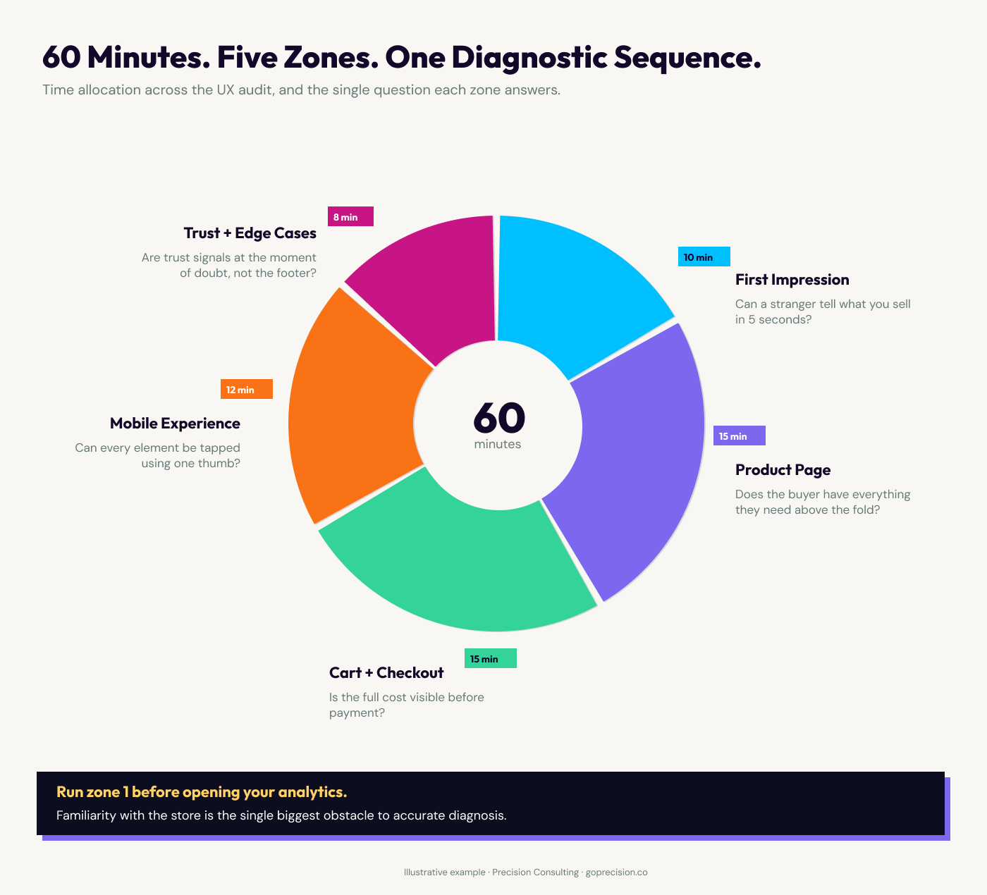
The 60-minute UX audit framework: five zones in sequence, each building on what the zone before it reveals.
How to audit your homepage and first impression
Open your homepage in an incognito window on a mobile device. Do not interact. Just look. The question you are answering is not whether the value proposition exists somewhere on the page. It is whether someone who has never heard of your brand can tell within five seconds what you sell and who it is for.
Nielsen Norman Group research puts the decision window at 10 to 20 seconds before the average visitor decides whether to stay or leave. Five seconds is the conservative threshold for value proposition clarity. If it takes longer than that to orient, you have a first-impression problem before anything else matters.
Users spend most of their time on other sites, which means they expect yours to work like the ones they already know. Navigation labels that deviate from convention ask the buyer to translate before they have even started. "Discover" instead of "Shop". "Our World" instead of "About". That translation costs attention the buyer was not expecting to spend. Jon Yablonski covers this in Laws of UX alongside its practical implications for navigation design.
Check whether a pop-up appears before the visitor has oriented themselves. A store that requests an email within the first three seconds of a first visit is telling the buyer: your attention belongs to us before we have given you a reason to stay. That is not a list-building strategy. It is a first-impression tax.
Open your homepage on a phone you have never used the store on. Set a five-second timer. When it ends, ask: what does this store sell and who is it for? If the answer is not immediate, you have a clarity problem. Check navigation labels against the standard. "Shop", "About", "Blog", "Contact" requires zero translation. Anything else introduces friction before the buyer has decided to stay.
What to audit on the product page and discovery journey
Navigate to a product page as a first-time visitor would: through your main navigation or a category page, not a direct URL. Most buyers arrive at a category, not a specific product. Count the taps from your homepage to a product. More than three is where buyers start to question whether they are in the right place.
On the product page, ask one question before you scroll: does the buyer have enough information here to decide? Product name, price, star rating and review count, delivery indicator, returns signal, and Add to Cart button. If any of those require a scroll to reach, you are asking the buyer to invest effort before they have decided the product is worth their attention.
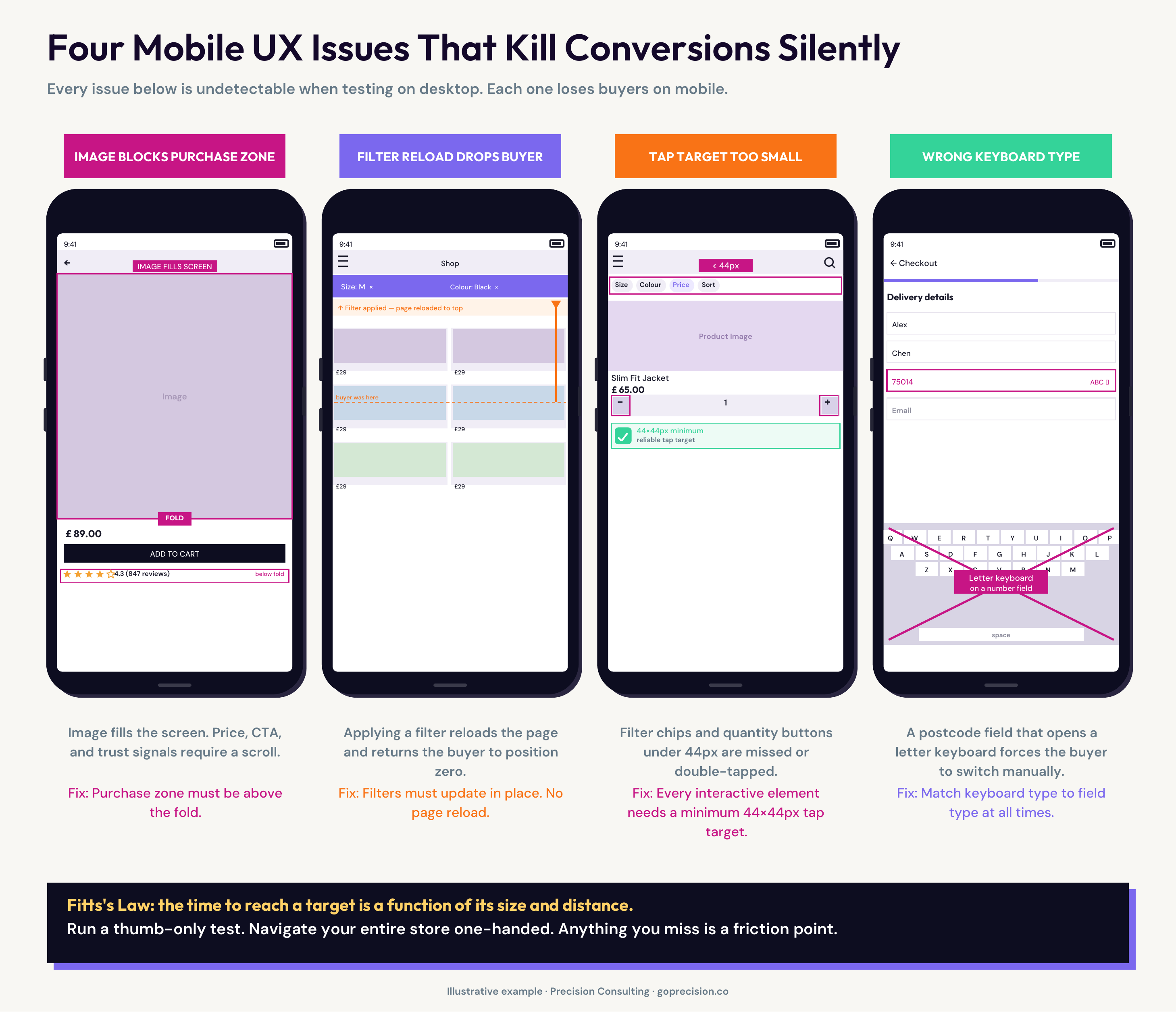
Mango's mobile product page illustrates exactly what this surfaces. The product image fills the entire screen. To see the product name, price, or any purchase action, the buyer must scroll. When they do, the CTA says "ADD". A label that strips the value exchange framing from the most important button on the page. There is no star rating visible anywhere on the product page.
Directly below the buy section, before reviews appear, a cross-sell block shows the full outfit with items to add. The cross-sell mechanic itself is sound. The problem is placement: when it loads before the star rating and returns policy, it deprioritises the trust signals the buyer needs to confirm the main purchase. A feature designed to grow the basket ends up creating doubt about the item already in it.
Compare that to Ugmonk. The price appears inside the CTA itself: "Add to Cart ($159)". The buyer can see the price and take action in a single element. A scarcity signal sits directly below the button. Feature checkpoints provide trust information without requiring a scroll. Not every store can match Ugmonk's design execution. Every store can apply Ugmonk's sequencing.
For how each element of the product page should be ordered and why, the article on product page design and the purchase zone hierarchy covers the full sequence with the behavioural reasoning behind each position decision.
Now scroll. Where do reviews appear relative to the product description? Reviews answer trust questions. Product descriptions answer detail questions. Trust questions come first. If reviews are below the description, the page is sequenced around the business's priorities, not the buyer's.
Apply the scroll test. Before you scroll, list everything the buyer can see. If price, star rating, and CTA are not all visible without scrolling on mobile, identify which is missing and why. Then check the CTA label. "Add to Cart" states the exchange. "Add", "Buy Now" with no price context, or a ghost button with no fill does not communicate the same thing with the same confidence.
Want to know exactly where your store is losing buyers?
A structured UX and CRO review covers every zone in this template, with prioritised fixes specific to your store's traffic and revenue data. Request your free audit and we will tell you exactly where to start.
What to evaluate in the cart and checkout
Add a product to your cart and go through the full checkout on mobile, without autofill, as if you have never used your store before. This is the test most founders have never run. What you find will almost certainly change your priorities.
Count the fields. The Baymard Institute benchmark for an optimised checkout is 12 to 14 fields. The average across the web is 23 fields. Every field above the optimum adds a small amount of effort. On mobile, small amounts of effort compound into abandonment faster than on desktop, because the physical act of typing on a small screen raises the effort cost of each field.
Check whether the full cost, including delivery and any taxes, is visible in the cart before the buyer reaches the payment screen. Baymard's research identifies unexpected costs at checkout as the single most common reason for abandonment. Nike's cart page addresses this directly: subtotal, delivery, and estimated tax are all visible in the cart summary before the buyer touches the checkout button. That transparency is a conversion decision, not a design preference.
Express payment options are the highest-leverage change available in mobile checkout. Apple Pay, Google Pay, and Shop Pay replace every form field with two taps. From the buyer's position, the difference between two taps and a three-minute keyboard entry is often the difference between a completed purchase and an abandoned one. Check whether express options appear above the card form or below it. If they require scrolling to reach, they are not functioning as an express option.
Fill in the address fields without autofill and note which fields trigger the wrong keyboard. A postcode field that opens a letter keyboard instead of a number pad, or an email field missing the @ symbol shortcut, breaks the entry flow. These feel like minor details. They are not. A buyer who has to switch keyboards mid-form pauses, re-evaluates, and sometimes decides it is not worth the effort. Multiplied across real traffic, these moments compound into a measurable gap in checkout completion.
Count your checkout fields. If you are above 14, identify which can be removed, combined, or made optional. Check that every field triggers the correct keyboard type on iOS and Android. Confirm express payment options appear at the top of the payment section, not below the card form. Confirm the cart shows the full total, including delivery and taxes, before the buyer proceeds to payment.
How to audit the mobile experience
The mobile audit gets more time than any other zone because mobile is where most traffic arrives and where the friction gap is widest. A store converting at 3% on desktop and 1.1% on mobile does not have a mobile problem. It has friction that is amplified on a small screen. The article on mobile CRO and the highest-impact conversion fixes covers the specific interventions once this audit has told you where to look.
The time required to reach a target is a function of its size and its distance from the starting point. On a phone, small interactive elements are not just difficult to tap. They are systematically missed. The minimum for reliable tap accuracy is 44 by 44 pixels. The most common offenders are filter options on category pages, close buttons on modals, and secondary navigation links. Jon Yablonski covers this in Laws of UX alongside its implications for touch interface design.
Run a thumb-only test. Navigate your entire store using only your thumb, one-handed. Anything you miss or hit by accident is a tap target problem. This test takes ten minutes and surfaces issues that no desktop review will find.
Check the filter experience on a category page. Apply a filter. Does the page reload and take the buyer back to the top, or does it update in place? A page reload that drops the buyer back to where they started is not a bug. It is a design decision that has not been tested against real buyer behaviour.
The buyer found the category, scrolled to the right price range, applied a size filter, and the page reloaded to the top. Now they need to re-scroll, re-establish context, and find the products they were already near. Most do not restart. They exit.
Run the thumb-only test across your homepage, category pages, and checkout flow. Log every element you miss or hit by accident. Check tap target sizes and add padding where needed, particularly on filter chips, modal close buttons, and quantity adjusters. If your category filter triggers a full page reload, test an in-place update. The difference in engagement from that single change is measurable.
Four mobile UX issues that kill conversion silently: each is invisible in desktop testing and only surfaces when running the audit on a real device.
Why trust signals and edge cases belong in every audit
Trust signals in the wrong position are not trust signals. They are decorations. A security badge in the footer contributes almost no conversion value. The same badge adjacent to the card entry field addresses the exact doubt that is present at that moment. Position determines function. The article on e-commerce trust signals and where to place each one covers every signal type with placement guidance for each point in the purchase journey.
In User Friendly, Cliff Kuang describes affordances as elements that communicate their function through their design. A button that looks like a button affords clicking. A form field that looks like an input affords typing. The edge case audit is where broken affordances become visible, because the normal path has been optimised and edge cases have not.
The edge case audit is the part most internal reviews skip. Search for a product that does not exist. An empty result page with no navigation and no suggestions is not a neutral experience. It is a negative one. The buyer expressed intent and received nothing. Navigate to a sold-out product. If there is no back-in-stock notification, that is a buyer who raised their hand and was given no path forward. Enter an invalid discount code. Remove an item from the cart. These paths are less frequent but disproportionately revealing about how seriously a store has thought through its experience design.
Search for a term that returns no results. Evaluate the empty state: does it suggest alternatives, link to categories, or offer a way forward? Land on a sold-out product and check for a notification option. Enter an invalid discount code and read the error message. If any of these paths dead-end or return a generic system error, document the fix alongside the main audit findings. Edge cases are the fastest signal of whether experience design was intentional or incidental.
What to do with the findings
After 60 minutes, you will have a list. The most common mistake at this stage is treating every item as an equal priority fix. That is not a UX audit problem. It is a triage problem. The value of the 60 minutes is in the two or three things you act on in the next sprint, not in the length of the list.
Prioritise by funnel stage and frequency. Checkout and product page findings are first-tier: they affect every buyer on every visit. Category and homepage findings are second-tier. Navigation labels, edge cases, and information architecture are third-tier unless analytics show they are causing a measurable drop-off. Checkout friction that affects 100% of buyers ranks above a broken empty-state page that affects 3%.
The audit surfaces what to fix and where. The CRO checklist then tells you what the specific conversion-architecture change should be. They work in sequence. Run the checklist first to confirm what is present. Run this e-commerce UX audit template to confirm whether what is present is working. Fix in funnel order, starting with checkout and the product page.
Precision works with growth-stage e-commerce brands on full-funnel UX and CRO reviews, starting from the same 60-minute walkthrough described here. If you want to know exactly where your store is losing buyers, book a call and we will walk through your store together. Or take a look at the full audit process to understand what a structured review covers.
Don't Make Me Think by Steve Krug: the benchmark for UX clarity in web and mobile. Krug's principle is the right standard for this audit — if a visitor has to stop and think about how something works, that is the UX failure, not a preference. Short, precise, and still the most useful single book on web usability.
Rocket Surgery Made Easy by Steve Krug: the practical companion to Don't Make Me Think. Krug's research shows that three people attempting tasks on a site surface most major usability problems. A guide to running your own user tests without a research lab or a budget.
Laws of UX by Jon Yablonski: a structured reference for the cognitive and perceptual principles that govern how people interact with interfaces. Covers Jakob's Law, Fitts's Law, and ten others, each with direct design implications for e-commerce.
- A UX audit evaluates how well the elements that are present actually work. Run the CRO audit checklist first to confirm what is present, then use this to evaluate whether it is working.
- The honest audit is run by someone who has not built the store. Steve Krug's research in Rocket Surgery Made Easy shows that three people attempting tasks on a site reveal most major usability problems. You do not need a research lab.
- Jakob's Law: users expect your site to work like the sites they already know. Navigation that deviates from convention costs the buyer attention they were not expecting to spend. Most of them do not spend it.
- Mango's mobile product page illustrates how small frictions stack: the image fills the screen before any purchase information appears, the CTA says "ADD", the star rating is absent, and a cross-sell block appears before reviews. None of these is fatal alone. Together, they describe a page that makes the buyer work to decide.
- Ugmonk's sequencing shows what the right purchase zone looks like: price inside the CTA button, scarcity signal directly below, feature checkpoints above the fold.
- Baymard Institute: an optimised checkout has 12 to 14 fields. The web average is 23. Every field above the optimum adds effort. On mobile, effort kills completion faster than it does on desktop.
- Fitts's Law: the time to reach a target depends on its size and its distance. Run a thumb-only test. Navigate your entire store one-handed. Anything you miss is a tap target problem.
- Prioritise findings by funnel stage and buyer frequency. Checkout friction affecting 100% of buyers is not the same problem as a broken empty-state page affecting 3%.
Frequently asked questions
What is a UX audit?
A UX audit is a structured evaluation of how a store behaves when a real person uses it for the first time. It differs from a CRO checklist in that it evaluates how well the elements that exist actually work, not just whether the right elements are present. A returns policy in the wrong position, a form that triggers the wrong keyboard, or a CTA that does not communicate its function are all UX problems a conversion checklist would not surface.
How many users do you need for a UX audit?
For the expert 60-minute audit described here, one auditor who has not previously seen the store is enough to surface the major issues. For a user testing component, Steve Krug's research in Rocket Surgery Made Easy shows that three participants attempting defined tasks will surface the most significant usability problems. More participants add diminishing returns on the first pass. Run three, fix the major issues, then test again.
What is the difference between a UX audit and a CRO audit?
A CRO audit checks what is present or absent: is the star rating above the fold, is the field count within range, is the returns policy in the purchase zone. A UX audit evaluates how well what is present works: does the star rating render before the buyer forms a first impression, is the checkout form configured for mobile input, does the returns policy read in plain language? Both are necessary. Run the CRO audit first, then the UX audit.
How do I audit my mobile UX specifically?
Use an actual phone on a real mobile connection, not a browser simulator. Run a thumb-only test: navigate the entire store one-handed. Apply a filter on a category page and observe whether it updates in place or reloads. Fill in the full checkout without autofill. These three tests surface the majority of mobile-specific UX friction. The tap target, keyboard type, and filter reload issues that appear here do not show up in desktop testing.
What are edge cases in a UX audit?
Edge cases are interactions outside the main purchase path: searching for a product that does not exist, landing on a sold-out product page, removing an item from the cart, and entering an invalid discount code. These are less frequent but disproportionately revealing. A brand that has thought through its edge cases has thought through the experience design seriously. Most have not.
How do I prioritise UX audit findings?
By funnel stage and buyer frequency. Checkout and product page issues are first-tier because they affect every buyer on every visit. Category and homepage issues are second-tier. Navigation and edge case issues are third-tier unless analytics show a measurable drop-off. The goal of the audit is not a comprehensive list. It is to find the highest-frequency friction and fix it first.