Last updated:
Here is a pattern in mobile conversion rate optimisation that comes up constantly in our work at Precision. A founder checks their analytics, sees an overall conversion rate around 2.5%, and feels reasonably comfortable. Then we split it by device. Desktop is at 3.8%. Mobile is at 1.1%.
The blended number looked fine. The mobile number is a revenue problem that has been running quietly in the background.
More than half of all e-commerce traffic comes from mobile (Statista, 2025). Most stores convert at two to three times the rate on desktop compared to mobile. Put those two facts together, and you have a business spending significant money to send visitors to an experience that loses the majority of them.
The gap is not due to mobile users being less willing to buy. It is because most e-commerce sites were designed at a desk, tested at a desk, and optimised at a desk. Then they got scaled down to fit a phone and were assumed to work. They do not work at the same rate. This is one of the highest-leverage areas in CRO precisely because the gap is so consistent. You do not need more traffic. You need the traffic you already have to stop leaving.
How Large Is the Mobile Conversion Gap?
Desktop e-commerce conversion rates typically range from 3% to 4%. Mobile sits between 1% and 2%. The same store, same products, same prices. The device alone accounts for a two to threefold difference in conversion rate. For context on what benchmarks look like across categories, the guide to e-commerce conversion rate benchmarks covers the full picture.
The revenue maths is worth sitting with for a moment. Take a store doing 100,000 monthly visitors. Sixty thousand come from mobile, forty thousand from desktop. If mobile converts at 1.2% and desktop at 3.2%, that produces 720 mobile customers versus 1,280 desktop customers.
In practice, closing the mobile gap changes the numbers significantly. No extra ad spend. No new products. The traffic was already there.
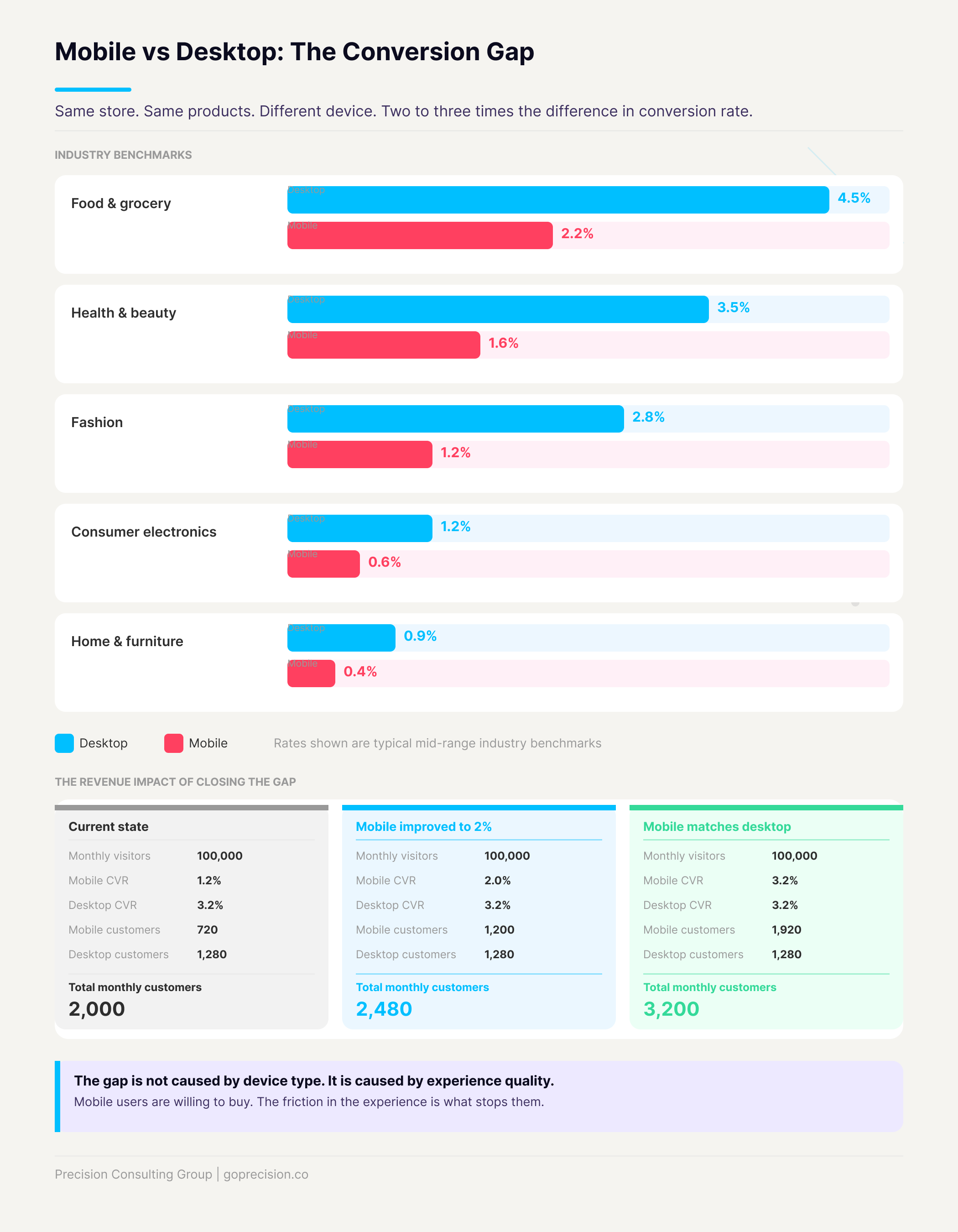
The mobile conversion gap: same store, same traffic, significantly different revenue outcomes by device.
Why Does Mobile Convert at a Lower Rate?
Mobile converts at a lower rate because mobile visitors encounter more friction at every step of the funnel, and friction kills buying intent faster than almost anything else. The instinct is to say mobile users are just browsing and will come back on desktop to actually buy. That is true for some categories and some users. What it misses is what is actually happening on most e-commerce sites.
Cognitive load is higher on a small screen
A desktop user moves a precise pointer to a target. A mobile user moves their thumb across a small screen, often holding the device in one hand, frequently while doing something else. Every interaction costs more effort on mobile. And effort is the most consistent predictor of whether a purchase completes. The same buying intent, applied to a harder experience, produces fewer conversions.
Touch targets are too small to hit accurately
Apple specifies a minimum tap target of 44 by 44 points (Apple Human Interface Guidelines). Google recommends 48 by 48 density-independent pixels (Material Design). Most e-commerce sites were designed for mouse clicks, which are precise to a single pixel. A finger is not. Add to Cart buttons, size selectors, quantity controls, and form fields: if they were sized for a mouse, they are too small for a thumb. A missed tap means trying again, and that friction is often enough to tip someone into abandoning.
Checkout forms are not built for mobile input
On a desktop, filling out a checkout form is mildly annoying. On mobile, it is a genuine obstacle. A 16-digit card number typed on a keyboard that covers half the screen. A billing address field that auto-corrects product names. A postcode that triggers the wrong keyboard type. Every field the customer has to work through manually is a point where they reconsider whether it is worth the effort. Most of them decide it is not.
Pages load more slowly on mobile connections
53% of mobile visitors leave a page that takes more than three seconds to load (Think with Google). A site that loads in 1.5 seconds on a home broadband connection might take 4 or 5 seconds on a 4G connection on a mobile device with a fraction of the processing power. As a result, every additional second of load time is a measurable conversion loss, and it compounds across every page in the funnel.
Above-the-fold content looks different on mobile
A product page built to show the hero image, headline, price, CTA, and star rating all above the fold on a 1440px desktop might show only the hero image and part of the headline on a 390px phone. If the customer has to scroll to find the price and the Add to Cart button, many of them will not. In other words, the problem is not the content, it is the hierarchy. The product page design guide covers exactly what should be visible before any scrolling occurs.
Open your best-selling product page on your phone right now. Without scrolling: can you see the product image, the benefit headline, the price, the star rating, and the Add to Cart button? If any of those are missing, your mobile hierarchy is the priority before anything else on this list.
How Do You Audit Your Mobile CRO? Eight Areas to Check
Audit your mobile CRO by walking through your store on a real phone and checking eight specific areas: page speed, tap target size, form fields, navigation, trust signal placement, CTA visibility, image weight, and checkout flow. Do this on your actual phone, for your actual store. Not a browser simulator, not a responsive design preview. The lived experience of using your site on a phone is the only reliable way to understand what your customers are dealing with.
Ideally, test on both an iPhone and an Android device. Most teams only ever check a flagship Android model, but mid-range and smaller Android devices are where things start to break down. A page that looks fine on a high-end device can get cramped, misaligned, or sluggish on a mid-range device with a smaller screen. If you only have one phone, ask someone with a different OS or screen size to walk through the checkout and tell you what they see.
1. Load speed on a mobile connection
Run your homepage, product page, cart, and checkout through Google PageSpeed Insights on a simulated mobile connection. A score below 50 is a conversion problem, not just a technical note. Specifically, uncompressed images and unused third-party scripts account for the majority of mobile speed issues and can usually be addressed without a full rebuild.
2. Above-the-fold content on product pages
Open your best-selling product page on your phone. Without scrolling: can you see the product image, the benefit headline, the price, the star rating, and the Add to Cart button? If any of those are missing, your mobile hierarchy is wrong and you are losing buyers at the first impression. The comparison below shows what the difference looks like in practice.
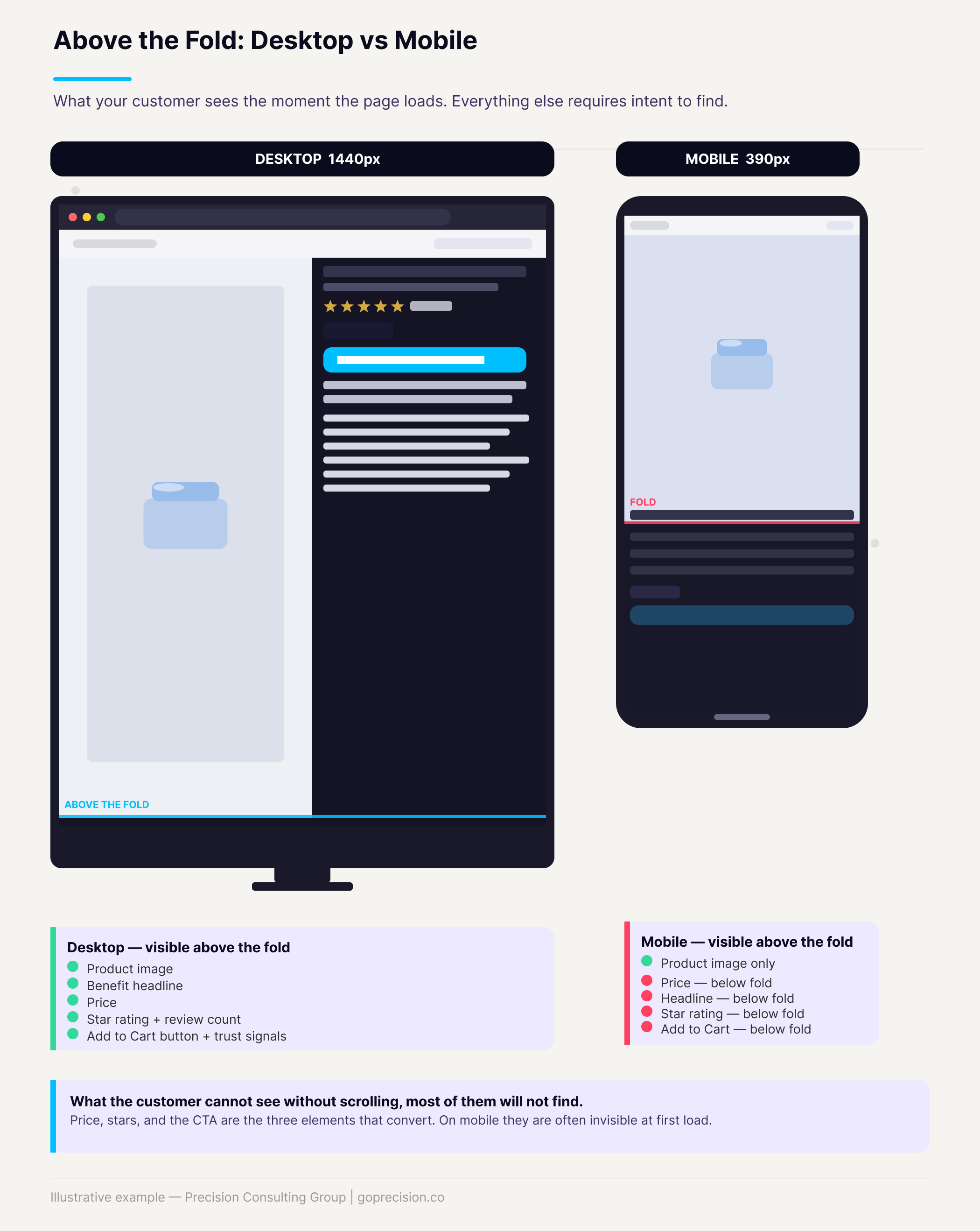
Mobile vs desktop product page hierarchy: what a customer sees before scrolling, and what gets cut off.
3. Tap target sizes
Go through every interactive element: Add to Cart, size and variant selectors, quantity controls, navigation links, and form fields. Anything smaller than 44 by 44 pixels is a problem. The fix is almost always just padding. A 36px button with 10px of padding on each side becomes 56px and easy to tap. No redesign required.
4. Mobile checkout friction
Walk your own checkout on mobile right now. Count the fields. Check whether the keyboard type matches each input (numeric for card numbers, email for the email field, and so on). Check whether Apple Pay, Google Pay, or Shop Pay is available. Mobile wallets eliminate the card entry problem entirely. If someone has to enter their card number on a mobile device manually, a significant percentage will not finish.
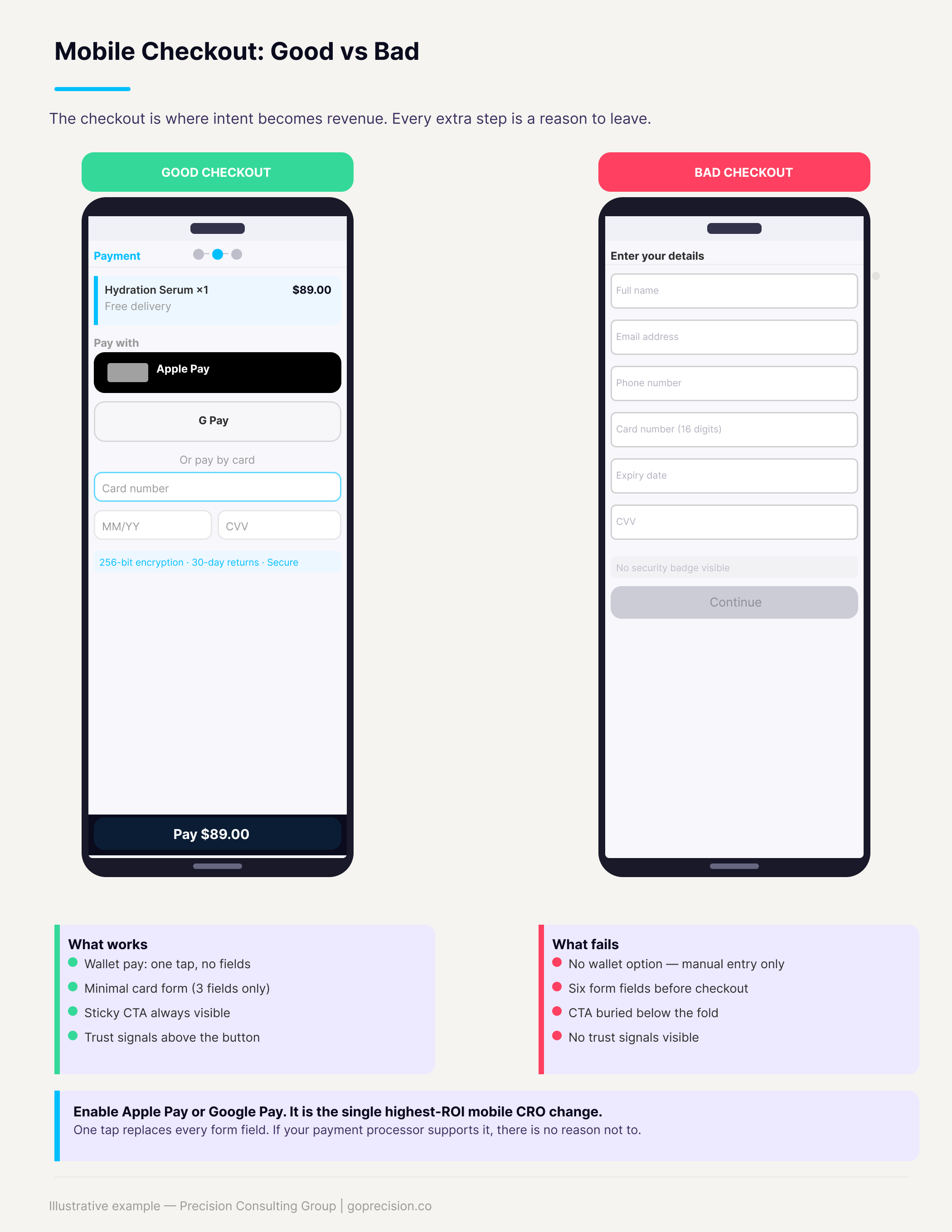
Mobile checkout comparison: a friction-heavy manual form versus a streamlined one-tap wallet checkout.
Enable Apple Pay, Google Pay, or Shop Pay. Mobile wallets replace every checkout form field with a single tap. If your payment processor supports it, this is the fastest conversion lift available in mobile CRO and requires almost no engineering work to implement.
5. Mobile navigation
Hamburger menus that need three taps to reach a category, search bars that expand into a full-screen overlay, and category filters that are impossible to select with a thumb. Mobile navigation should get a visitor to any category in at most two taps. The search bar should always be visible. If your navigation sends people to the wrong page or nowhere, they leave.
6. Images and media
Uncompressed images are among the biggest mobile speed killers and among the easiest to fix. Every product image should be under 200KB where possible, sized to the display width without requiring zoom, and in WebP format if your platform supports it. An image that requires pinch-to-zoom on mobile is also a UX signal that the site was not designed for phone users.
7. Trust signals at the CTA
Returns policy, security badge, and payment logos. On desktop, these often appear next to the Add to Cart button. On mobile, they are frequently pushed below the fold or removed entirely to save space. That is exactly backward. The moment of highest friction for a mobile user is right at the CTA, which is precisely where trust signals need to be visible.
8. Cart and checkout CTA visibility
The cart page on mobile should guide the customer from the item to the checkout button in a single scroll. If the checkout button is hard to find, it will not be found by everyone who intends to buy. Beyond that, the fix here is one of the easiest on this list. The cart page optimisation guide covers the full mobile layout hierarchy.
Pin a sticky checkout CTA to the bottom of the screen on the cart page. The button should be visible at all times without scrolling. It costs almost nothing to implement, and the lift in checkout starts tend to be immediate.
What Is the Root Cause of Poor Mobile Conversion?
The root cause of poor mobile conversion is that most teams do not actually use their store on a phone. Most product decisions get reviewed on a MacBook. Most analytics dashboards are open on a monitor. Most design work happens at a desk. The result is a team that has systematically less exposure to how the mobile experience actually feels than their customers do.
The fix is partly a process change. Before any page change goes live, someone should walk through it on a real phone. Mobile conversion rate should be a named metric in weekly reporting, tracked separately from the blended rate. Once you have that split visible, priorities tend to change quickly.
Spend one hour watching mobile session recordings in Hotjar or Microsoft Clarity (both have free tiers). Filter to mobile only. What you find will almost certainly change your priorities faster than any audit checklist.
The experience is rarely broken. It is just harder than it needs to be at every single step. That cumulative difficulty is what drives the gap. Fixing it does not usually require a redesign. It requires making each individual interaction slightly less effortful, consistently across the whole funnel.
This is the kind of analysis we run in a Precision Deep Dive Audit. If you want to see exactly where your store is leaking revenue, request your free audit and we will walk through it together.
Which Mobile CRO Changes Have the Highest ROI?
Not everything in the audit above is equal. Based on the stores we have worked through, these six changes move the conversion rate the most relative to the effort they require.
- Enable mobile wallets. Apple Pay and Google Pay replace every checkout form field with a single tap. Biggest lift, lowest complexity if your processor supports it.
- Fix page speed. Image compression and removing unused scripts solve most issues without architectural changes.
- Restructure product page hierarchy for mobile. CTA, price, and social proof should be visible before any scrolling occurs.
- Increase tap target sizes. Padding adjustments only. No visual redesign needed.
- Add a sticky checkout CTA on the cart page. Fixed to the bottom of the screen, always visible.
- Optimise checkout form inputs for mobile keyboards. Correct input type for each field, autofill enabled, minimum required fields only.
Start here before anything else. These address the highest-frequency, highest-impact friction points, and most can be implemented without significant engineering work. For a structured way to prioritise fixes across the entire site once the mobile fundamentals are in place, the CRO audit checklist covers the full prioritisation framework.
- Mobile drives more than half of e-commerce traffic but converts at roughly half the rate of desktop. That gap is a revenue problem, not an industry norm.
- The cause is friction, not intent. Mobile users want to buy. The site makes it too hard.
- Eight audit areas: load speed, above-the-fold hierarchy, tap targets, checkout friction, navigation, images, trust signal placement, and cart CTA visibility.
- Mobile wallets are the single highest-ROI change. One tap replaces every checkout form field.
- Desktop-first thinking creates the problem. Review on a real phone, track mobile conversion rate separately from the blended rate.
- If your mobile rate is below 60% of your desktop rate, this is your highest-leverage CRO priority right now.
Frequently Asked Questions
Why is my mobile conversion rate so much lower than desktop?
The most common causes, in order, are: checkout friction (too many form fields, no mobile wallet), slow load times, Add to Cart not visible without scrolling, and tap targets too small to hit accurately. Open your checkout on your phone and time how long it takes from the product page to order confirmation. If it takes more than two minutes, you have found a significant part of the answer.
Should I build a separate mobile site or app?
For most growth-stage stores, no. A properly optimised responsive site performs comparably to a dedicated mobile site and does not require maintaining two separate codebases. A native app starts to make sense when you have a large, repeat-purchase customer base that logs in regularly and justifies the ongoing development costs. Fix the mobile web experience first.
How do I track mobile conversion rate separately?
In Google Analytics 4, go to Reports, add Device Category as a secondary dimension, and filter to mobile. Build this as a saved report and add it to your regular weekly review. The key metric is sessions-to-purchase conversion rate by device. Once you have that split visible, priorities tend to change quickly.
Does improving mobile CRO help SEO?
Yes, directly. Google indexes from mobile first. Improving mobile page speed and Core Web Vitals, and reducing mobile bounce rate, all contribute to organic rankings. Mobile CRO and SEO pull in the same direction, so improvements in one tend to show up in the other.
What tools should I use to audit mobile experience?
Google PageSpeed Insights for load speed. Hotjar or Microsoft Clarity for mobile session recordings and heatmaps (both free). Google Search Console for mobile usability errors. And your own phone on a real mobile connection, which will surface problems that every tool misses. Start there.
Hooked by Nir Eyal covers the Fogg Behavior Model and how ability constraints affect whether behaviour happens, directly applicable to why mobile checkout friction kills conversion. Indistractable, also by Nir Eyal, examines how environmental context shapes user behaviour, helping explain why mobile users behave so differently from desktop users on the same site.
Want a mobile CRO audit of your store? See how Precision works with e-commerce brands, or book a strategy session to identify your highest-impact mobile fixes.