Last updated:
Category page CRO is the practice of improving the conversion impact of the pages that sit between a visitor's arrival and the product page: the collection pages, browse pages, and filtered listing pages that determine whether a visitor ever reaches a product worth buying. These pages are responsible for one of the most consistently wasted opportunities in e-commerce, and most businesses do not realise it because the obvious conversion events happen somewhere else.
Add to cart happens on the product page. Purchase happens in checkout. When a visitor leaves from a category page, the default assumption is that they were not ready to buy. Most of the time, that assumption is wrong. They were ready to look. The page did not help them find anything worth looking at more closely.
The Baymard Institute's research on e-commerce UX finds that the average site performs at only 58% of its potential on product list usability. That gap is not a design problem. It is an information architecture problem, and it is almost entirely fixable. If your category pages are contributing to that gap, our CRO engagements start with a structured funnel audit that includes your listing pages as a priority stage.
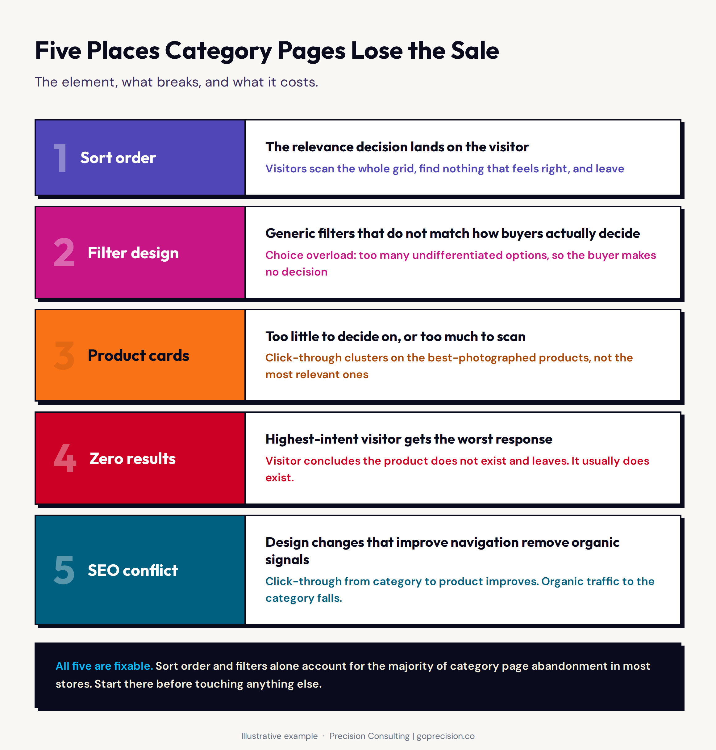
The five places a category page loses the sale before a visitor ever reaches a product page.
Why do category pages get ignored in CRO programmes?
Pull up a typical CRO roadmap and you will find a product page section, a checkout section, and sometimes an add-to-cart section. The category page is either missing or listed as a stretch goal. Nobody owns it.
The reason is attribution. When a visitor exits from a category page, analytics typically records it as a bounce or an exit. The funnel view starts at the product page. So category page abandonment is invisible in the same dashboards that surface checkout drop-off. It never makes the priority list because nobody is measuring it as a funnel step.
The result: stores invest heavily in optimising the product page for visitors who are already engaged, while losing a significant share of their traffic at the step before. It is like obsessing over how well your fitting rooms convert while the front door is half-closed. A structured audit checklist treats the category page as a named funnel stage, not an afterthought, because that is the only way to catch where revenue is actually leaking.
How does sort order determine which products visitors even consider?
The default sort order on most category pages is either newest arrival or best seller. The newest arrival is useful for returning customers who follow your releases. For a first-time visitor with no context for what is new, it is actively unhelpful. Best seller is better as a default, but only if the ranking is genuinely based on purchase volume rather than margin decisions or inventory management.
What most stores are actually doing is outsourcing the relevance decision to the visitor. Arriving at a category page sorted by newest arrival, a visitor has to scan the entire grid to find what matches their intent. Many do not. They leave. The relevant work they expected the page to do landed in their lap instead.
The most conversion-effective defaults are relevance-based: showing products that match the likely intent of the incoming session first. A page receiving traffic from a paid campaign targeting waterproof running shoes should surface waterproof running products at the top. Not last season's most popular trail trainer. Not the product with the highest margin. The product most likely to match what that specific visitor came looking for.
Pinning specific products based on intent requires a merchandising strategy, not just a default sort setting. Most stores have no strategy at all. The result is that the products most likely to convert are buried on page two, and the products that show up first are there by accident. This is a direct application of the primacy effect: buyers disproportionately evaluate the first options presented and rarely scroll far enough to encounter the best match.
Audit your default sort setting against your actual incoming traffic intent. If your paid campaigns are targeting specific use cases, the corresponding products should be pinned to positions one through four. If best seller is your default, verify the ranking logic: it should reflect purchase volume from the past 30 to 90 days, not margin weighting or inventory surplus.
Why does filter design cause so much category page abandonment?
Filtering is how a visitor moves from 87 products to the 6 that are actually relevant to them. When the filter design is right, it is invisible. The visitor applies a filter, the grid narrows, and they find what they came for. When it is wrong, it is one of the biggest sources of category page abandonment in the funnel.
Baymard Institute research found 42% of e-commerce sites have critically inadequate filtering. The mechanism is direct: better filters reduce time-to-product, and every second saved between arrival and clicking through to a product page is a second the visitor does not spend reconsidering whether they want to browse at all.
The psychological mechanism here is what Dan Ariely's research in Predictably Irrational describes as choice overload: the more options a person faces without a clear way to narrow them, the higher the likelihood they do not decide at all. Good filtering is not about giving visitors more ways to search. It is about reducing the number of items they have to evaluate before finding something worth clicking.
The most common filter failures fall into three types. First, category-agnostic attributes: showing generic Size and Colour filters on a page where the decision-relevant attributes are terrain type, cushioning level, or material weight. Second, interactions that reset scroll position after every filter selection, forcing the visitor to find their place in the grid again before they can see what changed. Third, selected filter states with low visual contrast, so a visitor cannot tell which filters they have already applied. Fix the filter taxonomy first: the attributes on each category page should be the attributes that matter for that specific product decision, not a universal set applied site-wide.
What should a product card include to earn the click?
Every product card on a category page is a half-second interview. The buyer scans it, decides whether to look further, and moves on. Most product cards either fail the interview by showing too little, or fail it by making the buyer do too much work to pass.
Too little: name, image, price. The visitor has no signal to differentiate one product from the next. They click through to the first thing that looks vaguely right, evaluate it, go back, click through to the next, and eventually leave because the whole process is exhausting. Too much: name, image, price, a 40-word description, five attribute tags, a colour swatch selector, a hover add-to-cart, and a quick-view button. The card becomes visually noisy. The buyer's attention splits across too many elements, and no single one earns the click.
This is Hick's Law applied at card level: the time it takes to make a decision increases with the number and complexity of choices. A card that presents the minimum information needed to make a yes-or-no browsing decision is faster to process and more likely to produce a click than one that presents everything at once. The goal of the card is not to replace the product page. It is to create enough confidence to justify opening the product page.
The most conversion-relevant card elements are: a primary image large enough to be meaningful on mobile, the product name, the price, and a star rating with review count on any product with more than ten reviews. One differentiating signal is genuinely useful: new, limited stock, or most popular. Beyond that, the card is carrying too much. Image consistency matters separately: a category page where product images vary in background, lighting, or composition creates an involuntary visual hierarchy that clusters conversion around the best-photographed products, not the best-matched ones. Standardising photography across a category is a product page design decision with direct category-level impact.
Not sure which category page element is costing you the most clicks? Request a free audit and we will review your top category page with specific observations on sort order, filtering, and card design.
How should your category page handle zero-result states?
A visitor who has applied a filter combination that produces zero results has done something remarkable. They have told you exactly what they want. They have narrowed from browsing intent to specific product intent. They are the highest-intent visitor on your category page at that moment.
The standard response to that signal is an empty grid and the text "no products found." It is the equivalent of a shop assistant shrugging when you ask for a specific item and saying nothing else. The visitor leaves, concluding that the product does not exist. The actual problem is that the communication failed.
The intervention is not complicated. Show the closest available alternatives. Tell the visitor which filter to relax to find results. Make it one tap to remove the most restrictive constraint. Most platforms support these behaviours natively. The gap is that nobody has thought about this visitor's experience specifically, because nobody is measuring zero-result exits as a distinct funnel event. Add it to your analytics. It is a separate failure mode from standard category page exit, and it has a different fix.
Why does the SEO and CRO tension on category pages matter?
Category pages carry a disproportionate share of a site's organic search authority. They sit higher in the hierarchy than product pages, they aggregate relevance signals across entire product ranges, and they are the most common landing point for non-branded category-level search terms.
This creates a tension that product page CRO does not have. A redesign that helps visitors navigate more effectively can also strip away the on-page content signals search engines use to understand what the page is about. When that happens, you improve click-through from category to product while losing the organic traffic that was feeding the category page in the first place. One revenue stream goes up. Another goes down.
Category page changes need SEO review before deployment. Not as a blocker, but as a check. Most changes that improve navigation for visitors do not conflict with SEO. The ones that do are usually design changes that remove existing on-page text in favour of pure visual grid layouts. Keep the text. Restructure the hierarchy so it serves both audiences. The on-page text does not have to be prominent. A well-structured paragraph below the product grid, with the category's primary search terms used naturally, preserves search signals without compromising the above-the-fold experience for visitors.
How do you audit your category pages for conversion loss?
The audit runs in two passes: quantitative first to find which pages are underperforming, then qualitative to understand why. Most businesses skip the first pass and go straight to assumptions. That is how you end up redesigning a category page that was not the problem.
The quantitative pass: find the problem pages
For each category page, pull sessions, exit rate, click-through rate to product pages, and median time on page. The combination to look for is high traffic with high exit rate and low click-through. That combination means visitors are arriving with intent and leaving without finding anything worth clicking.
Also pull the click distribution by product position. If 80% of clicks are going to positions one to four, visitors are not browsing. They are clicking the first relevant-looking thing and bouncing when it is not quite right. That is a relevance and filtering problem, not a design problem.
Long time on page with no click-through is the most diagnostic signal in the set. It means the visitor was engaged enough to stay but could not find what they wanted. This is the profile you are looking for when you move to session recordings. A structured UX audit template treats this metric combination as a named failure mode with a prescribed investigation path.
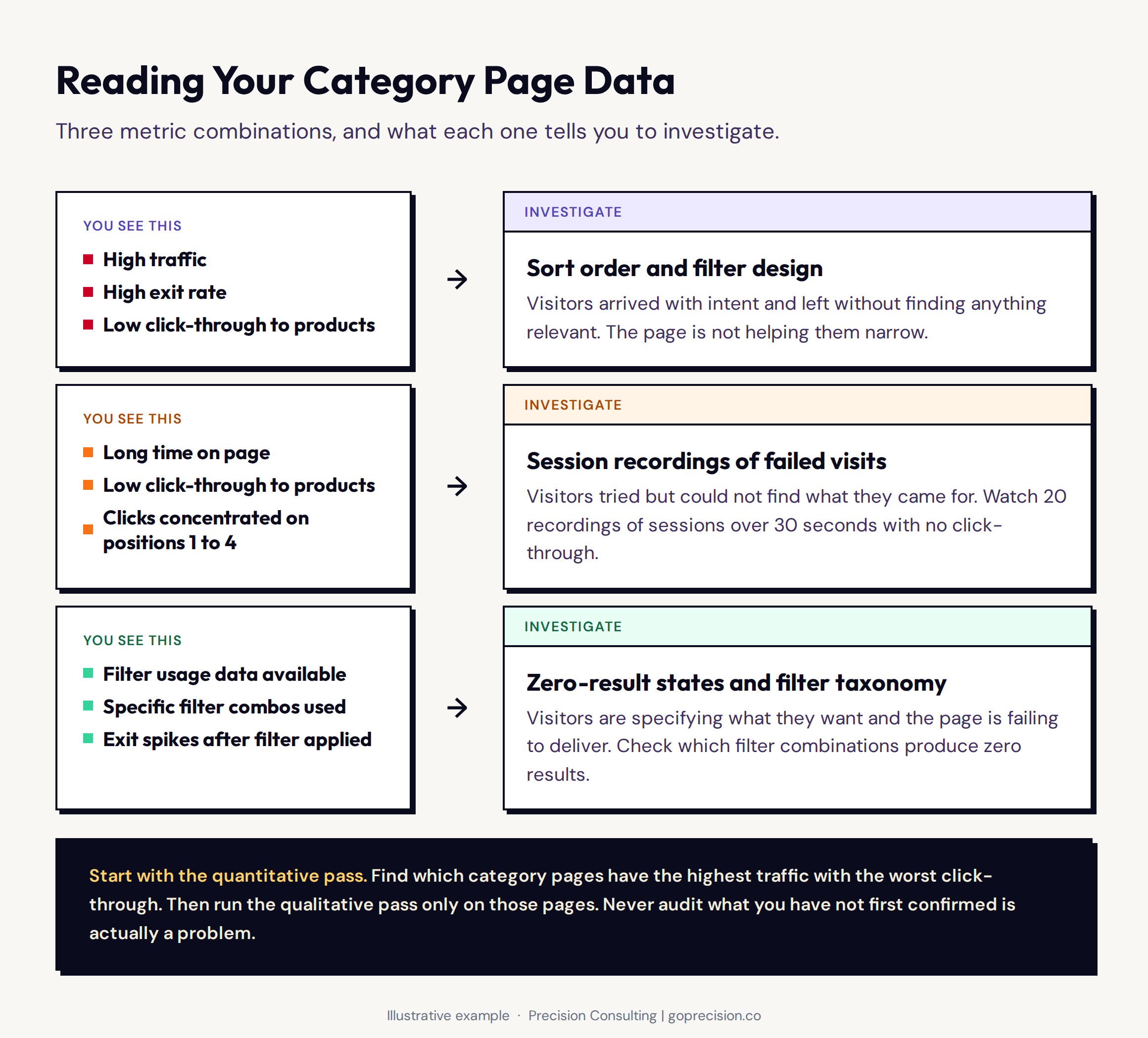
The metric combinations that identify category page failure type before any qualitative investigation begins.
The qualitative pass: find out why
Watch at least 20 session recordings of visitors who spent more than 30 seconds on a category page and left without clicking on a product. That specific filter gives you the highest-intent failed visits: people who genuinely tried to find something and could not. Heatmaps and session recordings used together give you two complementary views of the same failure.
Look for four things. How far do they scroll before leaving? Whether they engage with filters at all. Where their cursor moves relative to the product grid. Whether they reach the end of the visible product set before leaving. A visitor who scrolls to the bottom without clicking anything is telling you the page did not contain what they came for. A visitor who applies filters, hits zero results, and immediately exits is telling you the filter combination they need does not exist in your inventory. Both are actionable. Neither requires guessing.
- Category pages are the most consistently underprioritised funnel stage in e-commerce CRO. Most programmes start at product pages and miss the step before entirely.
- When a visitor exits from a category page, the default assumption is low intent. The more accurate assumption is a navigation failure. They arrived ready to look. The page did not help them find anything worth clicking.
- Sort order is the highest-leverage variable. A default sort that shows newest arrivals rather than intent-matched products makes the visitor do the relevance work the page should be doing. Most stores have no sort strategy at all.
- Filter design is the second-highest-leverage variable. Baymard Institute research shows 42% of e-commerce sites have critically inadequate filtering. Generic filters across all categories solve the wrong problem for every category.
- Product cards are a half-second interview. The right balance is: image, name, price, reviews, and one differentiating signal. Too little forces unnecessary click-throughs to evaluate. Too much creates visual noise that slows the browsing decision.
- Zero-result states are where your highest-intent visitor gets your worst response. Show alternatives, suggest which filter to relax, and make it trivial to remove the most restrictive constraint.
- Category page CRO must account for SEO impact. Changes that remove on-page content in favour of pure visual grids can improve navigation while damaging organic search performance. Both audiences need to be served.
Frequently asked questions
What is category page CRO?
Category page CRO is the practice of improving how effectively product listing pages help visitors find products worth clicking on. The goal is to increase click-through rate to product pages by improving sort order, filter design, product card information, and how the page handles edge cases like zero-result states. Most stores underinvest here relative to the revenue opportunity because the conversion event (the purchase) happens downstream on the product page and checkout, making category page abandonment harder to attribute.
Why do category pages have lower conversion rates than product pages?
Category pages are browse environments. The visitor has not yet identified a specific product to evaluate. The conversion action is a click-through to a product page, not a purchase. If the page does not help visitors narrow down from many products to the relevant few quickly enough, they exit. Most category pages create that friction through poor sort defaults, inadequate filtering, and inconsistent product presentation.
How do I know if my category pages are underperforming?
The clearest signal is high traffic with high exit rate and low click-through to product pages. The most diagnostic signal is long median time on page with no click-through. That combination means visitors are engaged enough to stay but unable to find what they came for. Session recordings of those specific visitors will tell you why more accurately than any analytics report alone.
Should I optimise category pages or product pages first?
Find out where the larger drop-off is. If you are losing a significant share of visitors at the category page before they ever reach a product page, start there. If click-through rates from category to product are reasonable but add-to-cart rates are low, fix the product page. The funnel metrics answer this question. Assumptions do not.
What is the most common category page CRO mistake?
Treating it as a design problem rather than a navigation problem. Most redesigns focus on visual refresh while leaving the sort order, filter taxonomy, and product card logic unchanged. A category page can look completely different after a redesign and perform identically if the underlying information architecture is the same. The aesthetic is not the problem. The navigation is.
Category pages are the most consistently underinvested funnel stage in e-commerce CRO, not because they are hard to fix, but because nobody is measuring them as a funnel stage in the first place. The stores that close that gap gain ground on every paid visit and every organic session without increasing their acquisition budget. If you want a structured read on where your category pages are losing revenue, our audit engagement starts there.
Information Architecture for the Web and Beyond by Peter Morville and Louis Rosenfeld covers how navigation systems and labelling affect whether users can find what they are looking for. Don't Make Me Think by Steve Krug covers web usability with particular relevance to navigation and browse behaviour. Predictably Irrational by Dan Ariely covers choice overload and how too many undifferentiated options reliably reduce purchase rates.
