Last updated:
Cognitive load is the total mental effort a page demands from a visitor at any given moment. In e-commerce, it is one of the strongest predictors of abandonment, and one of the hardest causes to see.
I have audited enough product pages to know the version of this that shows up most. Good product. Decent photography. Competitive price. Clean checkout. Conversion stuck at 0.8%, and nothing moves it. The founder has tested the headline, tweaked the CTA colour, rebuilt the checkout. None of it lands. I usually find the answer within the first two minutes of looking: the page is doing too much.
The number of options, the competing CTAs, the trust badges stacked three rows deep, the product description trying to say everything at once. The page is not broken. It is just exhausting. And exhausted buyers leave.
At Precision, cognitive load is one of the first things we map in every product page audit. Before recommending copy changes or design updates, we look at what the page is asking buyers to process and what they are spending working memory to do. See how an engagement works before deciding whether the timing is right for your business.
What cognitive load actually is
Your working memory has roughly four slots. That is the number your brain can actively hold and process at the same time. Research by Nelson Cowan put the ceiling at four; George Miller's earlier work suggested seven, plus or minus two. The practical ceiling most UX practitioners work from is four.
What that means for your product page: every element is competing for one of those slots. Your product name, your price, your main image, your add-to-cart button, your trust badges, your size guide, your delivery estimate, your review stars, your cross-sell recommendations. Each one is a claim on memory the buyer has to process before deciding.
When those claims exceed what working memory can comfortably hold, the buyer does not slow down and work harder. They stop. They leave. Or they do something far more damaging: they defer. They tell themselves they will come back. They almost never do.
Cognitive load sits alongside the broader set of cognitive biases that govern buying behaviour. The full picture, from anchoring to loss aversion to social proof, is covered in the breakdown of the psychology of e-commerce conversions.
Miller's Law: Working memory can hold approximately seven items at once, plus or minus two, according to Miller's original 1956 research. More recent work by Nelson Cowan puts the functional ceiling closer to four. Either way, a product page with twelve competing elements has long since exceeded it. Every element not directly contributing to the purchase decision is consuming a slot the buyer needed for something else.
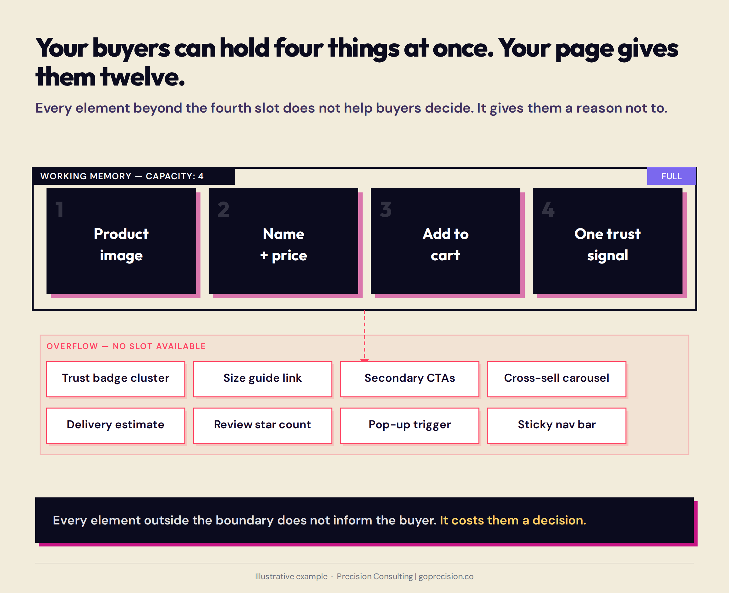
Each element on a product page competes for one of four working memory slots. A typical unoptimised page exceeds that limit before the buyer has reached the price.
What Hick's Law means for your product pages
Every choice you add to a page asks the buyer to do something before they can move forward: evaluate it, compare it to the other options, and decide whether to act on it or ignore it. That work takes time. And the more choices you add, the longer it takes. Not linearly, but exponentially.
The principle is Hick's Law, established in 1952 and replicated consistently in interface design research ever since. For e-commerce, the implications are direct. Every additional choice you present on a product page increases the time the buyer spends before acting, and increases the probability they will not act at all.
This includes variant selectors with too many options, size guides that require interpretation, cross-sell carousels offering six products below the add-to-cart, and navigation menus with fifteen categories visible from the product page.
The fix is not to remove choices that buyers need. It is to remove choices that buyers do not need at the moment of purchase, and to sequence the ones they do need so only one is active at a time.
Hick's Law: Decision time increases logarithmically with the number of available choices. In interface design, this means every additional option adds friction to the decision. The goal is not to eliminate choices but to present them sequentially rather than simultaneously: one decision at a time, in the order the buyer is most likely to need to make them.
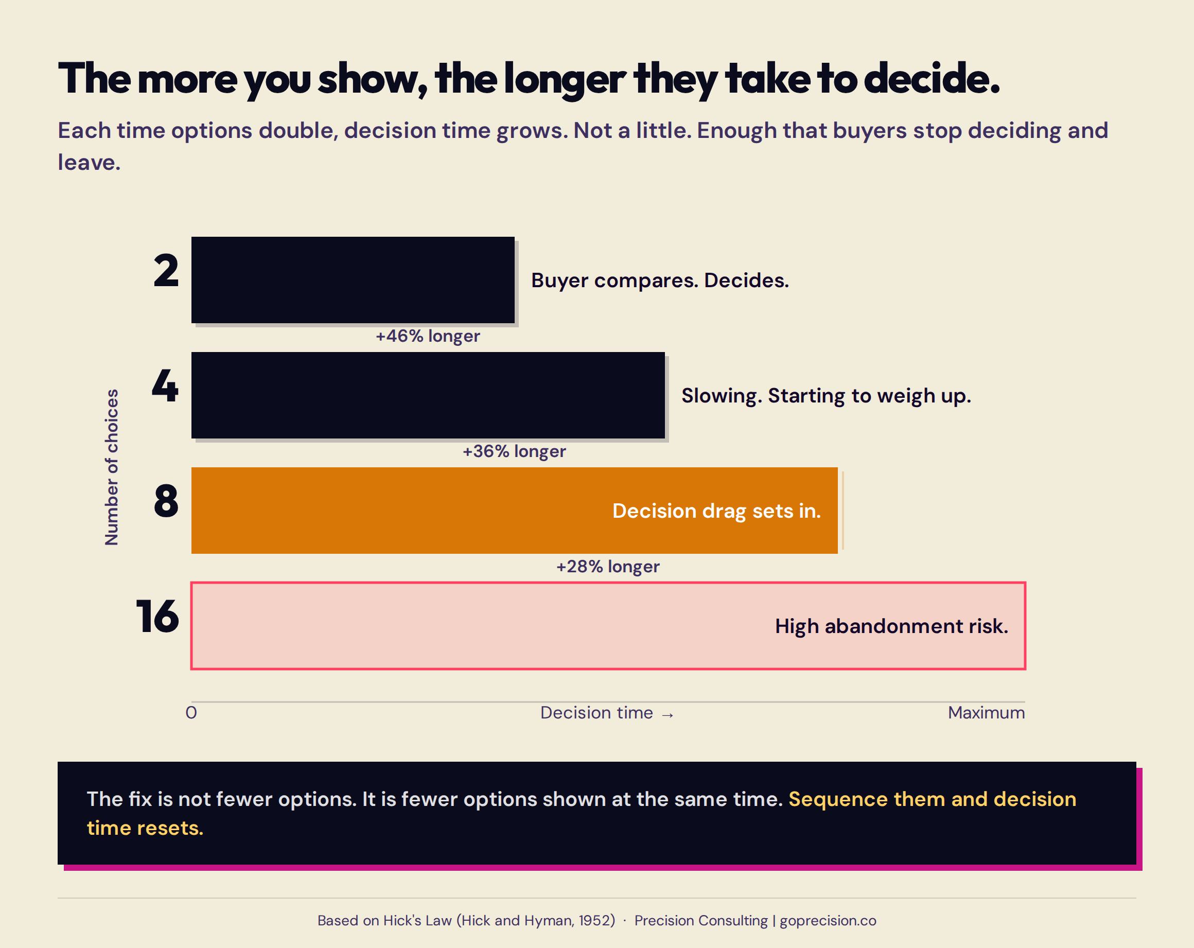
As the number of choices doubles, decision time rises exponentially. Adding a second CTA does not just create one more option: it multiplies the cognitive work required before the buyer can act on either.
What the jam study tells us about e-commerce
The most-cited demonstration of choice overload comes from Sheena Iyengar and Mark Lepper's research at a California gourmet store. A tasting booth offering 24 varieties of jam attracted more visitors than one offering 6. But the booth with 6 varieties converted buyers at ten times the rate. More choice drew attention. Less choice drove purchase.
The e-commerce equivalent is the product grid that leads with 48 SKUs versus one that leads with 6, or the single-product page that offers seven colour variants displayed simultaneously versus one that reveals them progressively. The conversion pattern follows Iyengar and Lepper's finding every time.
When Procter and Gamble reduced their Head and Shoulders line from 26 varieties to 15, removing the least popular options, sales increased by 10%. The elimination of choice, counter-intuitively, made the remaining options feel more valuable and easier to commit to.
Cognitive load analysis sits at the start of every Precision engagement because it sits upstream of every other conversion lever. If you want to see exactly where your product pages are creating friction before you invest in fixes, request your free audit and we will walk through the diagnostics together.
How cognitive load hides on your product pages
The reason high cognitive load is so hard to find in your own store is that every element on the page has a story. The trust badges were added after a customer complained. The cross-sells came from a consultant who said they would lift AOV. The sticky header was a developer suggestion. The pop-up captures emails. Each decision made sense at the time. What nobody calculated was the cost of all of them running simultaneously on a phone screen in front of a buyer who arrived with a single question.
Your trust signals are working against each other
A product page with a Trustpilot logo, a security badge, a 30-day returns banner, a money-back guarantee icon, a free shipping bar, and review stars in the header has six separate trust signals. Each one was added to increase buyer confidence. Together they create visual noise that reads, not consciously but functionally, as desperation.
One strong, specific trust signal outperforms six generic ones. "Over 12,400 verified buyers" is more effective than a cluster of badges because it is specific, because it requires no interpretation, and because it occupies one working memory slot rather than six. The principles behind which trust signals convert and where to place them are covered in the breakdown of 8 e-commerce trust signals and where to place each one.
Open your highest-traffic product page and count every distinct visual element above the fold on mobile. Include nav items, trust badges, review stars, product images, variant selectors, price displays, delivery estimates, and CTAs. If the count exceeds eight, you have a cognitive load problem. Go through your trust signals and ask: if you could keep only one, which would a buyer find most credible? Keep that one. Move the rest below the fold or remove them entirely.
Multiple CTAs that compete with each other
"Add to cart." "Buy it now." "Add to wishlist." "Save for later." "Add to compare." Each button is a decision. The buyer's working memory has to evaluate each option, understand the difference between them, and choose one. Most buyers in this situation choose none of them.
Every usability study that has tested single versus multiple CTAs has returned the same result: one primary CTA converts better. Secondary actions (wishlist, save, compare) should be available but not competing visually with the add-to-cart. If they are the same size, the same colour, or in the same visual band, they are competing. If they are visually subordinate and placed below or beside the primary CTA, they are not.
In your theme settings, identify every button and clickable action visible above the fold on your product page. Make exactly one of them primary: full colour, full width, unmistakable. Make everything else secondary: outline style, smaller, or below the fold entirely. The buyer's eye should land on the primary CTA immediately without having to evaluate alternatives first.
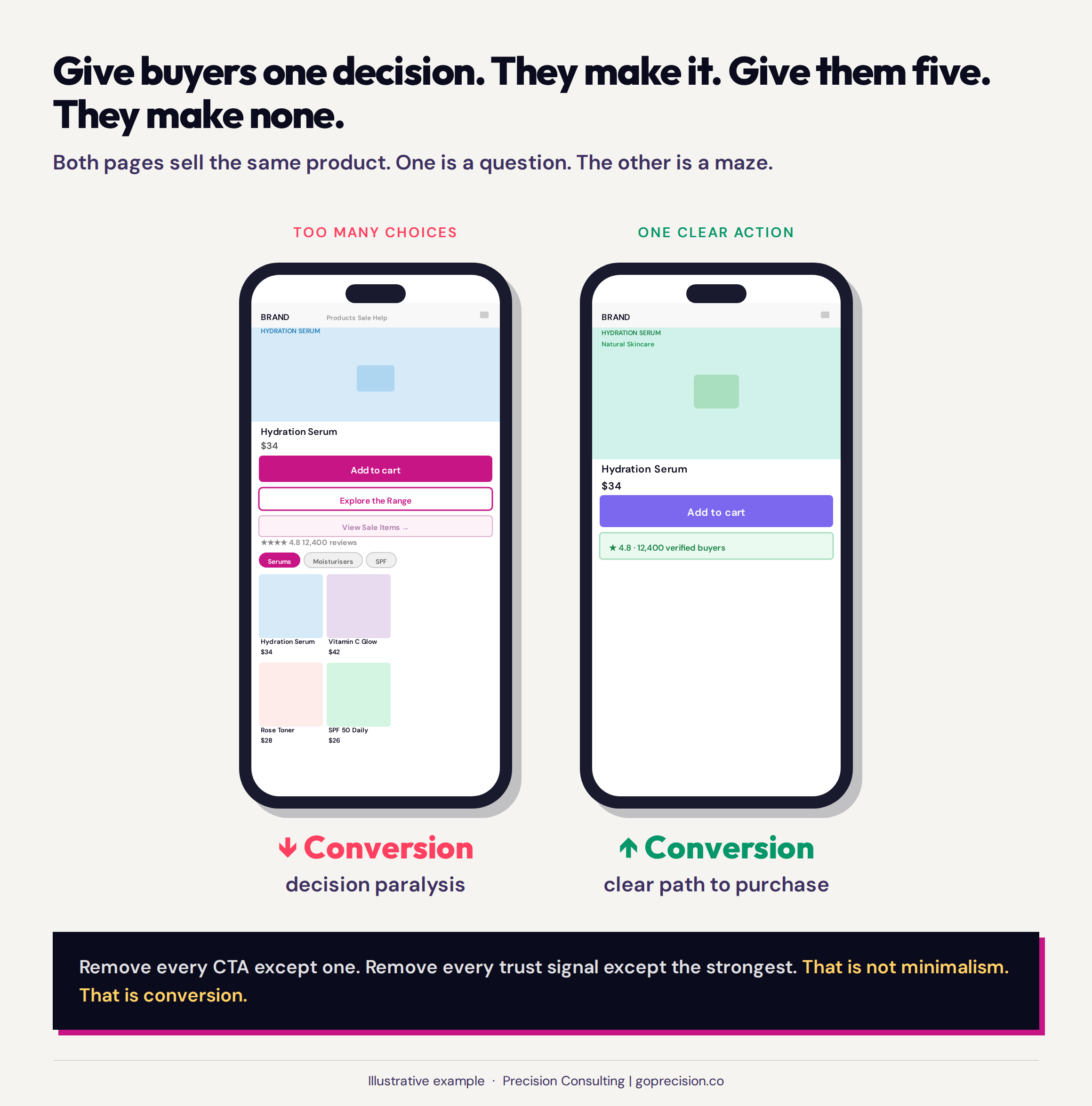
Both pages contain the same product information. The simplified version presents one decision at a time. That sequencing, not the information itself, is what drives the conversion difference.
Product descriptions that try to say everything
The product description is where cognitive load gets its most polite justification. Every item in a 600-word block of unbroken prose was added because someone decided it was useful: the origin story for brand trust, the certifications for credibility, the care instructions for returns reduction. Each argument is reasonable. The reader is still overwhelmed.
The function of a product description is to answer the specific question standing between the buyer and the purchase decision. Every buyer has a different question. Some need to know the material. Some need to know the size. Some need to know the delivery time. A description that tries to answer all questions simultaneously answers none of them effectively.
The format that works: a short paragraph (two or three sentences) for the buyer who wants the quick version, followed by a structured list of key attributes, followed by expandable sections for the buyer who needs depth. This allows the buyer to navigate to their specific question without processing everything else first.
How to audit your own cognitive load
The audit costs nothing and takes fifteen minutes. Pull up your highest-traffic product page on a mobile device you have not tested on before: your spare phone or a colleague's. Set a timer for eight seconds. Write down everything you notice. Then write down everything you cannot explain the purpose of.
What you notice in eight seconds is what buyers use to make their decision. What you cannot explain is what is costing you conversions. The first list shows you what is working hard enough to register. The second list is your removal queue.
The five-second test
The five-second test is a formalised version of this audit. Show a user your product page for five seconds and then ask them: what do you remember? What is the product? What does it cost? What would you do next? If they cannot answer those three questions from a five-second exposure, the page has a hierarchy problem.
The most important information is not reaching buyers before cognitive overload sets in. The principles of visual hierarchy and which elements should occupy the above-the-fold zone are covered in the product page design framework. Tools like UsabilityHub run the five-second test with a panel of real users if you want quantitative results. An informal version run with five or six people unfamiliar with your store gives you the signal you need to identify the hierarchy problems worth fixing.
Session recordings as a cognitive load diagnostic
Watch twenty session recordings on your product page, specifically on mobile. You are looking for one behaviour: the rapid scroll. A buyer who lands on a product page and immediately scrolls from top to bottom without stopping is not exploring. They are searching. They cannot find what they need in the first visual pass, so they are scanning the whole page looking for the answer to their specific question.
The rapid scroll is the signal. It means the hierarchy of information on the page is not matching the sequence of questions the buyer actually has. Find the most common exit point in those twenty recordings: where do buyers stop and leave? The answer they needed is almost always just below that line. Move it up. That is the entire intervention.
Session recordings are most useful alongside heatmaps, which show where buyers pause rather than where they scroll past. How to use the two tools together, and which to open first, is covered in the guide to heatmaps versus session recordings.
- Cognitive load is the total mental effort a page demands. Working memory holds approximately four items at once. Every unnecessary element on a product page is competing for one of those slots.
- Hick's Law: decision time increases with the number and complexity of choices. Every additional option adds friction. The goal is not fewer choices overall, but fewer choices presented simultaneously.
- Iyengar and Lepper's jam study found that a booth with 6 varieties converted at ten times the rate of one with 24. When Procter and Gamble cut Head and Shoulders from 26 to 15 SKUs, sales increased by 10%.
- Multiple competing CTAs consistently underperform a single primary CTA. Make one action unmistakably primary. Make everything else visually subordinate or below the fold.
- Trust badge clusters create visual noise that reads as desperation, not credibility. One specific, quantified trust signal outperforms six generic badges.
- The cognitive load audit: count every distinct visual element above the fold on mobile. More than eight elements is a signal. Remove the ones with the weakest direct connection to the purchase decision.
- The rapid scroll in session recordings is a cognitive load signal. The buyer cannot find what they need in the first visual pass. The exit point tells you where the missing information needs to go.
Frequently asked questions
What is cognitive load in e-commerce?
Cognitive load in e-commerce refers to the total mental effort a product page or website demands from a visitor at any given moment. Human working memory can hold approximately four discrete pieces of information at once. When a page presents more competing elements than working memory can comfortably process, buyers experience friction that leads to abandonment or deferral. High cognitive load is one of the most common causes of a low conversion rate on a store where the product, price, and photography are all reasonable.
What is Hick's Law and how does it apply to product pages?
Hick's Law states that the time it takes to make a decision increases with the number and complexity of available choices. In e-commerce, this applies to variant selectors, navigation menus, CTAs, cross-sell options, and any other element that presents the buyer with a choice. The fix is not to remove choices the buyer needs but to present them sequentially rather than simultaneously: one decision at a time, in the order the buyer is most likely to need to make them.
How do I reduce cognitive load on my product pages?
Start by counting every distinct visual element above the fold on your product page on mobile. More than eight elements is a strong signal of cognitive load problems. Remove or move below the fold any element not directly contributing to the purchase decision. Consolidate trust signals to the single most credible one. Make one CTA visually primary and everything else subordinate. Restructure product descriptions to lead with two or three sentences that answer the most common buyer question, with depth available in expandable sections below.
What is the jam study and what does it tell us about e-commerce?
Sheena Iyengar and Mark Lepper's jam study placed tasting booths with either 24 or 6 varieties of jam in a gourmet grocery store. The larger selection attracted more visitors but converted buyers at one-tenth the rate of the smaller selection. The research established the concept of choice overload: the finding that beyond a certain point, more options reduce the probability of any purchase being made. In e-commerce, this pattern appears in product grids, variant selectors, filter interfaces, and navigation structures.
Does simplifying a product page increase conversion?
Consistently, yes. Removing competing elements, consolidating trust signals, reducing the number of simultaneous choices, and establishing a clear visual hierarchy for CTAs reliably increases conversion rates on pages where cognitive load was the primary friction. The degree of improvement depends on how far from the optimum the starting state was. Stores with heavily cluttered product pages see larger improvements than stores whose pages were already reasonably focused.
If you want to understand exactly which elements of your product pages are creating cognitive overload and where that friction is costing you conversions, our CRO services include a product page cognitive load audit as part of every diagnostic engagement. The audit maps what each element is asking buyers to process, identifies what to remove and what to resequence, and gives you a prioritised fix list for the pages where simplification will return the most.
Predictably Irrational by Dan Ariely: covers the systematic irrationality that makes buyers susceptible to choice overload and decision paralysis in ways they cannot consciously detect, which is the psychological root of the cognitive load problem every product page faces.
Influence by Robert Cialdini: explains why one strong, specific trust signal outperforms a cluster of generic badges, and why reducing the cognitive effort required to trust a product is as important as the trust signal itself.
Don't Make Me Think by Steve Krug: the foundational argument that digital usability depends on minimising the cognitive effort users need to navigate a page, directly applicable to every product page decision covered in this article.