Last updated:
Most e-commerce sites convert below 2% not because they lack traffic, but because they have unresolved friction at three specific points: the product page, the cart, and the checkout. Those are the pages where the buying decision is made, and most stores have never audited them properly.
The mistake I see most often is teams responding to a low conversion rate by buying more traffic. More ad spend. More influencer campaigns. More email sequences to warm the list. Running more traffic into a leaking funnel does not fix the funnel. It empties the budget faster. Think of it like running water into a bucket with a hole in the bottom. The problem was never the tap. Most stores already have enough traffic to diagnose and fix their conversion rate problem. A store converting at 1.2% and spending on acquisition would almost always see a better return from fixing the three pages described below than from increasing ad spend.
What a sub-2% conversion rate is actually telling you
A conversion rate below 2% tells you that more than 98 out of every 100 visitors are leaving without buying. Some of those exits are expected. Browsers. Researchers. People who arrived on the wrong page. Those exits are structural and cannot be meaningfully reduced.
The exits that can be reduced are the ones happening at high-intent pages: visitors who arrived on a product page via a specific search query, added something to their cart, or reached the checkout and then stopped. Those are not browsers. Those are buyers who did not complete the transaction. The question is why.
The answer is almost always in one of three places. Not the ads. Not the email funnel. Not the homepage. The product page, the cart, and the checkout. Fixing those three in the right order is where most sub-2% stores find their conversion improvement.
Why the product page is where most conversion is lost
Here is a pattern that comes up in almost every audit I run. The product page is answering the questions the seller wants to answer, not the questions the buyer is actually asking.
Think about it from the buyer's position. They have arrived from an ad or a search result. They have no prior relationship with the brand. They are not reading the product description from top to bottom. They are scanning for four things: does this product do what I need it to do, can I trust this brand enough to hand over my card, what happens if it is wrong or does not fit, and how much is the total cost including delivery.
Most product pages answer the first question at length. They answer the other three poorly or not at all. The returns policy is buried in a footer. The delivery cost only appears at checkout. The review count is low, the star rating is an aggregate that tells the buyer nothing about their specific use case, and there is no visible signal that other people like them have bought this and been satisfied. A full breakdown of which trust elements belong where is covered in the trust signals guide on this site.
The review count problem
Review quantity and review quality are different problems. A product with 11 reviews at 4.9 stars typically converts worse than a product with 340 reviews at 4.3 stars. The mechanism is straightforward: the buyer's uncertainty is higher with 11 reviews because the sample is too small to trust. The 4.3-star average across 340 real buyers is more persuasive than a near-perfect score from a handful.
Research from the Spiegel Research Center at Northwestern University found that displaying five or more reviews increases purchase likelihood by 270% compared to a product with no reviews. The same research also found that products at 4.0 to 4.5 stars can outperform products at 5.0, because a perfect score reads as suspicious to many buyers. The most credible product is not the most perfect one. It is the most honest one.
The trust gap above the fold
The fold is a real constraint. The information visible without scrolling is the information most buyers use to make the go-or-stay decision. If your product page has the star rating below the fold, the returns policy in the footer, and no visible delivery estimate, you are asking buyers to trust you before you have given them a reason to.
In a Precision audit on a DTC apparel brand with a 1.1% mobile conversion rate, the product page above the fold had: a product image, a price, and an Add to Cart button. Nothing else. No star rating. No review count. No delivery estimate. No returns signal. We added a returns guarantee line directly beneath the price, pulled the star rating and review count to just below the product title, and linked a size guide from the product images. Mobile conversion moved from 1.1% to 1.9% in eight weeks. The product did not change. The information architecture did.
Mere Exposure Effect and trust signals: buyers do not consciously evaluate every element of a product page. They form an impression in the first few seconds of scanning. That impression is heavily influenced by what is visible without effort. A returns policy buried in a footer is functionally invisible to most buyers. A returns guarantee placed directly in the purchase zone is read and processed. The placement is not a design choice. It is a conversion variable.
Before increasing ad spend: check that your product page above the fold has a visible star rating and review count, a returns guarantee in the purchase zone, and a delivery estimate or cost on the page. If those four elements are missing or below the fold, fixing them will produce a faster return than any ad spend increase.
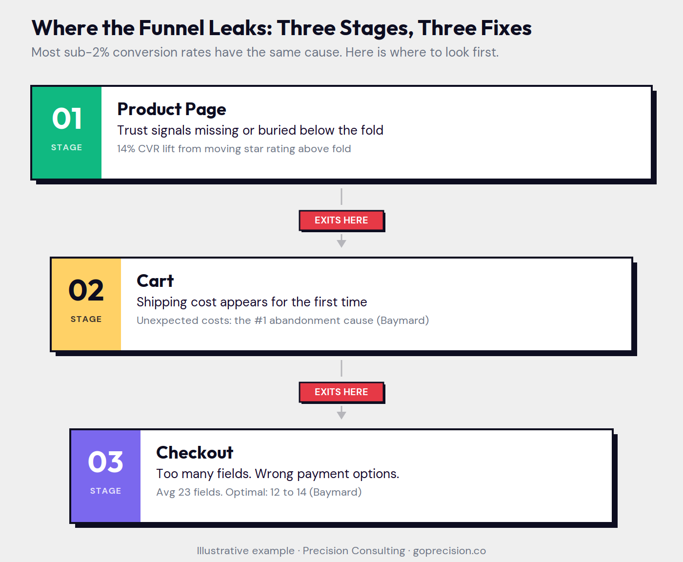
The three leak points in a sub-2% conversion funnel. Each stage has a specific, addressable friction pattern.
Why the cart converts worse than it should
The cart is the moment of maximum doubt. The buyer has decided to purchase but has not yet committed financially. At this exact moment, most e-commerce carts do two things that erode conversion: they reveal costs that were not visible on the product page, and they offer distractions that pull the buyer's attention away from completing the transaction.
Hidden costs and cart abandonment
Baymard Institute, which tracks checkout behaviour across thousands of e-commerce sites, found that unexpected extra costs, including shipping, taxes, and fees appearing for the first time at cart or checkout, account for the largest single share of checkout abandonment. The buyer's mental model was set at the product page price. When the cart total is meaningfully higher, the decision has to be made again from scratch. Some buyers make it. Many do not.
The fix is not necessarily free shipping, though that removes the problem entirely. The fix is visible delivery cost information at the product page stage, before the buyer has made the mental commitment to the price they saw. The shipping cost that appears on the product page is a decision factor. The shipping cost that appears on the cart page is a surprise. Surprises at the moment of commitment drive abandonment. For a full breakdown of why carts are abandoned and how to address each cause, the cart abandonment guide covers the data in detail.
The cart is not a holding area
Most carts are designed as a list of items with a total and a checkout button. That is the minimum viable cart. A higher-converting cart treats itself as the last persuasion surface before checkout. A single line of social proof, such as the number of customers who ordered this month, a visible returns guarantee, and a clear total including all costs reduce the doubt that kills transactions at this stage.
The buyer in the cart is not browsing. They are on the verge of committing. The cart's job is to not unmake a decision that was already made on the product page.
If you want to know which of these three pages is leaking the most conversions on your specific store, request your free audit and we will identify the highest-leverage fix first.
Why the checkout loses buyers who were ready to purchase
Baymard Institute's research across thousands of checkout flows puts the average checkout abandonment rate at approximately 70%. That means for every 10 buyers who reach the checkout, 7 leave without completing the transaction. The average checkout has 23 form fields. The optimum, based on the same research, is 12 to 14.
Most of those extra fields are not required to process the transaction. They are there because someone added them without ever asking whether the buyer needed to provide that information at that moment. A phone number is optional for most product categories. Separate fields for first name and last name instead of a single full name field is an extra tap on mobile. A company name field appearing as required on a consumer purchase is friction from a B2B checkout template that was never stripped out.
Mobile checkout friction
A checkout that converts at 3% on desktop and 1.1% on mobile is not a mobile-specific problem. It is a checkout problem that is amplified on mobile. The same friction that is tolerable on a laptop with a full keyboard becomes critical on a phone with a small screen.
The highest-leverage mobile checkout improvements are consistent across stores: one-page checkout instead of multi-step, express payment options (Apple Pay, Google Pay, Shop Pay) as the primary payment call to action rather than buried in a list, and field count reduction to the absolute minimum required to ship the product. These three changes consistently move mobile checkout conversion for stores that have never addressed them.
Trust at checkout
The checkout is where buyer confidence is most fragile. They are about to enter their card details on a site they may have found 20 minutes ago. The trust signals that matter here are specific, not generic. A "secure checkout" label and a padlock icon are so standard they are invisible. What reads as trustworthy at checkout is: a visible returns policy (not a link to the policy page, but the policy itself summarised in a sentence), a delivery estimate with a specific date rather than a range, and payment processing by a recognisable provider.
This is not a checklist to tick. It is a reading of the buyer's mental state at the most critical moment in the funnel. They are asking one question: is it safe to give these people my card number? The checkout's job is to answer that question before they ask it out loud.
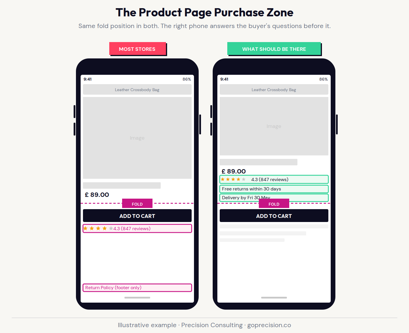
Product page anatomy: the four trust elements that belong in the purchase zone, and where most stores put them instead.
Why more traffic is the wrong response
Here is what actually happens when a store with a 1.5% conversion rate doubles its traffic budget without fixing the product page, cart, and checkout. The conversion rate does not hold flat. It dips. The existing audience was the best one: highest intent, most familiar with the brand, closest to the purchase decision. Every additional pound of ad spend buys incrementally less qualified traffic. That marginal audience converts at a lower rate. Revenue increases because volume increases, but efficiency falls.
The store concludes the ad spend worked because the revenue line went up. It worked. But it worked less efficiently than it should have, and the underlying problem is still there. A store that fixes conversion first and then scales traffic compounds from a higher base, with lower cost per acquisition, because a tighter funnel performs better across both the existing audience and the marginal one.
In work at Precision, the pattern is consistent: stores under 2% almost always have a product page or checkout issue that is easier to fix than it looks and produces measurable results within weeks. The stores that fix conversion first, then scale traffic, grow faster and spend less doing it.
Sunk cost bias in acquisition: teams that have been running ads for months find it psychologically harder to redirect that budget toward conversion fixes. The ad spend feels productive because it generates sessions and data. The conversion fix feels abstract because the result is a rate change, not a new channel. The rate change is worth more. A 0.5 percentage point improvement in conversion rate compounds on every visitor already arriving, including every visitor the ads are sending.
What to fix first to improve your conversion rate
Start with the product page. It is the highest-leverage surface because it is where the decision to buy is first made. Before spending time on the cart or checkout, make sure the product page has: a visible star rating and review count above the fold, a returns guarantee in the purchase zone, a delivery estimate or cost on the page, and reviews specific enough to address the buyer's likely objection.
Then the cart. Add delivery cost transparency before this stage so there is no surprise at the total. Add a single line of social proof and a visible guarantee. Remove any element that distracts from the single action you want the buyer to take.
Then the checkout. Reduce field count to the minimum required to ship the product. Enable express payment options and make them the primary call to action, not a secondary option. Add a returns summary and delivery estimate in the order summary panel. Remove anything that is not contributing to completing the transaction.
For a full field-by-field diagnostic across all three surfaces, the CRO audit checklist covers each page with specific questions for every element. It is the fastest way to identify which page is leaking the most conversions on your specific store.
Precision works with growth-stage e-commerce brands to identify and fix the specific friction points that are costing the most revenue. If you want to know which of the three pages is the highest-leverage fix on your store, book a call and we will walk through your funnel together. Or start with the full audit process to see what a structured conversion review looks like before committing.
Predictably Irrational by Dan Ariely covers how hidden costs and pricing transparency affect decision-making, which underpins the cart abandonment section. The chapter on the pain of paying is directly applicable to why surprise shipping costs drive exits at the cart stage.
Don't Make Me Think by Steve Krug covers the usability principles that apply directly to product page and checkout design, including why clarity at the decision moment consistently outperforms persuasion.
- Most e-commerce sites convert below 2% because of friction on three specific pages: the product page, the cart, and the checkout. More traffic does not fix a leaking funnel.
- The product page must answer the buyer's four actual questions: does this work for me, can I trust this brand, what happens if it is wrong, and what is the total cost? Most product pages answer only the first.
- Review count matters as much as star rating. Spiegel Research found that displaying five or more reviews increases purchase likelihood by 270%. A 4.3-star average across 340 reviews outperforms a 4.9-star average across 11.
- Hidden costs appearing at the cart are the single largest driver of checkout abandonment, per Baymard Institute research. The shipping cost visible on the product page is a decision factor. The shipping cost appearing in the cart is a surprise that drives abandonment.
- Baymard Institute puts average checkout abandonment at approximately 70%. The average checkout has 23 form fields. The optimum is 12 to 14. Reducing field count is the single highest-leverage checkout change for most stores.
- Mobile checkout converts worse than desktop not because it is a mobile problem, but because existing friction is amplified on small screens. One-page checkout, express payment options, and field reduction consistently move mobile conversion.
- Trust at checkout is not built with a padlock icon. It is built with a visible returns policy, a specific delivery date, and a recognisable payment processor. Answer the buyer's question before they ask it: is it safe to give these people my card number?
- A store that fixes conversion first and then scales traffic grows faster. The conversion improvement compounds on every visitor already arriving. Scaling traffic into a broken funnel is paying to fill a leaking bucket.
Frequently asked questions
Why is my e-commerce conversion rate below 2%?
The most common causes are friction on the product page (missing trust signals above the fold, low review count, returns policy not visible in the purchase zone), unexpected costs appearing at the cart or checkout, and a checkout with too many form fields or no express payment options. These three pages are where most sub-2% stores are losing buyers who were already ready to purchase.
What is a good e-commerce conversion rate?
A store converting at 2 to 3% is performing around the category average for most sectors. Higher-performing stores with strong brand recognition in mature categories can reach 4 to 6%. The more useful question is not what the average is, but what is driving the gap between your mobile and desktop conversion rates and where in the funnel buyers are exiting. Those two data points identify the fix faster than any benchmark comparison.
What is the fastest way to improve my conversion rate?
Audit the product page first. Add a visible star rating and review count above the fold, a returns guarantee in the purchase zone, and a delivery estimate or cost on the page. These three changes are faster to implement than checkout restructuring and consistently produce measurable improvements within a few weeks for stores that have not addressed them.
How do I fix a low mobile conversion rate?
Mobile conversion issues almost always come from checkout friction. Enable express payment options (Apple Pay, Google Pay, Shop Pay) as the primary call to action. Reduce checkout field count to the minimum required to ship the product. Move to a one-page checkout format if you are currently on a multi-step checkout. These changes reduce the friction that is tolerable on a laptop but critical on a small screen.
Does page speed affect conversion rate?
Yes. Deloitte research found that a 0.1-second improvement in mobile page load time increases retail conversion rates by 8.4%. The effect compounds: every additional second of load time increases the probability of a visitor leaving before the page finishes loading. Page speed is a conversion variable, not a technical metric, and should be treated as part of the product page audit rather than a separate technical project.
How much does checkout abandonment affect e-commerce conversion?
Checkout abandonment is the most direct driver of sub-2% conversion rates for stores that already have meaningful traffic. Baymard Institute puts average checkout abandonment at approximately 70%, meaning 7 out of 10 buyers who reach the checkout leave without completing the transaction. Reducing that abandonment by even 10 percentage points has a direct and calculable impact on revenue that is typically larger than any equivalent increase in traffic spend.