Last updated:
CRO and UX are different disciplines that work on different layers of the same problem. CRO identifies and removes specific commercial friction points measured against a conversion metric. UX designs the experience to be clear, navigable, and logical for the person using it. Both affect revenue. But when you conflate the two, you spend budget on the wrong layer and spend months wondering why the numbers are not moving.
The confusion is understandable. Both involve research and iterative changes to the same interface. Both can move conversion. The difference is in what question each one starts from, and that starting question changes everything that follows. Get it wrong and you spend budget on a redesign when you needed a targeted fix, or you run tests on an experience so fundamentally broken that the results tell you nothing useful.
In the work we do at Precision, the CRO vs UX question comes up on almost every new engagement. Most stores are doing one or the other without a clear view of which problem they are actually solving. This article covers what each discipline actually does, where they overlap, where they diverge, and a clear framework for deciding which to invest in first.
What CRO actually is (and what it is not)
CRO is the practice of identifying exactly where visitors are dropping out of a commercial action, forming a specific hypothesis about why, and making a measurable change to address it. Every CRO intervention is tied to a number. If you cannot measure whether the change moved a conversion metric, it is not CRO.
Think of CRO as working out why people who walk into your shop leave without buying. You watch where they stop. You notice which shelf they stare at and then walk away from. You time how long the queue at the till runs before people abandon it. Then you change something specific and measure whether it helped. Observation, hypothesis, intervention, measurement. That is the discipline.
Without the diagnostic step, you have changes rather than optimisation. Most businesses skip straight to making changes and call it CRO. It is not. It is guessing with a testing tool attached.
CRO is not A/B testing. A/B testing is one method CRO uses to validate hypotheses. A programme built primarily around running tests without a diagnostic foundation produces inconclusive results regardless of how many tests are run. The diagnostic is where the value is, not the tool.
Before running any test, document the specific friction point you are targeting, the hypothesis behind the change, and the metric that will tell you whether it worked. If you cannot write those three things down, the test is not ready to run.
What UX actually is (and why good UX does not guarantee conversion)
UX is the practice of designing the experience so that using the site does not require effort. Navigation that makes sense. Pages that answer the question the visitor arrived with. Actions that feel obvious rather than figured out. When UX is working, visitors do not notice it. When it is not, they leave and cannot always tell you why.
Here is the thing most people miss: UX does not require a commercial outcome to be valid. A site can have excellent UX and a mediocre conversion rate if the offer is wrong, the pricing is off, or the trust signals are missing. Good UX removes experience barriers. It does not automatically solve commercial ones.
Think of UX as the layout and signage in a physical shop. Clear aisles, logical sections, and obvious signs pointing to what you need. A well-laid-out shop is easier to browse. But if the products are wrong, the prices are too high, and there is no one to help at the till, the layout does not close the sale. UX clears the path. CRO works out why people are still not buying once the path is clear.
UX reduces cognitive load: the mental effort required to complete a task. When cognitive load is high, users abandon rather than persist. But reducing cognitive load is not the same as removing commercial hesitation. A buyer who finds the checkout effortless but is not yet convinced the product is right will still not buy. CRO addresses the conviction layer that UX does not reach.
When auditing your store, run two separate reviews: one for navigability (can users find and complete actions without confusion?) and one for commercial effectiveness (do the right pages build enough conviction to convert?). Mixing them produces a list of changes that may or may not be solving the actual problem.
Where CRO and UX overlap and where they diverge
The overlap is real. A UX problem that makes checkout confusing will show up in your CRO data as checkout abandonment. Fixing it improves the conversion rate. So the fix looks like CRO and feels like UX, and every practitioner in the room will claim it.
The divergence is in the starting question. A UX designer approaching checkout abandonment asks: is this experience clear and logical for the person going through it? A CRO specialist asks: where exactly is the drop-off, what is causing it, and what specific change is most likely to move the number? Both might produce the same recommendation. The difference is that one of them can tell you whether it worked.
The best work sits in the overlap: changes that are both commercially validated and experientially better. The worst work is when each discipline operates without any awareness of the other. CRO tests that produce winners nobody on the design team can explain. UX redesigns that look cleaner and convert identically to what they replaced.
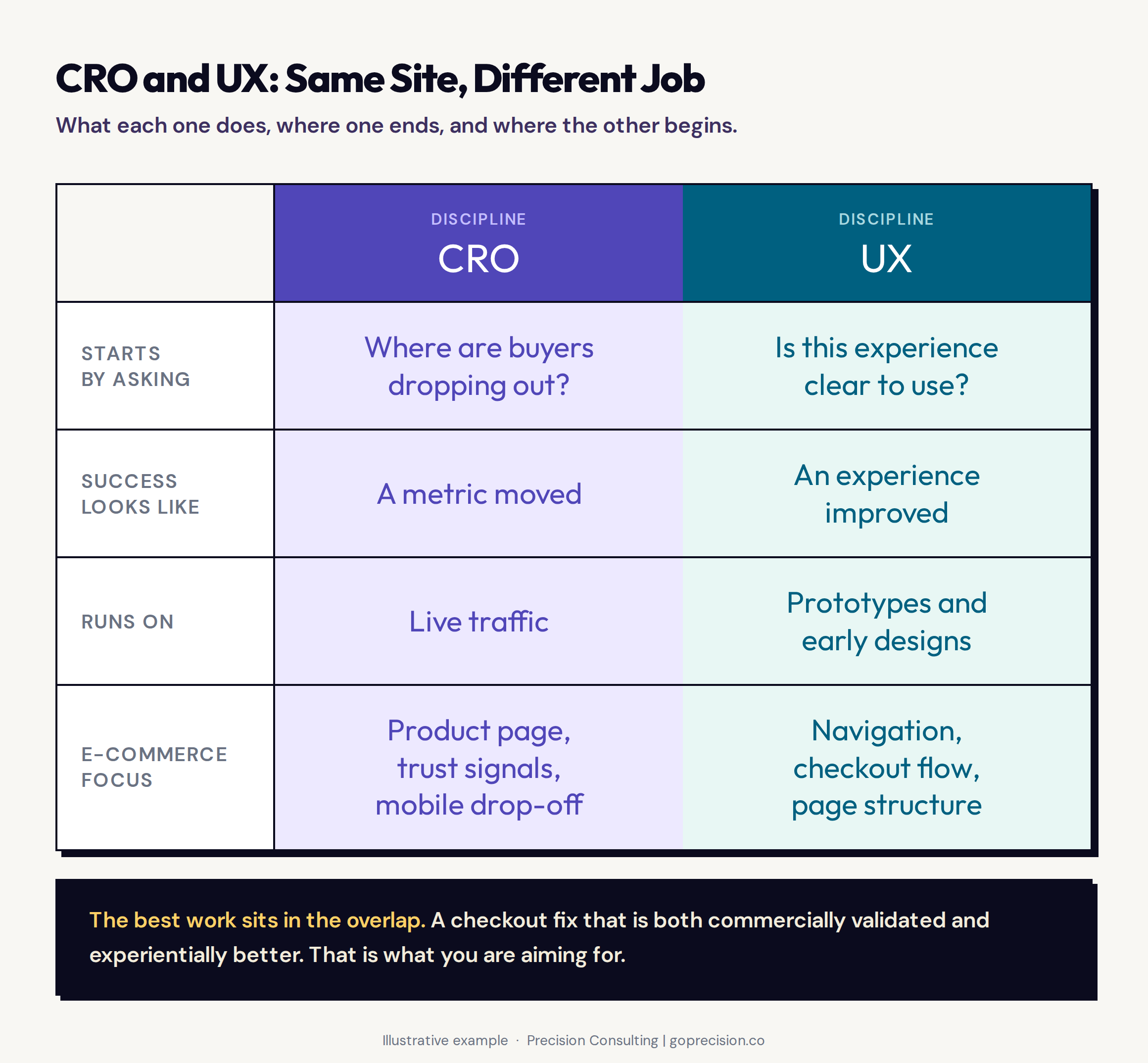
CRO and UX start from different questions and use different feedback loops. The confusion between them is how stores end up spending budget on the wrong layer.
Both disciplines draw on behavioural research, but they use it differently. UX research reveals how people experience the interface. CRO research reveals what that experience costs in commercial terms. A usability study tells you the checkout is confusing. A CRO diagnostic tells you the checkout is costing you 23% of buyers at step three specifically. Both are true. Only one tells you where to start.
Why the feedback loop is different in CRO and UX
UX work runs upstream of live traffic. Wireframes, prototypes, usability tests, and design reviews all happen before a real buyer ever sees the experience. The feedback is qualitative and relatively fast to gather.
CRO runs on live traffic. The feedback is real buyers making real purchase decisions, which means it is slower to collect but harder to argue with. A usability test with ten participants tells you the experience is confusing. A CRO test with 8,000 visitors tells you how much that confusion is costing you per month.
Both are worth running. Neither replaces the other. The error is using the fast qualitative read to make decisions that should be tested against real purchase behaviour.
Qualitative feedback reveals motivation and perception. Quantitative feedback reveals behaviour at scale. Neither alone is sufficient. A buyer who says in a usability test that they trust the site might still abandon at the payment step. Watch what buyers do with real money, not what they say in a controlled session.
Do not use a usability test with a small panel to make a decision about which checkout layout to ship to all traffic. Use the qualitative research to form the hypothesis, then validate it with a live test. Small panels reveal the what. Live traffic tells you the how much.
This is the kind of analysis we run in a Precision Deep Dive Audit: identifying whether your store is facing a UX problem, a CRO problem, or both, and sequencing the fixes accordingly. Request your free audit and we will walk through it together.
What e-commerce problems UX alone does not solve
General UX principles apply everywhere. But e-commerce has a specific set of problems that most UX work does not address by default, and CRO has to pick them up.
Trust is a CRO problem before it is a UX problem
In a physical shop, trust is ambient. You can see the merchandise, feel the quality, and read the body language of the staff. Online, the buyer is about to type their card details into a screen they found through a Google ad. Trust has to be manufactured from scratch, on every page, through signals they can see.
UX design rarely treats trust as a primary design concern. CRO almost always does, because the data makes it impossible to ignore. Review placement, security badge positioning, returns policy visibility, and social proof near the add-to-cart button are consistently among the highest-impact CRO interventions, and most of them require almost no design work. They just require knowing they matter and measuring whether they do. The trust signals placement guide covers where each signal has the highest conversion impact by page type.
Check where your reviews appear on your product page. If they are below the fold on mobile, the majority of your mobile visitors are making a purchase decision without seeing them. Move them above the fold. Measure the impact before making any other change to the page.
The buying decision lives on the product page, not in checkout
Most UX investment in e-commerce goes to navigation and checkout: making it easy to find things and easy to pay. Both matter. But the actual decision to buy happens on the product page, long before checkout. Everything the product page communicates about quality, value, fit, and trustworthiness determines whether the visitor reaches checkout at all.
You can have the smoothest checkout in your category and lose 70% of potential buyers before they ever start it, because the product page did not give them enough to commit. Product page CRO, covering image quality, information hierarchy, social proof placement, and price presentation, is where the most significant conversion opportunities live for most stores. UX on navigation clears the path to the product page. CRO on the product page determines how many people actually buy once they arrive.
The buying decision follows a sequence: attention, interest, desire, action. Most UX work addresses the attention and action layers (find it, pay for it). CRO addresses the interest and desire layers (why this product, why now, why from this store). A store that only invests in UX is optimising the start and end of the journey and leaving the middle unexamined.
Mobile is a diagnostic problem before it is a design problem
Most stores see 60% or more of their traffic on mobile and a significantly lower share of their revenue from it. The standard response is a mobile UX project: redesign the experience for smaller screens. Sometimes that is the right call. Often it is not.
Run the diagnostic first. Where specifically is the mobile funnel dropping relative to desktop? If mobile add-to-cart rates are fine but mobile checkout completion is 40% lower, the problem is in checkout, not in browse. A full mobile redesign addresses everything. A targeted CRO fix addresses the specific thing that is actually broken, faster, and for a fraction of the cost. The mobile CRO diagnostic walks through how to run this step by step.
Open your analytics and compare mobile versus desktop conversion rates at each funnel step separately, not overall. Step by step. The step with the biggest mobile-to-desktop gap is where you start. Not wherever feels most broken from the outside, and not wherever the last UX project left off.
How to decide which to prioritise first
There is no universal answer. But there is a reliable way to tell which one your situation is calling for.
Start with UX when the experience is structurally broken
If your session recordings show visitors who cannot find the navigation, who are clicking on things that are not buttons, or who are abandoning because the mobile layout is unusable, UX is the right investment. Not because CRO cannot help, but because the structural confusion is so loud that individual tests cannot hear what is actually broken underneath it.
Running an A/B test on your CTA copy on a site where 30% of mobile visitors cannot find the product images is not a good use of budget. Fix the structural problems first. Run the diagnostic. Then test.
Start with CRO when the experience is usable but conversion is low
If your store has been running for at least six months, you are spending on acquisition, the experience is generally navigable, and your conversion rate is below your category benchmark, CRO is the right move. The UX foundation exists. The specific friction points are in the data waiting to be found.
At this stage, a UX redesign is a high-cost intervention that might improve things or might not. A CRO diagnostic identifies precisely which friction points are costing the most and addresses those first. The return on a well-executed diagnostic is almost always higher than the return on a redesign that was not preceded by one. The CRO audit checklist is the starting point for this diagnostic.
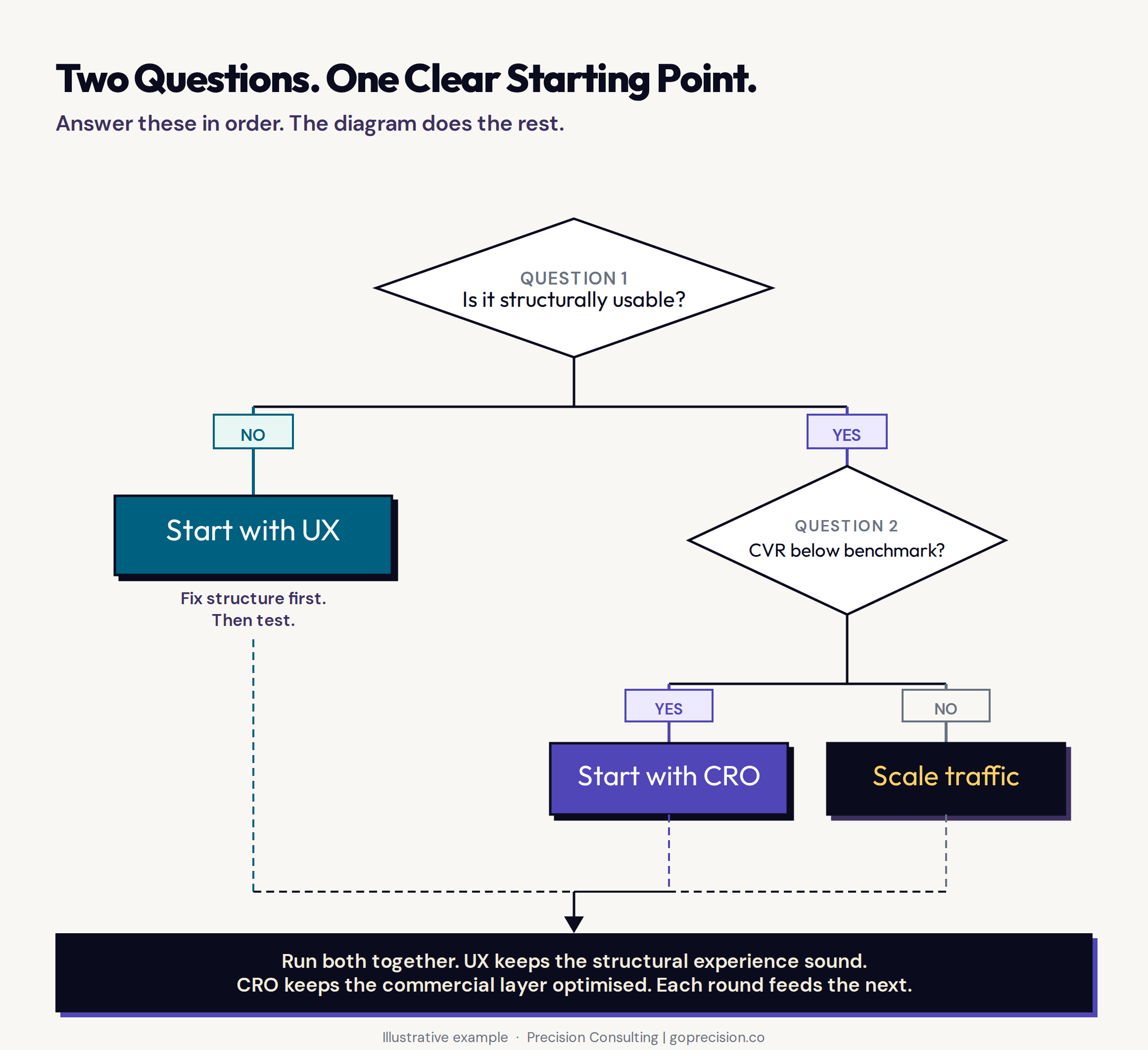
The prioritisation decision is not about budget, it is about what your data is telling you. Structural problems require UX. Commercial friction requires CRO.
Why running both CRO and UX together produces the best long-term results
The businesses with the strongest conversion rates over time are not the ones that chose CRO or UX. They are the ones who run both. UX keeps the structural experience sound. CRO keeps the commercial layer optimised and compounding. Each round of CRO learning informs the next UX improvement. Each UX improvement raises the floor that the CRO programme runs against.
Running either one in isolation means you hit a ceiling faster than you should. The loop is the strategy. For stores evaluating whether a full redesign is part of that loop, the CRO vs redesign article covers when a rebuild is actually justified and how to sequence it against a running CRO programme.
Goal gradient effect: people accelerate toward a goal as they get closer to completing it. A store where UX has removed navigational friction and CRO has removed commercial hesitation creates a compounding effect on momentum through the funnel. Each improvement increases the probability that the next micro-decision goes in the buyer's favour. Neither discipline alone creates that momentum. Both together do.
At the end of each CRO test cycle, brief your UX team on the insights: what the winning variant revealed about buyer motivation, what the losing variant revealed about what creates hesitation. That transfer of knowledge is what prevents UX work from being guesswork and what prevents CRO from running in circles.
- CRO and UX are not the same discipline. CRO optimises for measurable conversion outcomes. UX optimises for experience quality. Both affect revenue through different mechanisms and with different feedback loops.
- CRO requires a diagnostic first. Changes made without a specific hypothesis tied to a measurable outcome are not CRO. The distinction matters because one compounds and one does not.
- UX removes experience barriers. It does not automatically solve commercial ones. A site can have excellent UX and below-benchmark conversion if trust signals, offer quality, or product page effectiveness are the actual friction points.
- Trust signals, product page quality, and mobile drop-off are CRO problems as much as UX problems. Most UX investment misses them because it focuses on navigation and checkout structure.
- Start with UX first when session recordings show structural confusion that would drown out the signal from individual CRO tests. Start with CRO first when the experience is usable and conversion is below the category benchmark.
- The diagnostic step is what most businesses skip. Identifying where mobile drops relative to desktop by funnel step costs nothing and tells you exactly where to start.
- The strongest long-term results come from running both in a loop. UX keeps the structure sound. CRO keeps the commercial layer optimised. Neither discipline does the work of both.
Frequently asked questions
What is the difference between CRO and UX?
CRO (conversion rate optimisation) focuses on increasing the percentage of visitors who complete a specific commercial action, like a purchase. UX (user experience design) focuses on making the site easier, clearer, and more intuitive to use. Both affect conversion, but CRO ties every change to a measurable business metric while UX can improve the experience without a direct commercial outcome.
Can you do CRO without UX?
You can, but the ceiling is lower. CRO on a structurally confusing experience produces marginal gains because the noise from broken UX drowns the signal from individual test results. The most effective CRO programmes work on an experience that has already addressed its fundamental usability problems.
Does good UX automatically improve conversion rate?
Not automatically. A site can have excellent UX and a below-benchmark conversion rate if trust signals, offer quality, or product page effectiveness are the actual friction points. UX removes experience barriers. CRO identifies and addresses specific commercial barriers. Both are needed for the conversion rate to reach its potential.
Which should I invest in first for a new e-commerce store?
For a new store with low traffic and an unvalidated experience, UX first. The structural foundation has to exist before testing individual elements makes sense. Once the store has meaningful traffic and the experience is generally navigable, CRO becomes the higher-return investment.
How do CRO and UX work together?
CRO diagnosis surfaces specific friction points. UX design addresses them at a structural level. CRO testing validates that the UX changes produced the expected commercial improvement. The disciplines run in a loop: UX keeps the experience sound, CRO keeps the commercial layer optimised.
If you are not sure whether your store has a CRO problem, a UX problem, or both, that is usually the diagnostic telling you something. See how Precision works with e-commerce brands to untangle which layer is the priority and what to fix first.
Don't Make Me Think by Steve Krug: the foundational text on web usability, covering why structural clarity rather than visual polish is what allows buyers to navigate without effort. Essential reading for understanding what UX is actually solving for.
Predictably Irrational by Dan Ariely: covers the psychological biases that affect buying decisions in ways that UX alone cannot address. The chapter on relative value is directly applicable to product page and pricing CRO.
100 Things Every Designer Needs to Know About People by Susan Weinschenk: bridges UX and psychology, covering visual hierarchy, attention, and decision-making in ways that are directly applicable to both disciplines in an e-commerce context.
