Last updated:
Visual hierarchy, colour, and layout influence conversion rate by controlling what a buyer notices first, how much mental effort their brain spends processing a page, and whether the path to purchase feels clear or confusing.
Most stores that struggle to convert are not struggling because the product is wrong or the price is too high. The page is working against them. Buyers arrive, scan for about three to five seconds, and leave without taking any action. Not because they decided against it. Because the page did not tell them what to do.
This is a visual hierarchy problem. It is one of the most common and most underdiagnosed issues in store audits. The good news: it is fixable without a full redesign. The bad news: until you can see it, you will keep attributing the conversion problem to everything else.
Visual hierarchy, colour, and layout are each distinct, but they work together. Hierarchy tells the eye where to go. Colour signals urgency, trust, and category. Layout determines whether the journey through the page makes sense. When all three are aligned, the page converts. When they contradict each other, the buyer leaves. For a broader view of how psychology underpins conversion decisions at every stage of the buyer journey, our article on the psychology of e-commerce conversions covers the full behavioural picture.
What visual hierarchy actually is and why it determines conversion
Visual hierarchy is the arrangement of elements on a page so that the eye moves through them in the order most likely to produce a purchase. When it works, the buyer moves naturally from the product to the value to the proof to the action. When it fails, the eye lands on the wrong element, gets confused, or finds nowhere obvious to go.
Think of a well-designed restaurant menu. The chef's specials sit in a box at the top in larger text. The wines are in a separate section. The standard items are uniform below. You do not have to work to find what matters. The hierarchy does it for you. Your product page is the same challenge, just harder because most stores built it without thinking about sequence at all.
Before a buyer consciously reads a single word on your page, their brain has already processed every element by size, colour, contrast, and position. This takes under 250 milliseconds. The brain uses those signals to decide where to look first, second, and third. If your Add to Cart button has the same visual weight as three other elements on the page, the brain does not prioritise it. It treats it as an equal. Which means the buyer treats it as optional.
The squint test
Here is the fastest way to see your own hierarchy problem. Squint at your page until the text blurs and only shapes and weights remain. Whatever you can still identify is what your hierarchy is communicating to buyers. If the logo, the promotional banner, and the CTA all look like the same visual weight, your hierarchy is flat. A flat hierarchy gives the buyer's brain no signal about where to go. It defaults to leaving.
Most founders have never done this. They see the page as they intended it: knowing where the product is, knowing what the headline says, knowing what the CTA means. The buyer does not have any of that context. They see the raw page for three seconds and make a decision. The squint test puts you in that position in five seconds for free.
The Psychology: Pre-attentive attributes are the visual properties that the brain processes before conscious attention starts. Size, colour, contrast, and shape are all pre-attentive. Imagine walking into a party where everyone is in black, and one person is wearing a bright red jacket. Your eye goes there before you consciously decide to look. That is pre-attentive processing. On a page where everything has equal size and colour, nothing wears the red jacket. Nothing gets prioritised. Nobody clicks.
The Fix: Pick the three most important elements on each page: the primary product image, the headline, and the CTA. Check that each is visually larger, higher contrast, or better positioned than what is around it. If all three compete equally, reduce the visual weight of secondary elements first. Do not add more emphasis to the primary ones. Adding emphasis everywhere adds emphasis nowhere.
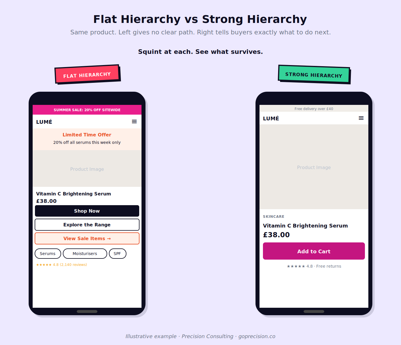
Flat versus strong visual hierarchy on a product page. On the left, the CTA competes with four other elements of equal weight. On the right, size and contrast differentiation makes the purchase path immediately clear.
Why contrast drives clicks more than colour choice
There is a persistent myth in e-commerce that certain button colours convert better than others. Green means go. Red creates urgency. Orange drives impulse. Most of this is folklore. The research does not support colour-specific rules. What the research does support is contrast.
Contrast, not colour, is the mechanism
The most common colour mistake in e-commerce is choosing a CTA button colour based on the brand palette rather than how it stands out from the surrounding page. A mint green button on a mint green page converts poorly regardless of how on-brand the mint is. A bright orange button on a white page converts well, not because orange is magical but because it stands out. The button gets clicked because the eye finds it. Colour is just the vehicle.
Research from the Nielsen Norman Group shows that users click interactive elements that look different from their background, not elements that match it. The button that blends in gets missed. This is the Von Restorff Effect at work: items that differ from their surroundings get noticed and remembered. Your CTA needs to be the outlier on the page, not another harmonious piece of the palette.
The Psychology: The Von Restorff Effect, also called the isolation effect, describes the brain's tendency to notice and remember items that stand out from their surroundings. In conversion terms, the element that looks different from the rest of the page is the one the buyer's brain flags as important. A CTA that matches the colour scheme too closely is invisible, regardless of how clearly labelled it is.
The Fix: Put your CTA button on a white background in isolation. Does the colour read clearly? Now look at it in context on your actual page. Does the surrounding content compete with it or reduce it? If the button reads worse in context than in isolation, the page is swallowing your CTA. Fix the contrast between the button and its immediate background before you change the button colour itself.
Your palette is probably misaligned with your category
There is a second job colour does that most founders miss. Buyers carry strong associations between colour palettes and product types. Dark, minimal palettes signal premium. Bright, saturated palettes signal accessible pricing. Pastels signal wellness, natural, and gentle. These associations form before reading begins.
When your palette contradicts your category, buyers feel something is off. They cannot tell you what. They just do not buy. A luxury skincare brand using loud primary colours on its product pages undermines the premium price before a buyer reads a single word. A children's supplement brand using a stark minimalist palette feels cold in a category where parents want warmth and reassurance. The palette needs to reinforce the category story, not fight it.
How layout determines what buyers actually see
Layout affects conversion because buyers do not read pages. They scan them. Eye-tracking research by the Nielsen Norman Group established that on content-heavy pages, users scan in an F-shaped pattern: horizontally across the top, a shorter scan lower down, then vertically down the left side. The right column and the bottom right are the areas least likely to be seen at all.
You are hiding your CTA from most buyers.
If your CTA sits on the right side of the page, or below a long block of text, most buyers are missing it. Not because they are inattentive. Because they are using the same scanning behaviour they use everywhere on the web. The F-pattern is not a flaw. It is how the brain protects itself from information overload. Your page needs to work with it, not assume buyers will read every element in sequence.
Think about how you skim a newspaper. You do not read top-left to bottom-right like a book. Your eye jumps to the headline, the photo, the pull quote. You decide in two seconds whether to read on. That is exactly what is happening on your product page. Buyers are not reading your specifications and then reaching your CTA. They are scanning for the two or three things they need and leaving if they cannot find them fast.
Your highest-priority elements belong in the top horizontal band and along the left column. The product image and headline earn the top band. The Add to Cart button should be visible in the first screen without scrolling on desktop, and without any scrolling at all on mobile. If it is below the fold, a significant share of buyers never reach it. Mobile layout is a separate and significant problem with its own scan patterns and thumb zone constraints. Our article on mobile CRO covers how those differ on small screens.
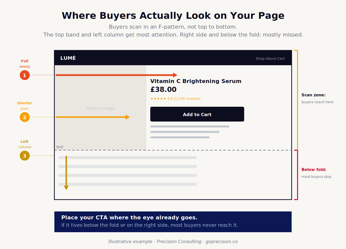
F-pattern scan zones on a product page. High-visibility areas are concentrated at the top and left. A CTA placed in the right column or below a long text block is missed by the majority of buyers.
When to use a Z-pattern instead
Landing pages with a single clear action work differently. On a sparse page with minimal content, the eye follows a Z-path: across the top, diagonally to the opposite corner, across the bottom. This is why landing page best practice puts the logo top-left, supporting elements top-right, proof in the middle, and the CTA bottom-right. The eye arrives there naturally.
The Z-pattern breaks the moment the page gets dense. Add a navigation bar, a promotional banner, multiple text blocks, and the pattern reverts to an F-scan. This is why a dedicated landing page for a paid campaign almost always converts better than your homepage for the same offer. The simplicity is the strategy, not the design. Our articles on landing page optimisation and homepage CRO cover how to apply these layout principles at the page level.
Visual hierarchy problems are some of the fastest to identify and fix once you know what to look for. If you want to see exactly where your store's layout and hierarchy are losing you revenue, request your free audit and we will walk through it together.
Why visual clutter kills conversion
Every element on your page costs the buyer mental energy to process. Your navigation links. Your announcement bar. Your pop-up. Your three competing CTAs. Your 24 product variants. Each one is a small tax on attention. You pay that tax with lost conversions.
In the Jam Study by Iyengar and Lepper, a supermarket display with 24 jam options attracted more browsers but converted at one-tenth the rate of a display with six options. More choices looked more appealing. It produced far fewer sales. The same mechanism plays out on every page in your store.
The Psychology: Hick's Law states that decision time increases as the number of choices grows. In e-commerce, this applies to every competing action on a page, not just product variants. Navigation options, CTAs, promotional banners, social links, and pop-ups all sit in the buyer's choice environment. The more options the page presents, the more likely the buyer is to exit without acting on any of them.
The Fix: Count the distinct actions available on each key page. Include navigation links, CTAs, promotional banners, pop-up triggers, and social icons. If the total is more than five, decide which two or three matter most and reduce or remove the rest. This is not minimalism. It is protecting the buyer's attention for the decision you actually want them to make.
If you want to see how Von Restorff, Hick's Law, and the other psychology principles covered here play out in real product interfaces, growth.design's case studies are worth working through. They break down exactly how well-known brands apply these mechanisms, with annotated walkthroughs of real screens.
When everything shouts, nothing is heard
When conversion is low, the instinct is to add emphasis. Bigger headline. Brighter CTA. Louder promotion. Applied to one element in a restrained page, this works. Applied to every element, you end up with a page where everything is shouting at equal volume, and nothing stands out. Emphasis only works when something else does not have it.
What appears most often in stores with this problem is a homepage that has been upgraded section by section over time. A promotional banner was added. Then an announcement bar. Then a hero with a larger headline. Then a second CTA. Each decision made sense in isolation. Together, they created a page with no hierarchy, no visual breathing room, and no clear direction. The buyer sees effort everywhere and finds clarity nowhere. The fix is almost always to remove before you add.
How to diagnose your visual hierarchy before you redesign anything
Most visual hierarchy problems do not require a redesign. They require a diagnosis and then targeted changes on the highest-impact elements. Start with the pages that get the most traffic and have the biggest gap between traffic and conversion. That gap is where the hierarchy problem is most expensive.
The 5-second test
Show your page to someone who has never seen it. Give them five seconds. Cover it and ask: what was the page about, what were you supposed to do, and what stood out most? If the standout element is a promotional banner rather than the product, your hierarchy is pointing buyers in the wrong direction. If they cannot answer the second question at all, your CTA has no visual priority.
This test is free and takes fifteen minutes. It reveals things that weeks of analytics cannot. Analytics tells you buyers are not converting. The 5-second test usually tells you why.
Three things to check on every page
First: the entry point. Squint at the page. Where does your eye land? If it is not the product image or headline, the hierarchy is wrong. Fix that one thing before anything else.
Second: CTA visibility. Is the Add to Cart button or primary CTA visible without scrolling on both desktop and mobile? Is it the highest-contrast element in its immediate area? If something nearby has more visual weight, the CTA is losing the pre-attentive competition.
Third: action count. Count every distinct thing a buyer can do on the page. Navigation links, CTAs, banners, social icons, pop-up triggers. If the total is above five, you have a clutter problem that is competing with your primary action.
If you want a structured framework to apply these checks across your full store, our CRO audit checklist walks through the diagnostic in order.
- Visual hierarchy, colour, and layout all influence conversion by controlling where attention goes and in what order. When they are misaligned, conversion fails regardless of traffic quality or product strength.
- Pre-attentive processing means buyers categorise your page by visual weight before reading a word. Size, contrast, and colour are the signals the brain uses. An element that matches its surroundings in all three is invisible.
- CTA buttons convert through contrast, not colour. A button that blends with the surrounding page is missed before the buyer consciously reaches the decision to click.
- The F-pattern scan means content in the right column and below the first scroll is the area least likely to be seen. High-priority elements belong in the top horizontal band and left vertical column.
- Hick's Law applies to page structure. Every additional CTA, navigation option, and banner competes for the buyer's processing capacity. More choices mean slower decisions and higher abandonment.
- The squint test and the 5-second test are faster and often more revealing than weeks of behavioural analytics. Use them before commissioning a redesign.
- Removing emphasis from secondary elements is more effective than adding emphasis to primary ones. Hierarchy is relative. You cannot increase the prominence of every element simultaneously.
Frequently asked questions
What is visual hierarchy in e-commerce?
Visual hierarchy in e-commerce is the arrangement of page elements so that the buyer's eye moves through them in the sequence most likely to produce a purchase. It is achieved through size, contrast, colour, whitespace, and position. A page with strong visual hierarchy makes it obvious what to look at first, what the product is, what the offer is, and where to click. A page with weak hierarchy presents all elements at similar weight, creating confusion that typically results in the buyer leaving without acting.
Does button colour affect conversion rate?
Button colour affects conversion rate primarily through contrast, not through the specific colour chosen. A button that contrasts with the surrounding page is more likely to be noticed and clicked than one that blends with it. The common claim that orange or green buttons outperform others is a correlation: those colours often contrast well on typical e-commerce pages. The underlying mechanism is visual distinctiveness, not colour psychology. Test button colour changes by first checking whether you are increasing contrast with the surrounding background.
What is the F-pattern in e-commerce?
The F-pattern describes the way users scan content-heavy web pages: horizontally across the top, a second shorter horizontal scan lower down, then vertically down the left side. Eye-tracking research by the Nielsen Norman Group established this pattern across many thousands of page sessions. In practical terms, it means content placed in the right column and below long text blocks receives significantly less attention than content placed at the top of the page or along the left edge.
How does colour affect trust in e-commerce?
Colour affects trust by signalling category expectations. Buyers carry unconscious associations between colour palettes and product types. A palette that contradicts the category expectations for a product creates a dissonance that the buyer experiences as unease without being able to identify the source. A premium product presented with loud, cheap-signalling colours reduces perceived value. The fix is not to abandon brand colour but to verify that the palette reinforces the product's category positioning rather than contradicting it.
What is Hick's Law in e-commerce design?
Hick's Law states that decision time increases as the number of available options grows. In e-commerce, this applies to every competing action on a page: CTAs, navigation links, promotional banners, pop-up triggers, and cross-sells all participate in the buyer's choice environment. Pages with fewer competing actions convert more reliably than those with many, even when the buyer arrived intending to complete the primary action.
Most visual hierarchy problems are invisible to the people who built the page. You know what each element means and where the CTA is. Your buyer does not. The squint test, the 5-second test, and a careful count of competing actions on your highest-traffic pages will surface the issues faster than any analytics tool. Once you can see them, most are fixable without touching the product or the offer. If you want a structured audit that maps exactly where your store's hierarchy is costing you revenue, our services page explains how we work through it.
Don't Make Me Think by Steve Krug. The chapters on scanning behaviour and visual noise are the most direct application of visual hierarchy to web design. Krug's work on how users actually read pages, rather than how designers imagine they do, established many of the principles still in practice today.
Laws of UX by Jon Yablonski. Each chapter covers one perceptual or behavioural law with direct application to interface design. Hick's Law, Fitts's Law, and the Von Restorff Effect are all covered with clear e-commerce applications.